Limitations. The reason I am here today.
I love limitations! I love them because they inspire me to find ways to break them.
Before anything else, I want to thank Excel for its 1 million row limit! It pushed me to learn R, Python, Alteryx, and, most importantly, it led me to Tableau.
The first time I had the chance to test the tool, I didn’t see it. Fast forward to the present, and I am using Tableau every day. I can’t imagine life without it!
I decided to expand on the reasons I believe this software is extraordinary. I hope this article will help some of you avoid making the same mistake I did.
Let’s start!
1. Analysis at the speed of thought
It’s arguably Tableau’s greatest strength. You can create different types of charts by dragging and dropping fields on the canvas.
You can explore different visualizations to answer questions as they come to mind. You will probably throw a lot of them out, but that doesn’t matter. What matters is that the ones you keep answer questions.
Story 1
One of my colleagues is passionate about Python. He likes creating “interesting” things using the Plotly library. He would try to argue, but that kind of stuff takes days to develop.
Since he learned the basics of Tableau, he can create visuals with a much lower time investment.
I asked him how much faster he can work in Tableau. He said it’s incomparable because he’s doesn’t have to start with the end in mind anymore.
My question to you: how can one know what story to tell when one doesn’t know the data? Even if we think we know the data, we actually don’t.
There are loads of data visualization/BI tools out there. I have tested a lot of them.
I can say that Tableau is the only one that doesn’t require you to know what you want to build before you build it.
Story 2
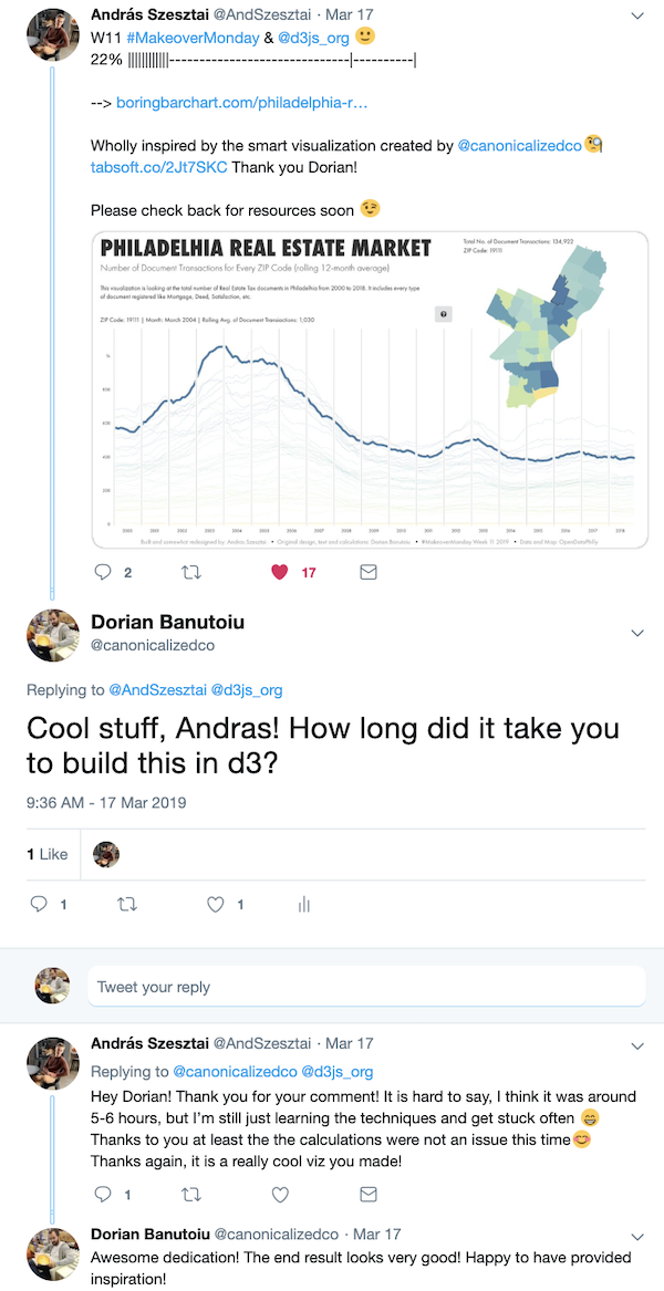
A while back, I created a visual about the Philadelphia real estate market for MakeoverMonday (a social DataViz project).
András Szesztai, an active member of the Tableau community liked it, and he re-created it in D3.
I asked him how long it took him to create the D3 version. His answer is in the twitter conversation below:
András is selling himself short here. He’s a very talented guy! He knew what he wanted to create, but effort was the price to pay. His passion makes the 5-6 hours worth it.
Does it matter you can create this in Tableau in 20 minutes once you’ve decided what story to tell?
I don’t know.
What I do know is that the speed of Tableau frees up a lot of time that can be used for exploration. And that matters!
2. The visual technology
Some users might be able to match the speed of Tableau in a tool they’re very proficient in. Yes, the super-nerds.
They might hit a different kind roadblock down the way: the number of elements they can display.
Most BI tools will limit you to thousands or tens of thousands of marks. In Tableau, you can display millions!
You probably don’t need that many. But when you’re exploring different options, you don’t want anything slowing you down.
Having millions of rows of data available is not the most exciting part for me. But the speed of switching between different graphs.
VizQL (Tableau’s breakthrough technology) is the engine behind all of this. Thanks to it fast analysis without coding knowledge is a reality.
People with little or no training can create and interact with visualizations faster than ever before. And that’s the biggest difference of all.
Example 1
Below is a visualization I created to emphasize this point. I was able to build it in about ~20 minutes (including the time it took to source the data).
The map is showing all the cities in the world (or settlements) with at least 500 people. There are about 190.000 points displayed on the map doubled in the jitter plot beneath it.
The viz displays ~370.000 points in total. Here’s how swift you can interact with it:
Example 2
Alex Varlamov is a passionate DataViz guy who always tries to push Tableau to the limit. Below is a visual he created by plotting 4 million points:
This is not a business visualization, but a beautiful statement of how boundless our options are.
3. Interactivity
Visual interactivity is my favorite piece of the Tableau pie.
Yes, technology is awesome! But for me enabling people to explore on their own is something really special. It’s almost magical to be able to click on different elements of a dashboard to answer questions.
A lot of Tableau developers are hesitant to put this kind of interactivity in front of stakeholders.
Even the best of the breed have a difficult time achieving meaningful interactivity. A lot of things can go wrong. Not because of the tool, but people might use dashboards in different ways than their creator imagined it.
I have written a great deal about Set Actions and Parameter Actions. These new features can take interactivity opportunities to a whole new level.
I believe if we take it step-by-step, we can gain executive trust. We will be able to offer engaging experiences.
At this link you’ll find ways I’m using interactivity to improve visualizations and how people respond.
4. From report readers to explorers
Having a real-time view on what’s happening in our organizations is something most of us strive to achieve.
Static reports are fine to answer questions at a glance. The problem arises when a secondary question pops up.
With Tableau, you can answer a lot of them on the spot. The analyst doesn’t need to go back to re-work a report.
In fact, almost anyone can answer questions on their own. Even more so if the visualizations are interactive.
In this way, organizations can free-up high-priced talent to perform analysis instead of compiling reports.
Example
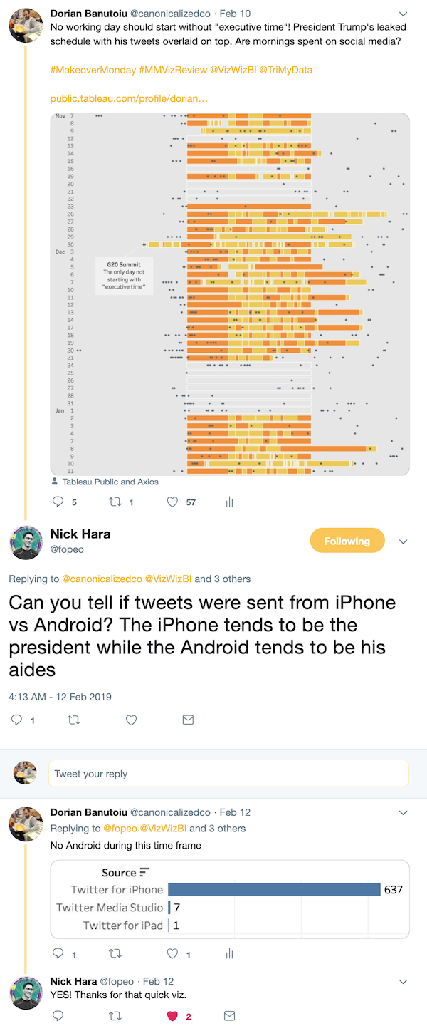
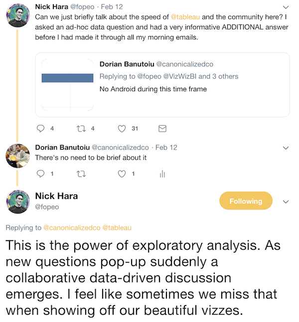
I have another quick Twitter chat for you. Nick Hara saw one of my visualizations and a question popped in his mind. I was able to answer moments after noticing his message:
There are tons of similar examples. This is one of those unique experiences Tableau can facilitate.
Asking Tableau questions in natural language
Don’t have the time to create your own visual in Tableau? Don’t want to bug people with small questions all the time?
How about asking your data directly?
Yes, you can now ask questions in plain English and get answers with charts. AskData is available by default from Tableau 2019.1.
I recommend downloading this white paper as a solid guide for getting started.
5. The Data Connections
With Tableau, it’s easy to connect to a bunch of different data sources: databases, files, (big) data warehouses, etc.
You can join, union, and blend them in various ways.
- File-based data sources: Excel, text, statistical, spatial, etc.
- Relational database data sources: SQL, Teradata, Exasol, Vertica, etc.
- Big data frameworks: Hadoop, Spark
- Cloud-based data warehouses: Snowflake, Amazon Redshift. etc.
- Web Applications: Salesforce, Google Analytics, Quickbooks, etc.
- Web Data Connectors: web services as data sources
You do not have to pay anything extra for the data connectors. They are all built into the tool.
You can use live connections or Tableau’s extract engine for “Hyper”-fast performance.
6. A data analysis tool that happens to create dashboards
The primary purpose of business dashboards is to enable people and organizations to make better decisions.
Some might say that Tableau is good to create pretty pictures, business run on efficiency. What they might not get is that those pictures are created out of pure passion. The creators push their limits and force themselves to improve.
Two of my favorite Tableau guys Adam McCann and Rody Zakovich are the perfect example for the point I am trying to make.
If you click on their names, you can see their Tableau Public profiles. Can they create pretty pictures? Some of the most beautiful things. Not to mention that Adam is color blind!
Does that mean that they don’t know businesses run on efficiency? I highly doubt it.
If you pay attention to their work, you will notice a lot of visuals that apply to business scenarios.
I want to end this section with a tweet from Rody:
7. Fast iterations and a non-linear development process
Say you have a team of analysts working on a project. They pour their blood, sweat, and tears into it, hoping it will make a positive impact.
They put the visuals in front of stakeholders and get feedback on how to change things around.
In a non-Tableau world, they would go back to their regular development process.
Imagine this instead: analysts are not only open to feedback, but they will ask for it multiple times along the process.
The speed of Tableau makes implementing feedback a breeze. Executives are no longer frustrated by tedious development cycles, and analysts feel they are making a difference.
Examples?
I have seen lots of cases where discussions and fast iterations led to fruitful results.
I want to share a screenshot with a twitter discussion and a link to a blog post from Steve Wexler where he summarizes a community effort.
8. The intuitiveness of the platform
You might have heard more or less about how easy it is to get started with Tableau.
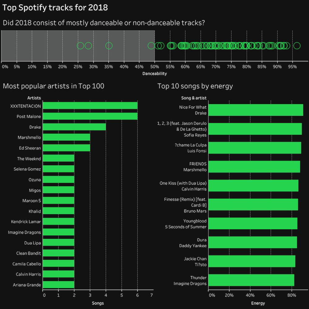
I want to tell you a story about a colleague of mine and her first ever data visualization.
She got a data source with the top Spotify tracks in 2018 and three questions. She created what you see below:
I was fascinating for me to see her dragging and dropping fields on the canvas to create this story. I gave her some pointers on some technical stuff, but it was all her. And it took no more than 30 minutes.
It might not have been a big deal to her, but for me, it was enlightening to watch.
A few other Tableau benefits
- Tableau is not one tool, but a suite of tools (Desktop to create, Server/Online to explore and collaborate, Prep to prepare the data, Public to share with the community)
- basic statistical analytics with trends and forecasting
- advanced analytics using R and Python integrations
- praise from its users as measured by Gartner
- developing new functionalities on a rapid pace
- doesn’t require a complicated software setup which makes it less dependent on IT
- fits businesses of any size (small to enterprise)
- platform agnostic (Desktop and Prep work on Mac and Windows, Server works on Windows and Linux)
- secure environment for the content
- it enables a collaborative work environment
The struggle: Sense-making
With great power comes great responsibility!
Creating stuff that communicates correctly and effectively is not always easy. Even with the best tool.
Stephen Few says that “information is useless until we understand what it means”.
Wrong assumptions can lead to bad decisions. And once the wrong choice is made, the trust goes away.
The good news is that we have a set of rules based on what we know about visual perception and cognition. We can follow them to display information effectively.
Anyone can learn these rules. We just have to put in the time to do it.
A few pointers that can help:
- we should always start with a question in mind; otherwise, we’re just wasting time
- getting a grasp of the whole process is beneficial, from data collection to creating and presenting visuals
- getting the data right is essential, but the visual part of things is decisive
- we should always question the data and the calculations to make sure it makes sense
- building charts for the sake of building charts is not a game you should be in
- focusing on communicating clearly is infinitely more important than pretty charts
I am dealing with a lot of these things myself. I have created stuff along the way that was plain wrong.
I’ve had some sleepless nights, but I believe I am better because of it.
This is where the community can play a key role for us.
9. The Community
Examples of people’s contributions are sprinkled across this article.
The Tableau community is vibrant. The people are involved, and (in most cases) helpful.
There are tons of social projects meant to engage people and help them improve: MakeoverMonday, WorkoutWednesday, PreppinData, Viz for Social Good, Sports Viz Sundays, ProjectHealthViz, and so on.
There are also User Groups, where you can meet fellow Tableau passionates and share experiences.
I wrote about MakeoverMonday a while back, my all-time favorite community project, and my playground.
I encourage everyone to take part for one main reason: you have the possibility to mess up badly.
The feedback might bite a bit, but it’s what we need to make progress.
I believe we, as a society, tend to emphasize mistakes. If we could find the strength to embrace them, we will be able to achieve true greatness.
Don’t have the time for it? I believe if you’re passionate enough, you’ll find the time.
You’re not the first one to go through all of this.
Conclusion: Not your everyday BI platform
Tableau, the company, wants to help people see and understand data. But the tool does not work on its own. We are the ones who have to use it.
Let’s try to make the best out of it!
For those of you who are new to Tableau and want to take it for a spin, here’s a link to download a 14-day free trial risk-free.
Highly passionate about data, analysis, visualization, and everything that helps people make informed decisions.
I love what I do! I am working to improve speed in every aspect of my life and that of our clients.
I find comfort in helping people, so if you have a question, give me a shout!
