In this article, we discuss how we can use Plolty with Google Analytics data.
For this we need the following:
- a Google Analytics account from which we pull the data through Google Analytics API V4;
- Python, which is going to be our programming language;
- to process the data we use Pandas; the best library for processing data in Python.
- to visualize the data we use Plotly.
So let’s start.
Connecting to Google Analytics API
For this, we are going to use OAuth, and we start with this official tutorial. First, we must enable the API, which very easy to do.
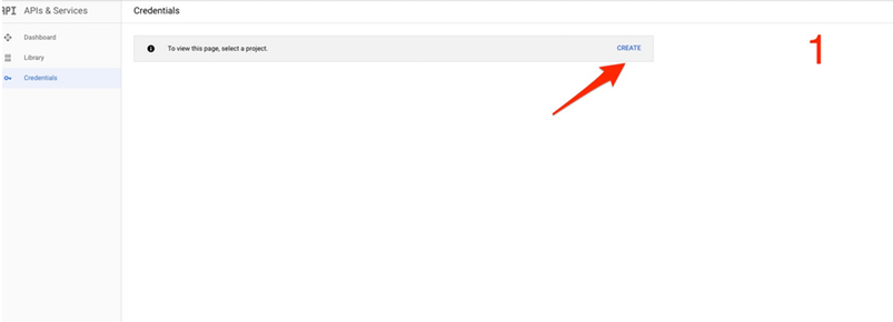
For this, we start at the credentials page. If you do not have a project created already you must create a new one. If you already have a project created, you can use it or of course create a separate one. Also after you create a project, you must enable the Google Analytics Report API.
After that click on create “Create Credentials” and “Select OAuth ID” and for the “Application type” choose other. The “Client ID” you can name whatever you want. Now you can click “Create”.
Here is the sequence of steps:
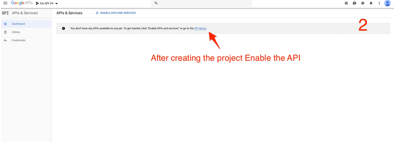
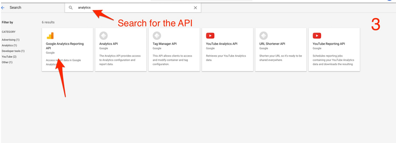
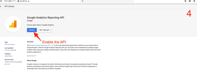
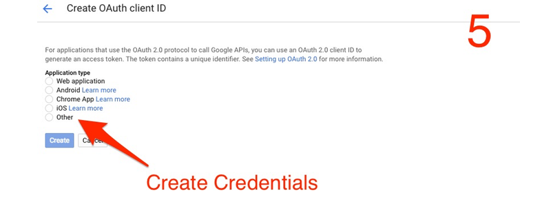
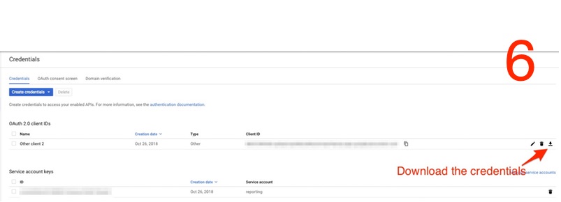
Download the credentials, and put them in the same location where you want to build your app.
OK, so now that we can authenticate we need to install a library which fetches the data for us. We use the same command as in the tutorial. Just type it your terminal console.
sudo pip install --upgrade google-api-python-client
Keep in mind that if you are using pip3 you need to use that:
sudo pip3 install --upgrade google-api-python-client
After the setup is complete you must see something like this:

So that we are all set to get some data and start preparing it for visualization.
To write my code I am using Pycharm. Also, you can use Atom.
Now choose a view ID from your Google Analytics account for which you want to process the information.

Now we use the code mentioned in the Google Tutorial, except for the “print_response” function.
IMPORTANT: Remember to replace the name of the .json file and view ID:
import argparse
from apiclient.discovery import build
import httplib2
from oauth2client import client
from oauth2client import file
from oauth2client import tools
SCOPES = ['https://www.googleapis.com/auth/analytics.readonly']
DISCOVERY_URI = ('https://analyticsreporting.googleapis.com/$discovery/rest')
CLIENT_SECRETS_PATH = 'client_secret_.json' #replace with the path to JSON File
VIEW_ID = ‘23915819' #replace the view ID

def initialize_analyticsreporting():
  parser = argparse.ArgumentParser(
      formatter_class=argparse.RawDescriptionHelpFormatter,
      parents=[tools.argparser])
  flags = parser.parse_args([])
  flow = client.flow_from_clientsecrets(
      CLIENT_SECRETS_PATH, scope=SCOPES,
      message=tools.message_if_missing(CLIENT_SECRETS_PATH))
  storage = file.Storage('analyticsreporting.dat')
  credentials = storage.get()
  if credentials is None or credentials.invalid:
    credentials = tools.run_flow(flow, storage, flags)
  http = credentials.authorize(http=httplib2.Http())
  analytics = build('analytics', 'v4', http=http, discoveryServiceUrl=DISCOVERY_URI)
  return analytics
def get_report(analytics):
  return analytics.reports().batchGet(
      body={
        'reportRequests': [
        {
          'viewId': VIEW_ID,
          'dateRanges': [{'startDate': '7daysAgo', 'endDate': 'today'}],
          'metrics': [{'expression': 'ga:sessions'}]
        }]
      }
  ).execute()
def main():
  analytics = initialize_analyticsreporting()
  response = get_report(analytics) #get the response from the API
  print(response) #print the response from the API
if __name__ == '__main__':
  main()
Now we are ready to execute the code. If you execute the code for the first time you will promoted in the browser to select and account:
After you select you will receive the answer in the console, like below:

HURRAYYY!!! WE HAVE DATA FROM GOOGLE ANALYTICS!
PREPARING THE DATA
The response you get is a dictionary. You can prettify the data using an online tool of you can use the PPRINT Library to understand the response better.
{
  'reports': [{
    'columnHeader': {
      'metricHeader': {
        'metricHeaderEntries': [{
          'name': 'ga:sessions',
          'type': 'INTEGER'
        }]
      }
    },
    'data': {
      'rows': [{
        'metrics': [{
          'values': ['34930']
        }]
      }],
      'totals': [{
        'values': ['34930']
      }],
      'rowCount': 1,
      'minimums': [{
        'values': ['34930']
      }],
      'maximums': [{
        'values': ['34930']
      }]
    }
  }]
}
The example above contains only metric. Let’s introduce some dimensions and plot our first graphic 🙂
In Google Analytics, Audience > Demographics there are two graphics: Age and Gender. Let’s get the data and combine it into one graphic.
Let’s get familiar with the Dimensions & Metrics explorer. Here you can access any dimension and metric in Google Analytics through the API. To get the age and gender, we need to call the following: ga:userAgeBracket and ga:userGender (To get an API name very quickly always use the search 😛).
Now we need to introduce them in our API call, like this:
def get_report(analytics):
  return analytics.reports().batchGet(
      body={
        'reportRequests': [
        {
          'viewId': VIEW_ID,
          'dateRanges': [{'startDate': '7daysAgo', 'endDate': 'today'}],
          'dimensions': [{'name': 'ga:userAgeBracket'}, {'name': 'ga:userGender'}], #our new dimensions
          'metrics': [{'expression': 'ga:sessions'}]
        }]
      }
  ).execute()
Keep in mind that you need to specify each dimension in a separate dictionary.
Execute and you get the following (of course the numbers will be different):
{'reports': [{'columnHeader': {'dimensions': ['ga:userAgeBracket',
                                              'ga:userGender'],
                               'metricHeader': {'metricHeaderEntries': [{'name': 'ga:sessions',
                                                                         'type': 'INTEGER'}]}},
              'data': {'maximums': [{'values': ['3682']}],
                       'minimums': [{'values': ['411']}],
                       'rowCount': 12,
                       'rows': [{'dimensions': ['18-24', 'female'],
                                 'metrics': [{'values': ['654']}]},
                                {'dimensions': ['18-24', 'male'],
                                 'metrics': [{'values': ['432']}]},
                                {'dimensions': ['25-34', 'female'],
                                 'metrics': [{'values': ['3682']}]},
                                {'dimensions': ['25-34', 'male'],
                                 'metrics': [{'values': ['2683']}]},
                                {'dimensions': ['35-44', 'female'],
                                 'metrics': [{'values': ['2126']}]},
                                {'dimensions': ['35-44', 'male'],
                                 'metrics': [{'values': ['2141']}]},
                                {'dimensions': ['45-54', 'female'],
                                 'metrics': [{'values': ['1183']}]},
                                {'dimensions': ['45-54', 'male'],
                                 'metrics': [{'values': ['1042']}]},
                                {'dimensions': ['55-64', 'female'],
                                 'metrics': [{'values': ['1111']}]},
                                {'dimensions': ['55-64', 'male'],
                                 'metrics': [{'values': ['730']}]},
                                {'dimensions': ['65+', 'female'],
                                 'metrics': [{'values': ['448']}]},
                                {'dimensions': ['65+', 'male'],
                                 'metrics': [{'values': ['411']}]}],
                       'totals': [{'values': ['16643']}]}}]}
Because we introduce the two dimensions, the array is a bit more complicated so let’s talk a bit about it:
If you look an the “columnheader” you will see that is has the same structure as each member of the “rows” list, apart from mentioning the type of the metric. Apart from rows where all our data is, we have a minimum, maximums, total number of rows and and the sum of metrics. I will suggest not to focus on this aspects, because will calculate them much easier below :).
So now let’s get our data:
data = response.get('reports', [])[0].get('data', {}).get('rows', [])
To get data from dictionary we use the get function, which will return a list because we can have multiple responses. We select the first response (in this case the only one) and after that we need to get through another two dictionaries…. and we are done.
Now we are going to use Pandas to process our data. If you do not have it installed using:
pip3 install pandasAfter install, remember to import the library:
import pandas as pd
I suggest you put this line of code at the begging of your file, to keep the code clean.
Our full code to process the data below:
def print_response(response):
    data = response.get('reports', [])[0].get('data', {}).get('rows', [])
    df = pd.DataFrame(data)
    df.insert(loc=0, column="age", value=df['dimensions'].apply(lambda x: x[0]))
    df['dimensions'] = df['dimensions'].apply(lambda x: x[1])
    df['metrics'] = df['metrics'].apply(lambda x: x[0]).apply(lambda x: x.get('values')).apply(lambda x: x[0])
    df.rename(columns={'dimensions': 'gender', 'metrics': 'sessions'}, inplace=True)
    return df
Our code is pretty simple we import the data into a Pandas DataFrame, and we get this:
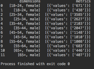
We can easily see that the dimensions are inside a list, which we can access very easily. The metrics are in: list > dictionary > list 🙂 But we can access them very easily as well.
After we make a new column for the age, we replace the dimensions column with the gender.
In the metrics columns, we leave the number.
To finish it off, we rename the columns just for beauty.
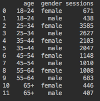
To print the response for each step, I added a new line in our “main” function:
def main():
  analytics = initialize_analyticsreporting()
  response = get_report(analytics)
  print(print_response(response)) #print our response
A FEW MENTIONS ABOUT PLOTLY
Now let’s build an elementary to get us started. For this, we use Plotly. It is a free tool and, you only need an account if you want to use the online.
So Plotly can work in two modes offline and online.
| Characteristic | Offline Mode | Online Mode |
| Import Function | import plotly.plotly as py | import plotly.offline as py |
| Price | Free with no limitations | Free in a limit of 100 API call per 24 hours |
| Installation | pip3 install plotly | -pip3 install plotly -you also need to make an account on Plotly and get API credentials |
| Sharing the graphs | No, you can send only images | You can share the graphs in more ways: -with just a link; -embed via HTML or iframe -you can also invite people to collaborate on a graphic |
PYRAMID CHART
For the data that we have now let us use the pyramid chart.
So for this let’s prepare the data real quick. We will need to select the male and female sessions separately. This is very simple. Just put this in the main function. We will use the “print” function just to check the data.
df = print_response(response)
print(df[df['gender'] == 'male']['sessions'])
print(df[df['gender'] == 'female']['sessions'])
Now we can take the code for the graphic and send our variables:
women_bins = df[df['gender'] == 'female']['sessions’]
men_bins = df[df['gender'] == 'male']['sessions’]
y = df['age'].unique() #we declare our Y axis
layout = go.Layout(yaxis=go.layout.YAxis(title='Age'),
                   xaxis=go.layout.XAxis(
                       range=[-1 * df['sessions'].astype(int).max(), df['sessions'].astype(int).max()], #we used astype(int) to make sure al the variables are integer
                       tickvals=[0], #what value do you want to show on the X axis
                       ticktext=[0], #what text will be show on the X axis according to the value
                       title='Number'),
                   barmode='overlay',
                   bargap=0.1)
data = [go.Bar(y=y,
               x=men_bins,
               orientation='h',
               name='Men',
               hoverinfo='x',
               marker=dict(color=‘LightBlue') #we choose a representative colour for boys
               ),
        go.Bar(y=y,
               x=-1 * women_bins.astype('int'),  #we multiplied by -1, because we want to put this graphic on the negative side of the X axis (left)
               orientation='h',
               name='Women',
               text=women_bins.astype('int'),
               hoverinfo='text',
               marker=dict(color='pink')  #we choose a representative colour for girls
               )]
fig = go.Figure(data=data, layout=layout)
plot_url = py.plot(fig, filename='bar_pyramid')
Execute the file and here you go:
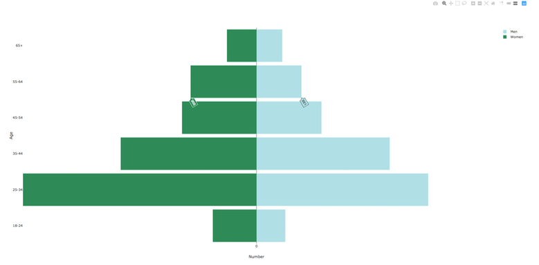
Now, that we have warmed up we can get going other graphics. And also we will make a comparison between offline and online mode.
HEATMAP
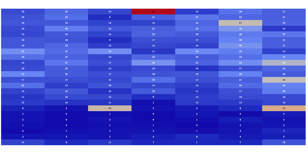
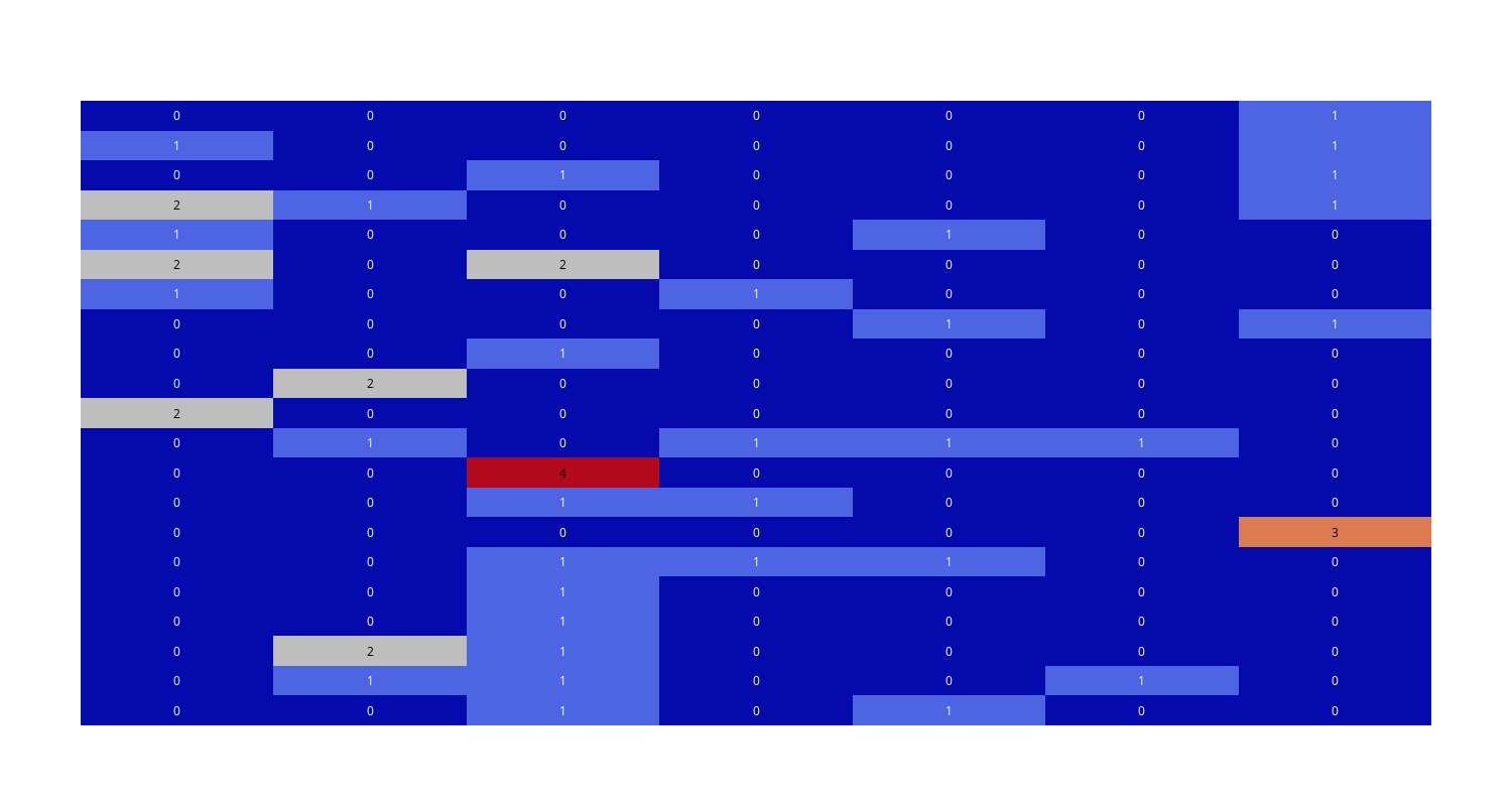
Let’s use heatmap to understand some of our data better. Let’s say that you have an ongoing Facebook campaign and you want to see which day hours attracted the visits so you can plan your post
So let’s get our data. This time we have to apply a dimensions filter:
def get_report(analytics):
  return analytics.reports().batchGet(
      body={
        'reportRequests': [
        {
          'viewId': VIEW_ID,
          'dateRanges': [{'startDate': '2019-02-01', 'endDate': 'yesterday'}],
          'dimensions':[{'name':'ga:hour'},{'name':'ga:dayOfWeekName'}],
          'metrics': [{'expression': 'ga:sessions'}],
          'dimensionFilterClauses': [
          {
          'filters': [
            {
              "dimensionName": "ga:source",
              "operator": "PARTIAL",
              "expressions": ["facebook"]
            }
          ]
        }
      ]
        }]
      }
  ).execute()
Now let us process the data to create heatmap:
def main():
  analytics = initialize_analyticsreporting()
  response = get_report(analytics)
  df = print_response(response)
  days=df['dimensions'].unique() #we will use in our graphic
  hours=df['hour'].unique() #we will use in our graphic
  df = df.pivot(index='hour', columns='dimensions', values=’sessions’) #we reshape the dataframe
  df = df.fillna(0) #we will change of NaN values to zero
  df = df.astype('int').values #we make all the data integer
Now we are going to plot our graphic:
fig = ff.create_annotated_heatmap(df)
plot_url = py.plot(fig, filename='annotated_heatmap')
Remember tha you need to import another part of the Plotly library
import plotly.figure_factory as ff
And we run our script and we get this:
Also you can extend this a bit further and make a drop-down to filter the information by country. We will do this below.
BAR CHART
Now let us imagine the following scenario: you have implemented Enhanced E-commerce, and you have a multiple step checkout, and your Shopping Behavior and Checkout Behavior are working fine. However, what if we want to put them together in one funnel? Moreover, what if you want to have a simple dropdown to select between the traffic channels? Well, let’s learn how to do that! 🙂
First of all, we need them to get from the Google Analytics API the following: Shopping Stage, Traffic Channels and Sessions. Like this:
def get_report(analytics):
  return analytics.reports().batchGet(
      body={
        'reportRequests': [
        {
          'viewId': VIEW_ID,
          'dateRanges': [{'startDate': '2019-02-01', 'endDate': 'yesterday'}],
          'dimensions':[{'name':'ga:channelGrouping'},{'name':'ga:shoppingStage'}],
          'metrics': [{'expression': 'ga:sessions'}]
        }]
      }
  ).execute()
After that we need to process our data a bit:
def print_response(response):
    data = response.get('reports', [])[0].get('data', {}).get('rows', [])
    df = pd.DataFrame(data)
    df.insert(loc=0, column="Channel", value=df['dimensions'].apply(lambda x: x[0]))
    df['dimensions'] = df['dimensions'].apply(lambda x: x[1])
    df['metrics'] = df['metrics'].apply(lambda x: x[0]).apply(lambda x: x.get('values')).apply(lambda x: x[0])
    df.rename(columns={'metrics': 'sessions'}, inplace=True)
    return df
And now let us plot our graphic, we will the simple bar chart from Plotly:
ef main():
  analytics = initialize_analyticsreporting()
  response = get_report(analytics)
  df = print_response(response)
  df = df.pivot(index='Channel', columns='dimensions', values='sessions').fillna(0).astype(int)
          #we reshape the dataframe
         #we replace all the NaN with “0” (for some traffic channels you may not have some shopping stages)
          #we make all the data integer
  text = ['ALL_VISITS', 'Sessions with Product Views', 'Sessions with Add to Cart', 'Sessions with Check-Out 1','Sessions with Check-Out 2', 'Sessions with Transactions’]
          #it will appear on the xAxis
  toplot = ['ALL_VISITS', 'PRODUCT_VIEW', 'ADD_TO_CART', 'CHECKOUT_1', 'CHECKOUT_2', 'TRANSACTION’] #what shopping stages are we interested in
  data=[] #data to plot
  for channel in df.index.values:
      data.append(go.Bar(x=text,y=df.loc[[channel], toplot].values.tolist()[0], name=channel))
          #we the data by row and by the columns we are interested -> we grab the values -> transform them into a list and grab the first element
  layout = go.Layout(barmode='stack’) #we use stacked bar chart
  fig = dict(data=data, layout=layout)
  py.plot(fig, filename='funnel.html')
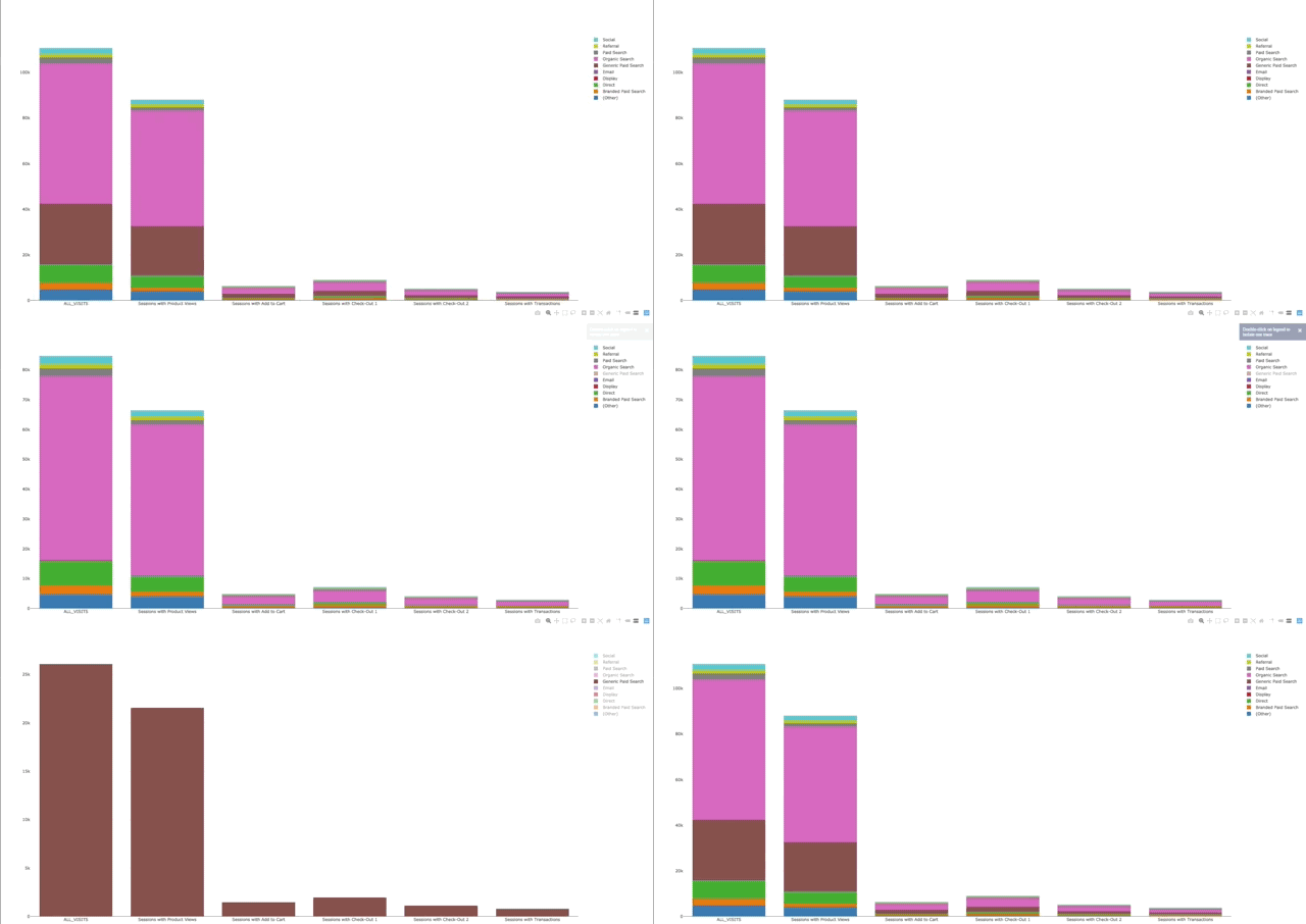
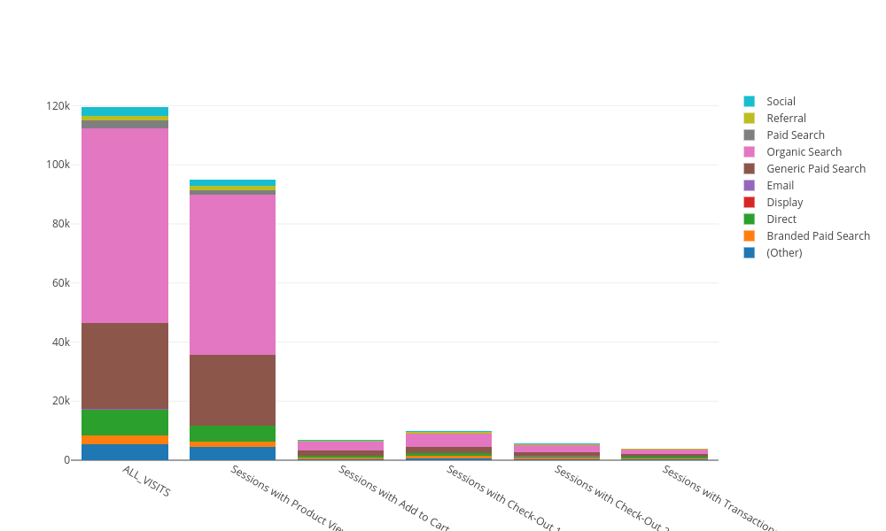
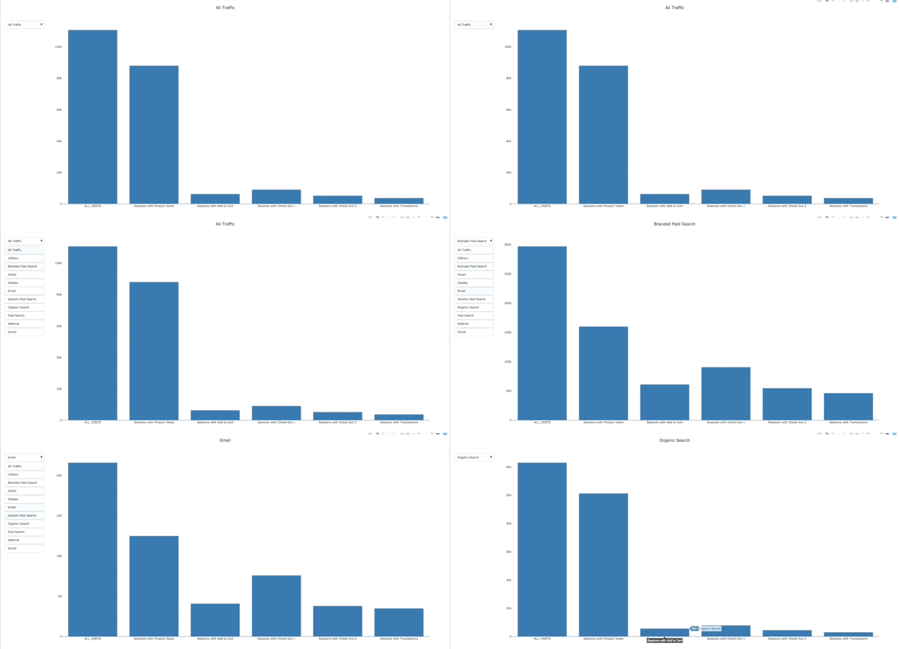
Aaaaand we get this
As you see in this example, we can remove or show just one traffic channel from the right. You can also see that the scale is updated automatically.
However, come on guys we can do better than that! Let’s add our drop down to filter the channels.
INTERACTING WITH OUR DATA
First we need to calculate the total of sessions for each or our stage. With Pandas this is again very easy to to:
data.append(go.Bar(x=text,
                   y=[df['ALL_VISITS'].sum(), df['PRODUCT_VIEW'].sum(), df['ADD_TO_CART'].sum(), df['CHECKOUT_1'].sum(),
                      df['CHECKOUT_2'].sum(), df['TRANSACTION'].sum()], name='All traffic’))
        # All the traffic
To add the channel traffic filter, we use the dropdown menu from Plotly.
First, we need to create the buttons list. Each list as you can see from the example is composed of a dictionary. We have to make one for each for our channels including the “All traffic options”. So this is how it works: we generate all the graphics for each of the traffic channels, and we show which one we select.
Here we have the following aspect: we do not know exactly how many traffic channels we have. We also do not want to do this by hand especially if we want to make a cron job. So here is what we do: we can get all the different traffic channels with Panda, which returns an array. We get the length of that and add 1. After that, we generate an array to show our graphs. The full code explained below:
def main():
  analytics = initialize_analyticsreporting()
  response = get_report(analytics)
  df = print_response(response)
  df = df.pivot(index='Channel', columns='dimensions', values='sessions').fillna(0).astype(int)
          #we reshape the dataframe
          #we replace all the NaN with “0” (for some traffic channels you may not have some shopping stages)
          #we make all the data intege
  text = ['ALL_VISITS', 'Sessions with Product Views', 'Sessions with Add to Cart', 'Sessions with Check-Out 1','Sessions with Check-Out 2', 'Sessions with Transactions’] #it will appear on the xAxis
  toplot = ['ALL_VISITS', 'PRODUCT_VIEW', 'ADD_TO_CART', 'CHECKOUT_1', 'CHECKOUT_2', 'TRANSACTION’] #what shopping stages are we interested in
  data=[] #data to plot
  buttons=[] #the dropdown which will manipulate our data
  data.append(go.Bar(x=text,y=[df['ALL_VISITS'].sum(), df['PRODUCT_VIEW'].sum(),df['ADD_TO_CART'].sum(),df['CHECKOUT_1'].sum(),df['CHECKOUT_2'].sum(),df['TRANSACTION'].sum()], name='All traffic’))
        #All the traffic
  visibility =[False] * (len(df.index.values)+1)
  visibility[0]='True'
  buttons.append(dict(label = 'All Traffic',method = 'update',args = [{'visible': visibility},{'title': 'All Traffic','annotations': []}])) #to show all the traffic
  for idc, channel in enumerate(df.index.values): #here we need to get the iteration number
      visibility =[False] * (len(df.index.values)+1)
      data.append(go.Bar(x=text,y=df.loc[[channel], toplot].values.tolist()[0], name=channel,visible=False)) #get our data to plot
      visibility[idc+1]='True'
      buttons.append(dict(label = channel,method = 'update',args = [{'visible': visibility },{'title': channel,'annotations': []}])) #our drop-down menu
  updatemenus = list([dict(active=0, buttons=buttons)])
  layout = dict(title='All Traffic', showlegend=False,updatemenus=updatemenus) #in this example we do not use the stacked bar chart
  fig = dict(data=data, layout=layout)
  py.plot(fig, filename='funnel.html')
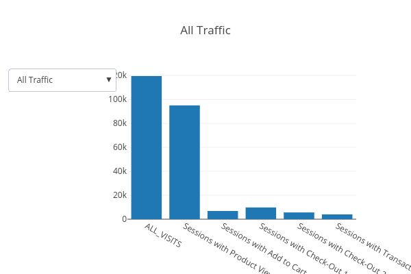
And….. if we execute this code we get:
So with under 25 fines line of code we can combine two Google Analytics reports and make our traffic channel filter. We can also add all the fancy numbers that Google Analytics. If you guys like the post I can reproduce the entire graph 😀
SUB BURST / WIND ROSE CHART
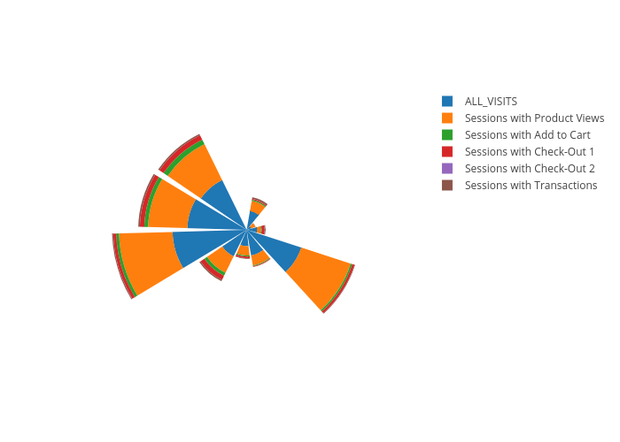
Some time ago my colleague Dorian, did a very nice sub burst / wind rose chart. Now let us make one for the Enhanced Ecommerce data. We get the data from from our Google API the same way we did above and we just process it exactly the same.
def main():
  analytics = initialize_analyticsreporting()
  response = get_report(analytics)
  df = print_response(response)
  df = df.pivot(index='Channel', columns='dimensions', values='sessions').fillna(0).astype(int)
        #reshape our data for better use
  text = ['ALL_VISITS', 'Sessions with Product Views', 'Sessions with Add to Cart', 'Sessions with Check-Out 1','Sessions with Check-Out 2', 'Sessions with Transactions’]
        #what we want to show at the legend
  toplot = ['ALL_VISITS', 'PRODUCT_VIEW', 'ADD_TO_CART', 'CHECKOUT_1', 'CHECKOUT_2', 'TRANSACTION’]
        #what we want to plot from the shopping process
  data=[] #initialise our data
  for idc, toplot in enumerate(toplot):
     data.append(go.Barpolar(r=df[toplot], text=df.index.values,  hoverinfo='text+r', name=text[idc]))
        #first: variable we grab our data to plot
        #second: we want to show the traffic channel
        #the hover information
        #name in the legend
  layout = go.Layout(polar = dict(radialaxis = dict(visible = False,),angularaxis = dict(visible = False)))
        #we do not want to show the internal axis
        #we do not want to show the external axis
  fig = go.Figure(data=data, layout=layout)
  py.plot(fig, filename='sunt_burst.html')
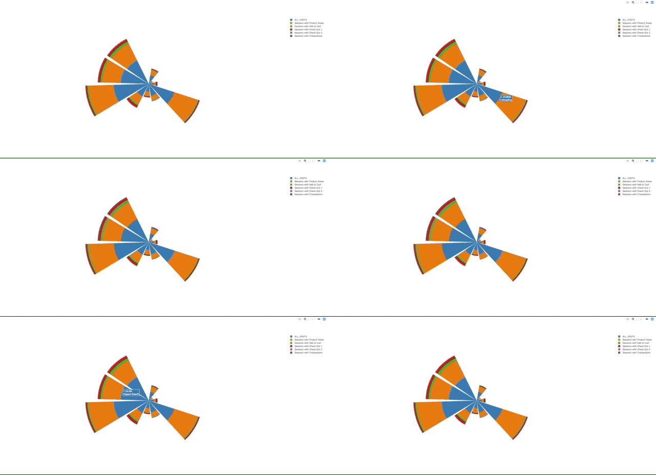
Execute your code and you get:
SHAPE AND DOT PLOTS
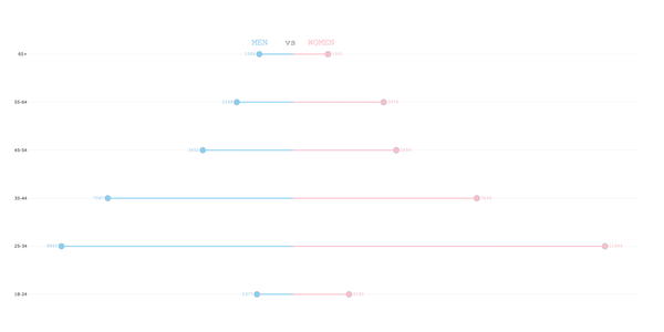
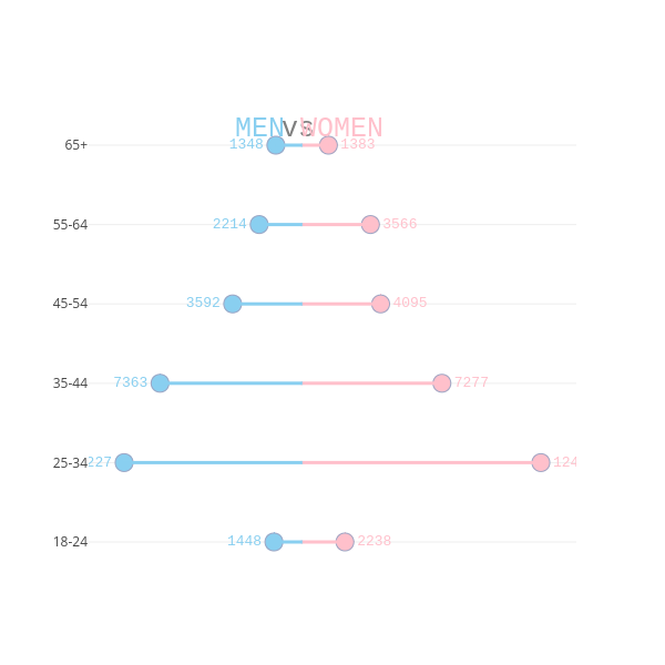
Now let’s try to combine two different type of graphics which you can do with Plotly in a more nonconventional way. We will use shapes and dot plots. We will try do redo our first graph from the article: the pyramid graph
We will use the same data but with different values. You may think that the code is a bit suffocated, but you will see that is very easy to understand.
ef main():
  analytics = initialize_analyticsreporting()
  response = get_report(analytics)
  df = print_response(response)
  marker_women=dict(color='#FFC0CB',line=dict(color='rgba(156, 165, 196, 1.0)',width=1,),symbol='circle',size=16)
        #we will use to style the the women’s side of the graph
  marker_men=dict(color='#89cff0',line=dict(color='rgba(156, 165, 196, 1.0)',width=1,),symbol='circle',size=16)
        #we will use to style the the men’s side of the graph
  data=[]
  annotations=[]
  shapes=[]
        #initialize our data
  data.append(go.Scatter(x=df[df['Gender'] == 'female']['Sessions'].astype(int),y=df['Age'].unique(),mode='markers+text', marker=marker_women, text=df[df['Gender'] == 'female']['Sessions'].astype(int), textposition='middle right', textfont=dict(family='Courier New, monospace', size=13, color='#FFC0CB'),hoverinfo='none’))
        #we will plot our dots for the women’s values; we will show the values, position and style them
  data.append(go.Scatter(x=-1 * df[df['Gender'] == 'male']['Sessions'].astype(int),y=df['Age'].unique(),mode='markers+text', marker=marker_men, text=df[df['Gender'] == 'male']['Sessions'].astype(int), textposition='middle left', textfont=dict(family='Courier New, monospace', size=13, color='#89cff0'),hoverinfo='none’))
        #we will plot our dots for the men’s values; we will show the values, position and style them
  for age in df['Age'].unique():
      shapes.append(dict(x0=0, y0=age, x1=df[df['Age']==age][df['Gender'] =='female']['Sessions'].values.tolist()[0], y1=age,  xref='x', yref='y',line=dict(color= '#FFC0CB',width= 3)))
      shapes.append(dict(x0=0, y0=age, x1=-1* df[df['Age']==age][df['Gender'] =='male']['Sessions'].values.tolist()[0], y1=age,  xref='x', yref='y',line=dict(color= '#89cff0',width= 3)))
        #we will plot our dots for the men’s values;
  annotations.append(dict(font=dict( family='Courier New, monospace', size=25, color='#89cff0' ),xref='paper', yref='paper', x=0.38, y=1, showarrow=False, text="MEN"))
  annotations.append(dict(font=dict( family='Courier New, monospace', size=25, color='#7f7f7f' ),xref='paper', yref='paper', x=0.43, y=1, showarrow=False, text="vs"))
  annotations.append(dict(font=dict( family='Courier New, monospace', size=25, color='#FFC0CB' ),xref='paper', yref='paper', x=0.48, y=1, showarrow=False, text="WOMEN”))
        #we will show which graph is which
  layout = dict(shapes=shapes,annotations=annotations, xaxis=dict(autorange=True,showgrid=False,zeroline=False,showline=False,ticks='',showticklabels=False), showlegend=False)
  fig = dict(data=data, layout=layout)
  py.plot(fig, filename='box_plot_shapes.html')
And we run our code, and we get the following:
Conclusion
So we are at an end. A few simple graphs to get you started with Plotly and Google Analytics. I am not saying that they are the best graphs or the most beautiful graphs, but I hope they get you going.
Also if you like me to plot any graph from Google Analytics with Plotly, leave me a message below and I will be happy to do it
