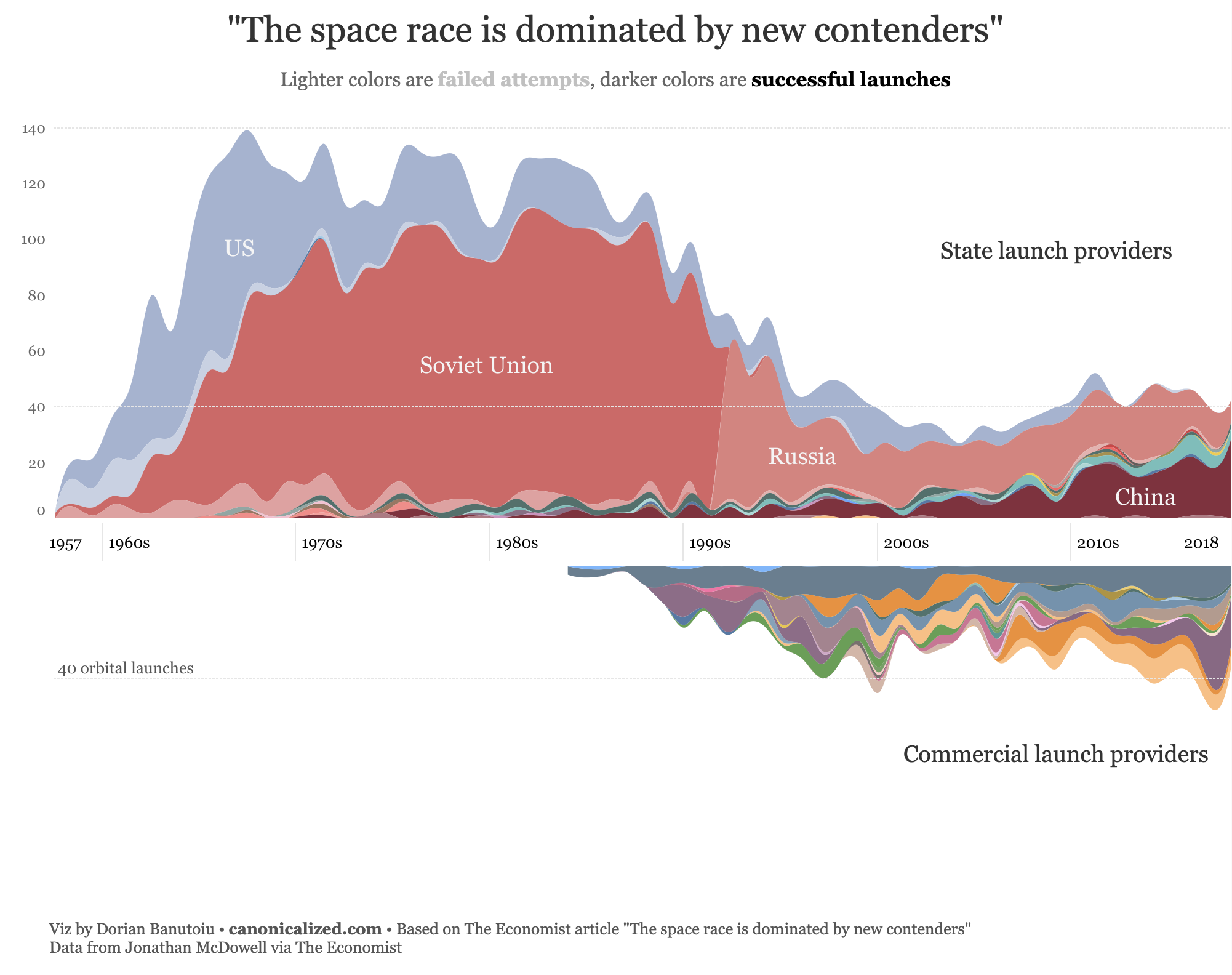
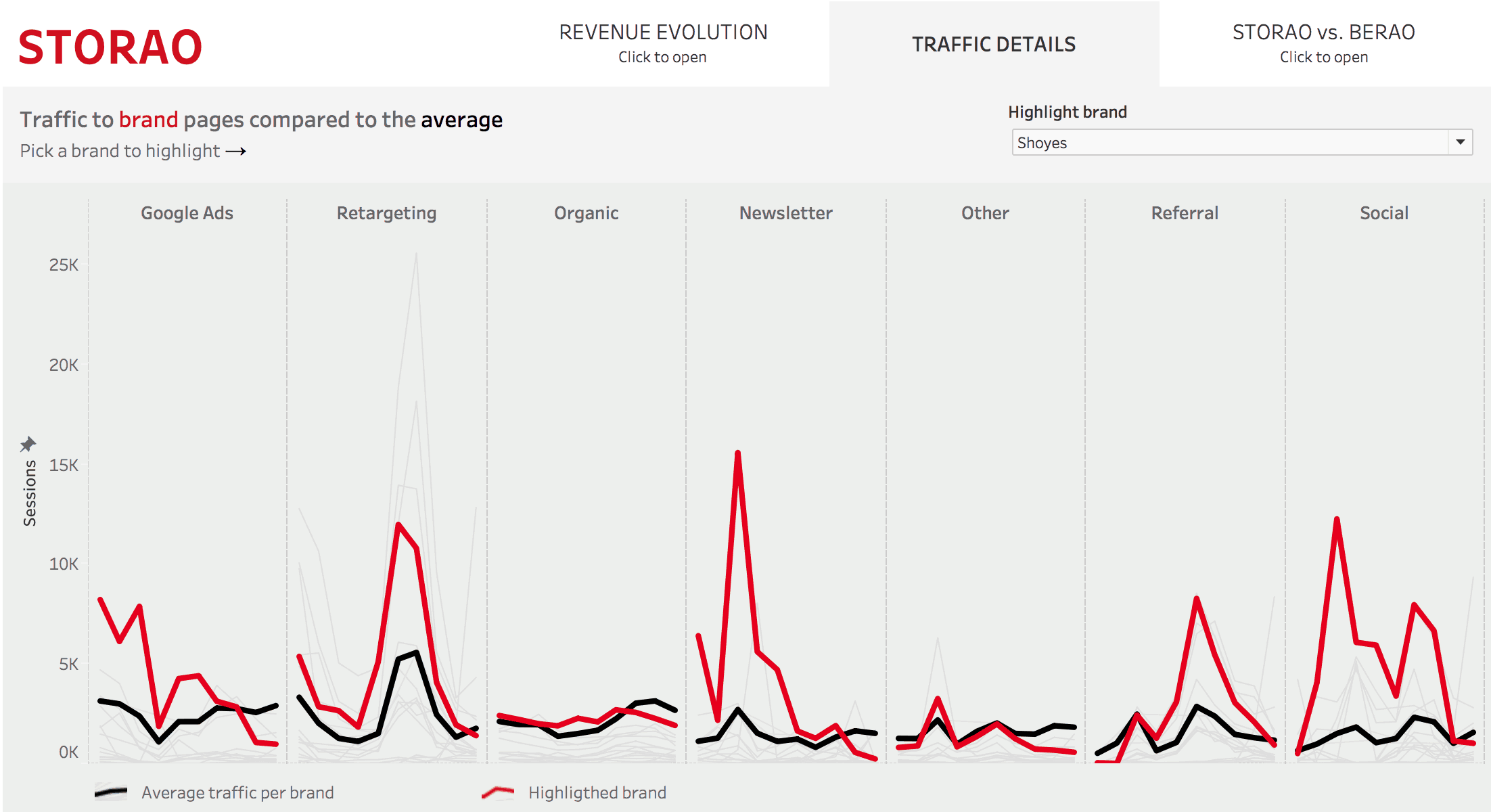
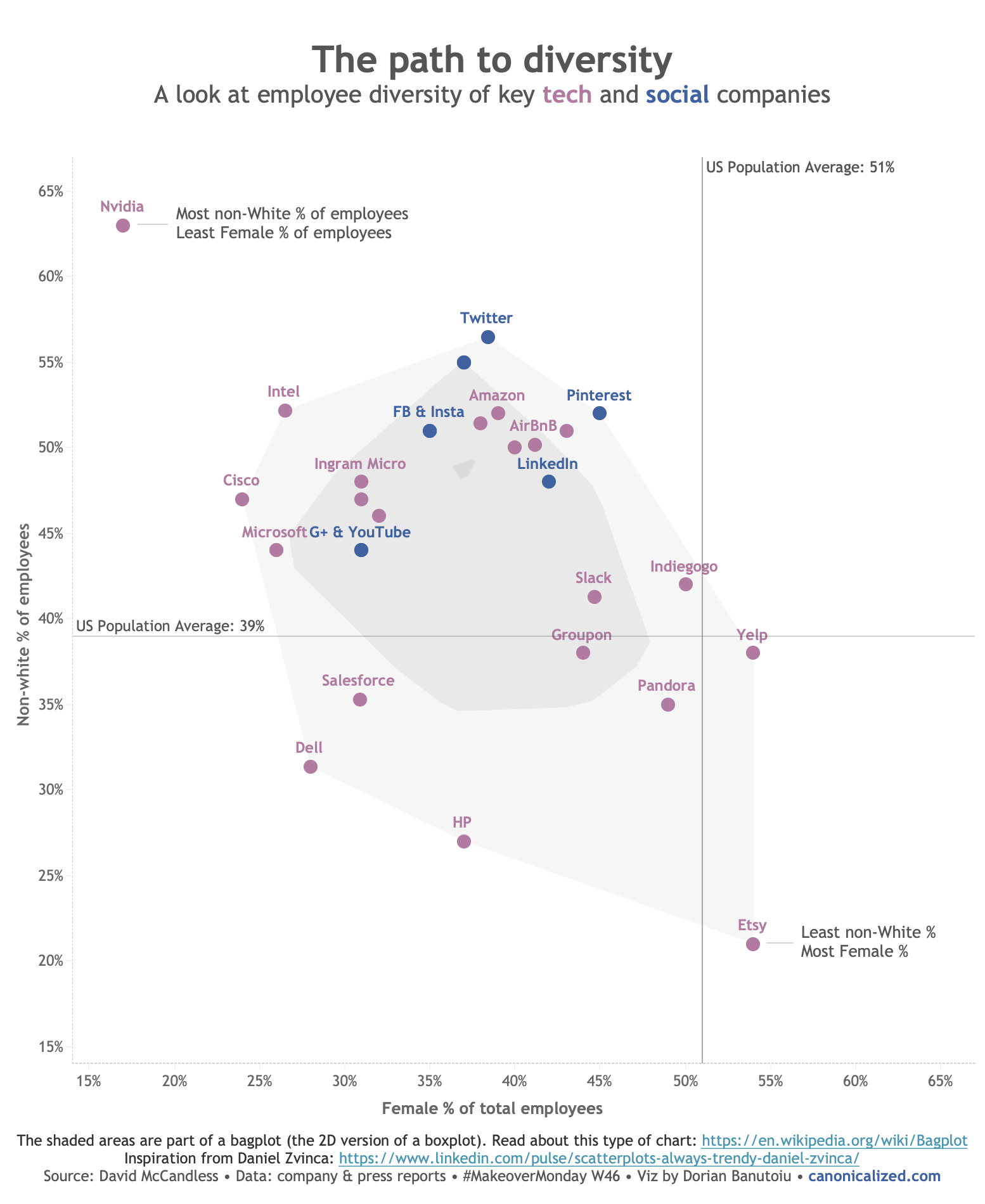
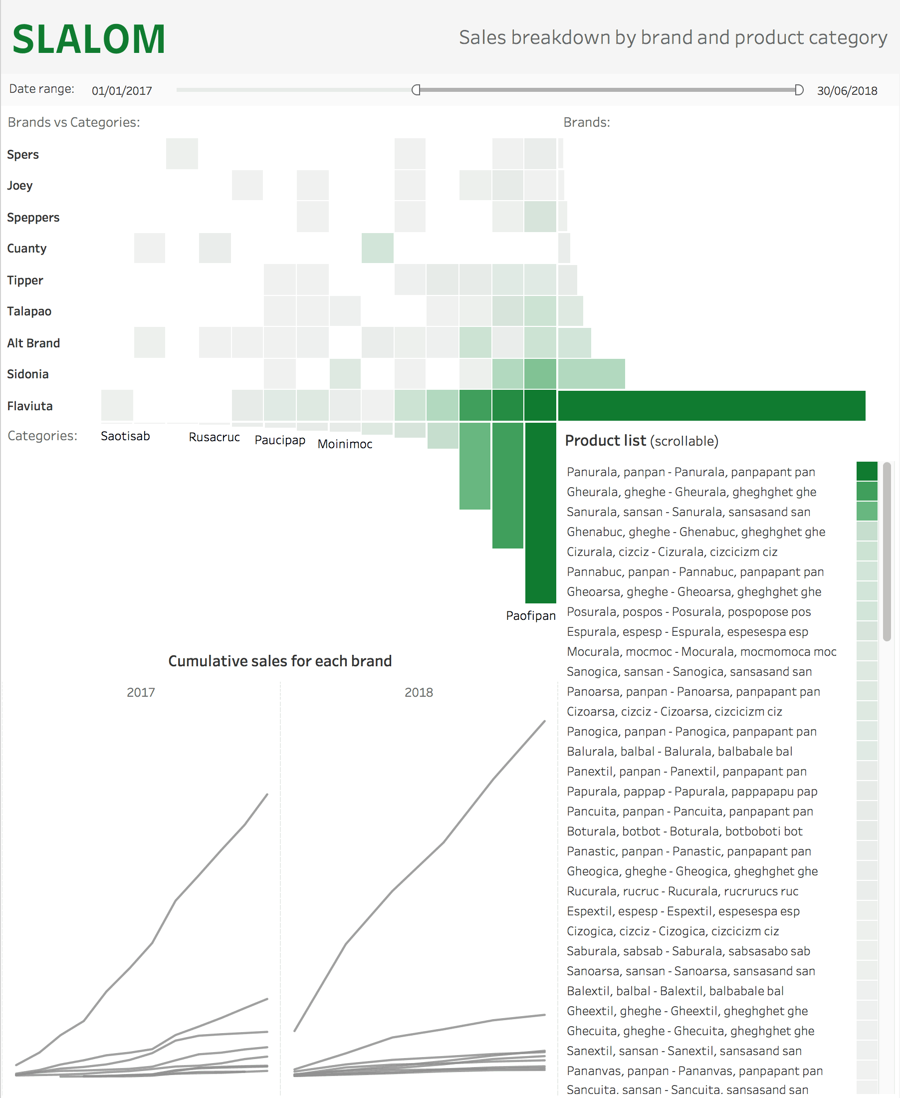
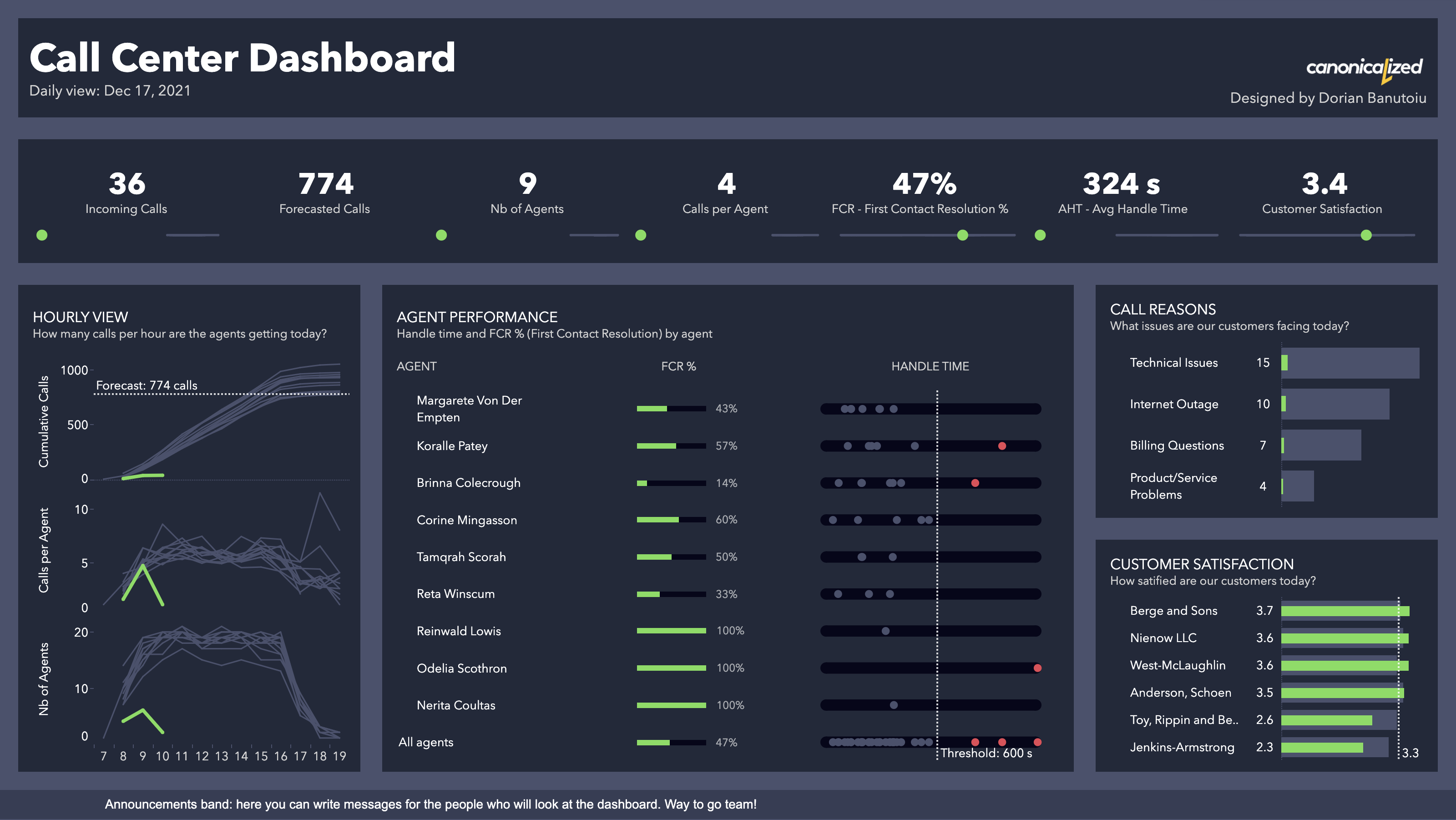
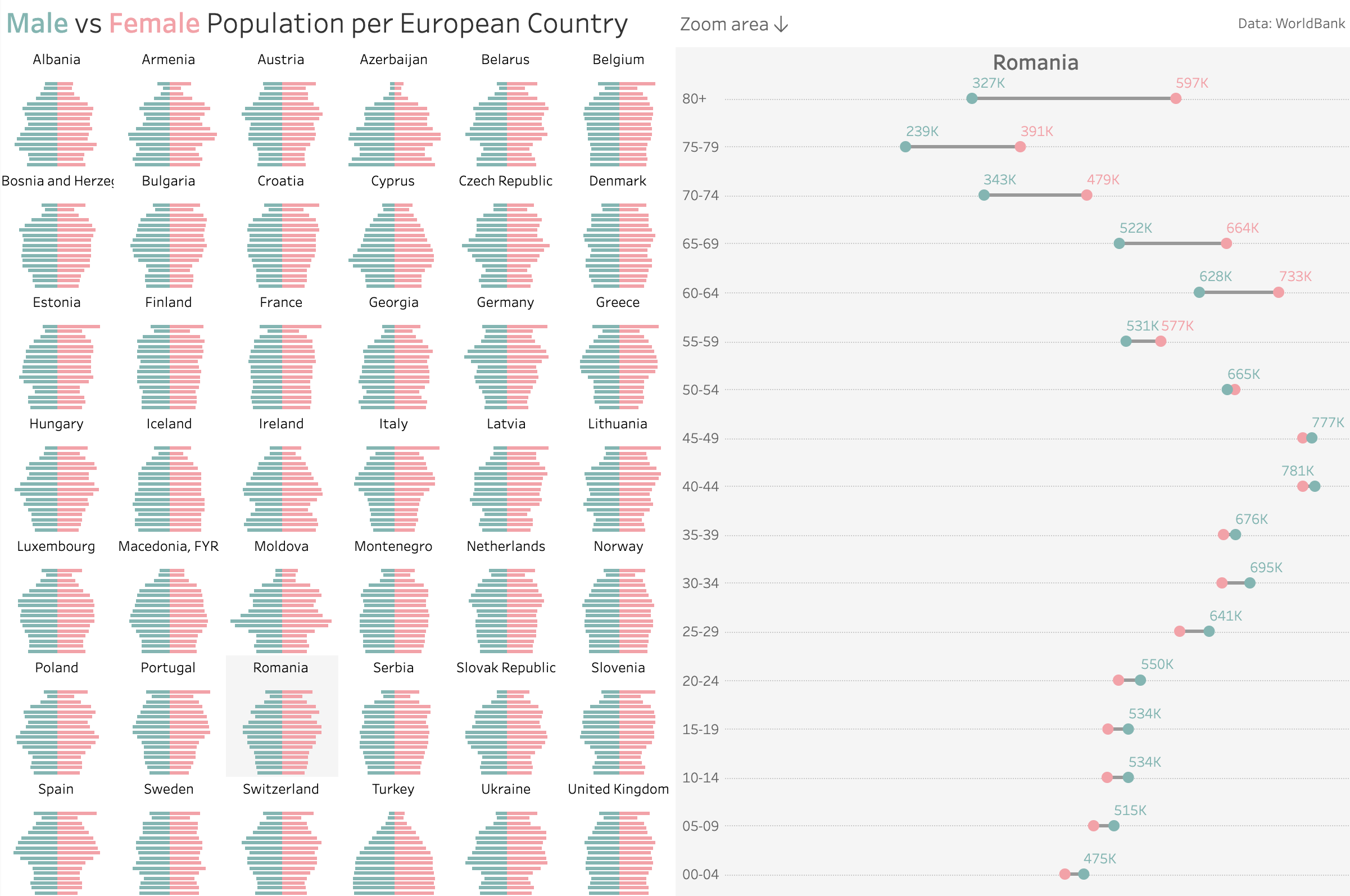
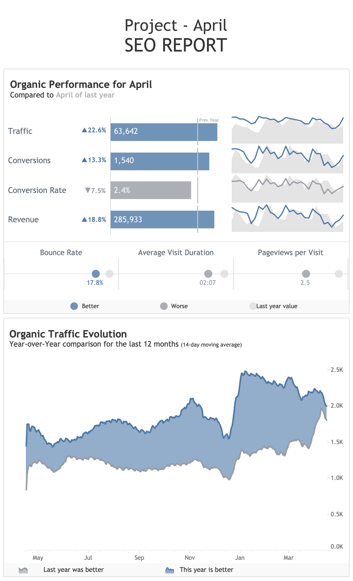
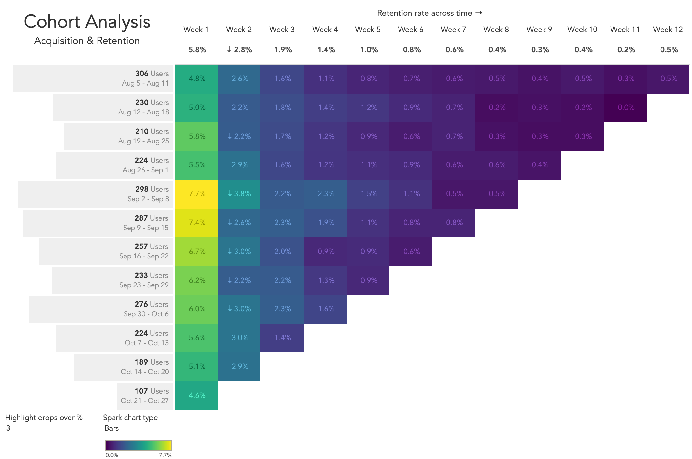
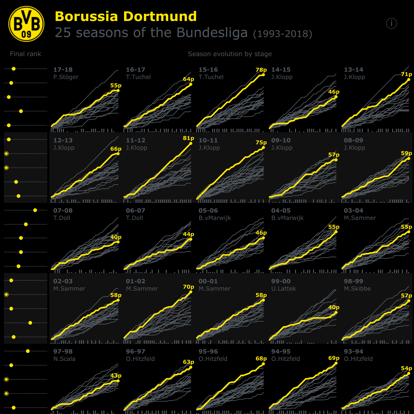
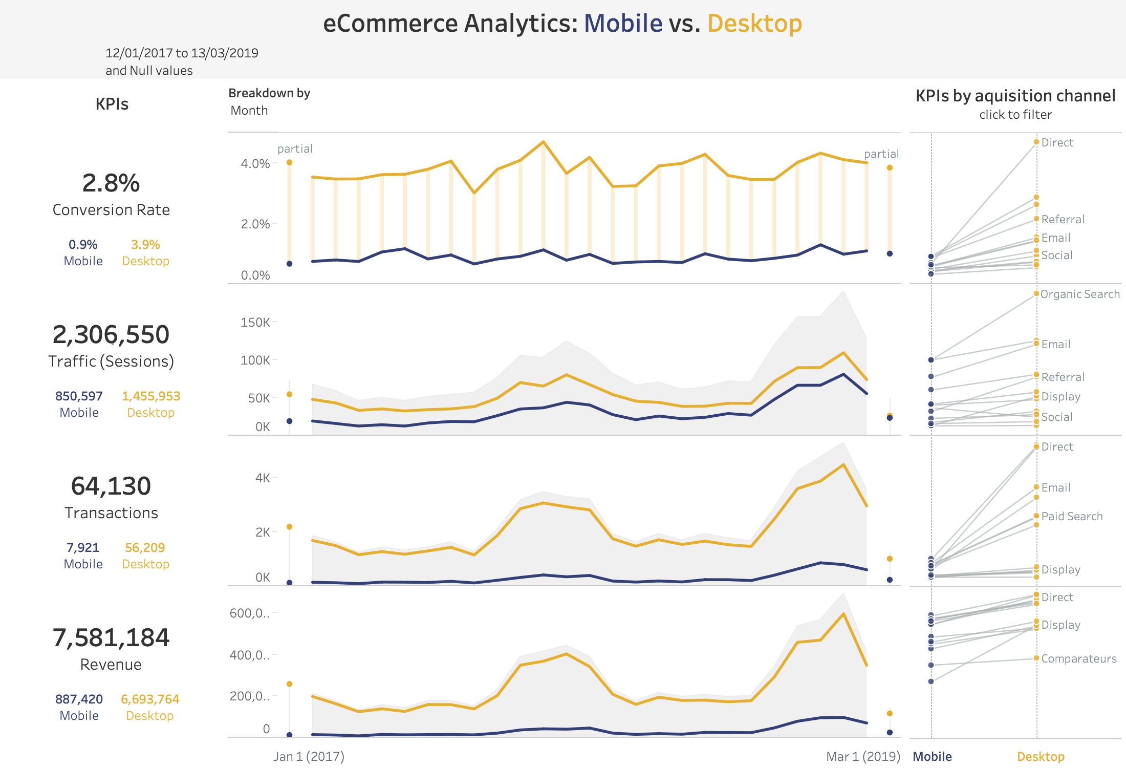
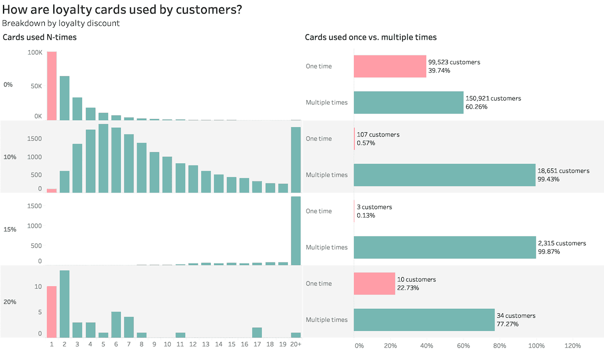
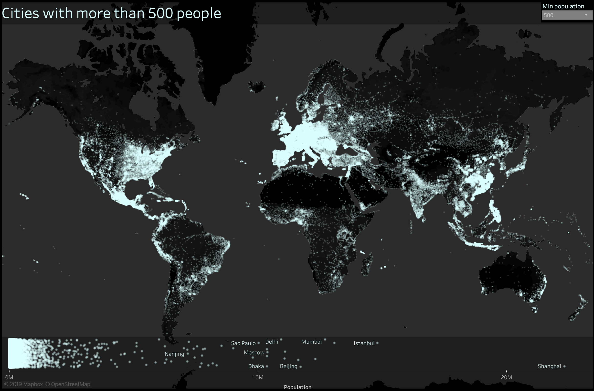
Tableau Dashboard Examples
This collection of dashboards is here to serve as inspiration.
Some of them are best-practice dashboards, some are created to test the limits of Tableau, and the rest for fun.
All of them are created in Tableau.
You can find interactive versions for most of the visualizations on this Tableau Public page.
Hover over the images to find out more about their data visualization purposes!