Love line charts? Love slope charts? Why not put them together?
In this article, I am going to show you why this is not always a good idea and some good use cases of how they could work well.
People think computers will keep them from making mistakes. They’re wrong. With computers you make mistakes faster.
Adam Osborne, the creator of the first commercially available portable computer
It’s a good thing that data visualization is done with pen and paper nowadays. Well, not quite.
It might be fun to draw, but most people use software products to get answers from data.
My weapon of choice these days is almost always Tableau. In a recent article I wrote about the speed of working with this tool, which inevitably increases the chances of screwing up.
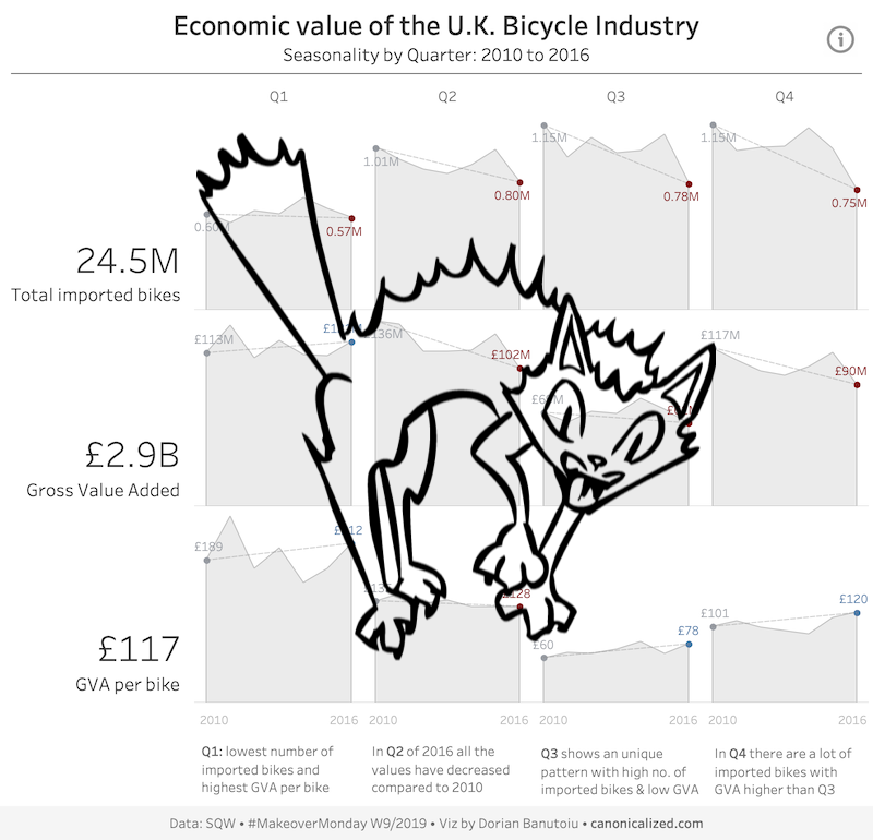
With this in mind, below is a dashboard I built for MakeoverMonday a while back:
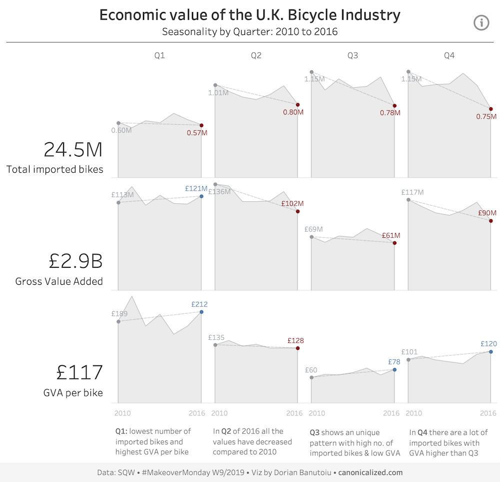
I am looking at seasonal patterns for the U.K. Bicycle Industry using cycle plots.
I felt that the seasonal side of this story was not enough. I wanted to find a way to highlight the difference between the 2010 and 2016 values.
So that’s how I ended up adding dashed lines to connect the beginnings to the ends.
The problems
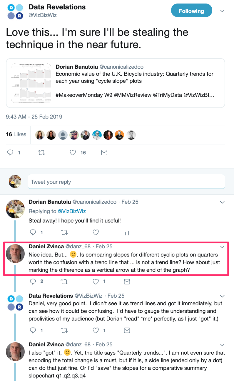
The visualization was somewhat well received on social media, but a problem was pointed out by Daniel Zvinca.
He pointed out that people might confuse my intended slope with a trend line for the area chart. It was not my intention, but this stuff happens.
Not only that but comparing the yearly trend (area chart) with the start-end trend (slope chart) is pointless. My biggest problem was that I could not explain its meaning in a valid sentence.
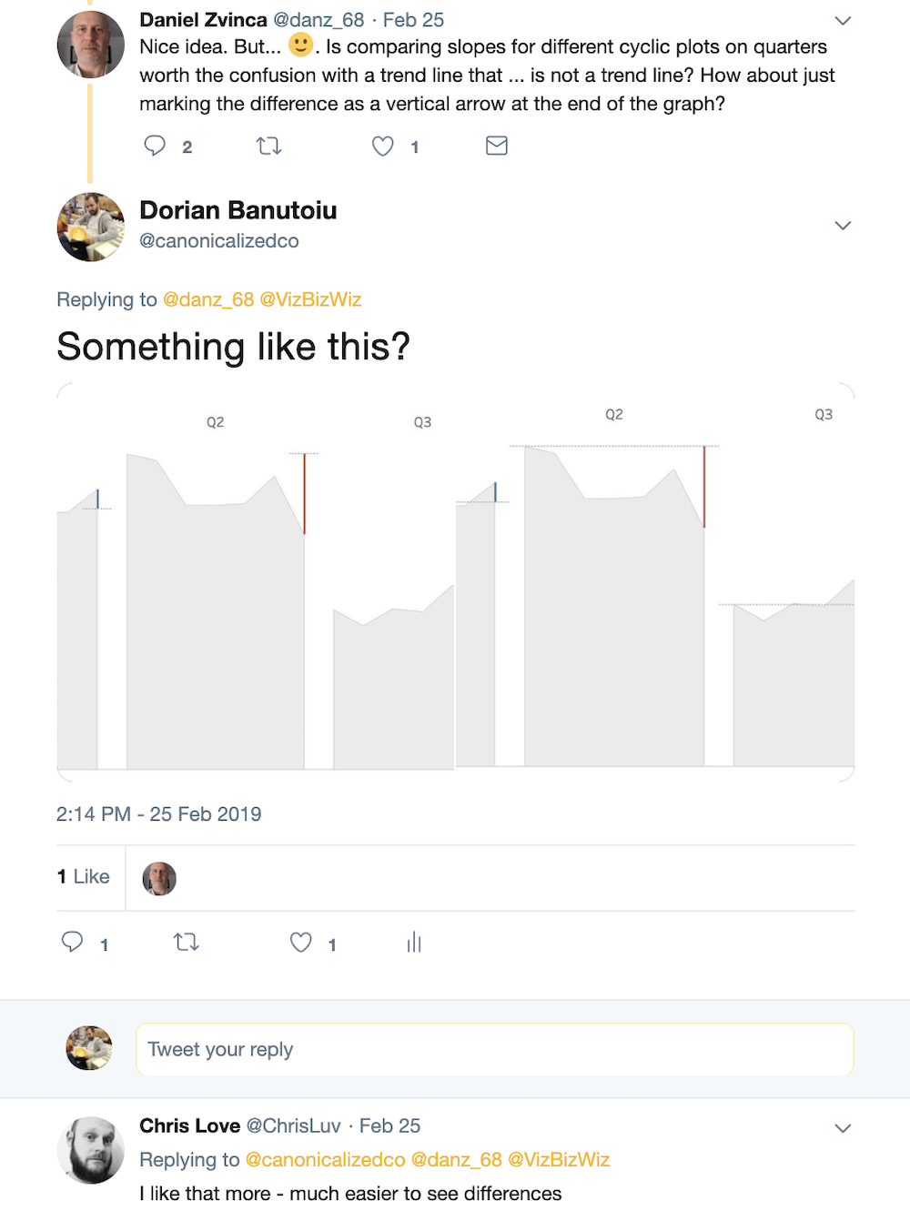
I tried a couple of iterations without the slope, but I wasn’t very pleased with the results:
With this in mind, I’m giving myself a screaming cat!
Don’t worry; I didn’t make you read through all off this to show you bad a chart!
The gold nugget
The same Daniel Zvinca reached to me on Twitter, making me aware that there is a valid use case for the “slope and line” chart.
We can use slopes to compare evolution along the same month of the year, day of the week, etc. in a sort of cyclical way. All while displaying the intermediary values as reference in a line or area chart.
This fixes both problems from my initial visualization:
- avoiding the trend line confusion since the slope is the main focus of the chart
- being able to explain the meaning in a valid sentence
Let’s see some use cases!
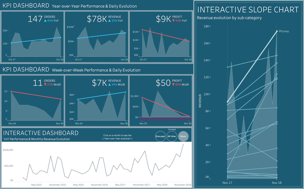
Year over Year KPIs
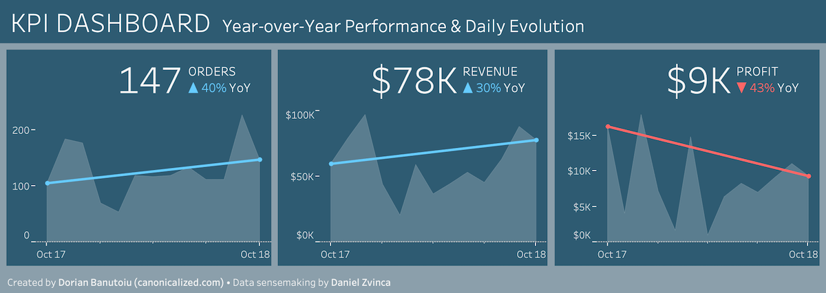
In the above charts, you are looking at the variation of orders, revenue, and profit for October compared to the same month of the previous year.
All while keeping the monthly evolution in the view.
What I like most about this approach is the fact that we have the information in the same graph. Our focus is directed to the YoY comparison, but we also get to see how we got there month by month.
Some people might want to look at a KPI dashboard every day of the week. This technique could also work on a weekday comparison.
Below is how it might look for a specific Friday:
The interactive one
Line charts are perfect for showing trends over time. Let’s have a look at one below, showing revenue evolution:
If we take a step back, we can notice a similar yearly pattern and a high growth at the right end.
Nice! Line charts are awesome!
But what if we want to compare the values for a specific month along the years? For example, try to figure out how the business did in May of 2018 as opposed to the same month of the previous year.
Not so easy, right?
The perfect opportunity to try our slope approach:
It’s quite effortless to notice it now, isn’t it?
We can even take it up a notch and show the evolution across all years for a specific month. See how the interactivity might look in the video below:
Rank and magnitude
Slope charts can be a bit controversial since angles represent the level of magnitude.
It’s easier for the human eye to compare length or position in graphs like bar charts or dot plots.
The instance in which a slope chart shines is when we want to look at changes in rank along with magnitude.
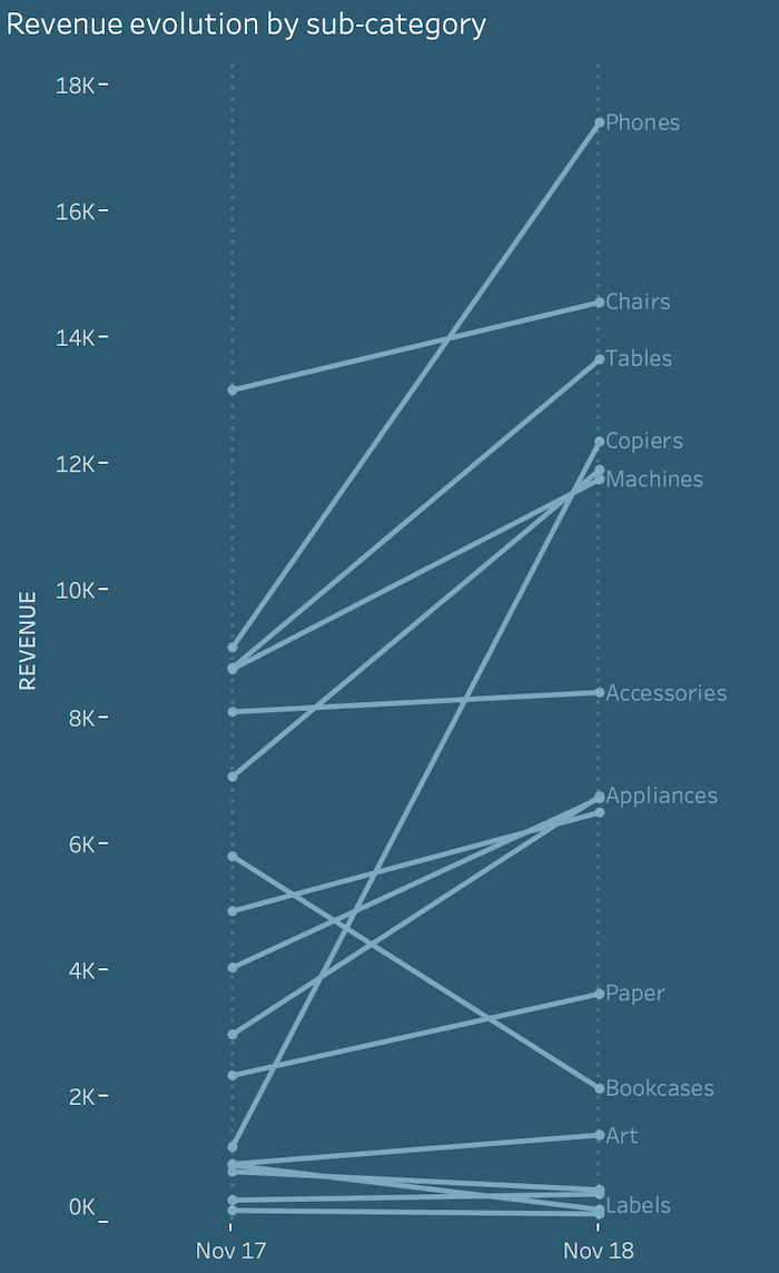
Let’s have a look at the one below:
Notice how Phones surpassed Chairs to become the number one sub-category in revenue. Or how Copiers jumped to number four Year-over-Year.
But what if we want to see the values for the intermediary months? Here’s how we can do it on demand to avoid cluttering up our main story:
In this way, we can expose “hidden” parts of the story as we explore the visualization. The slope shows the evolution for November, while the area reveals the overall trend.
We are doing this in a separate (detailed) view to avoid cluttering the main part of our visualization.
Tableau
The interactivity is fuelled by parameter actions and set actions.
We want to focus more on the what and why, and less on the how. That is why I am not going to expand too much on the Tableau technical aspects.
If you like what we did and want to rework the visuals, here’s a link to the workbook on Tableau Public. It’s available for anyone to download!
Over to you
Do these ideas fix any problems for you? Can you find more use cases for this technique?
I would love to spark some more conversations on the topic!
Whatever you do, make sure you share. I shared a lot of stuff that wasn’t good along the way.
Having an amplifier like MakeoverMonday certainly brought many eyes on my work. However, I also got the critique that we all desperately need.
Since we are on the topic, I want to thank Daniel Zvinca for getting on my case, discussing the issues with me and for coming up with the valid use case. Him being on vacation, no less!
I want to end with yet another quote from Adam Osborne:
The most valuable thing you can make is a mistake – you can’t learn anything from being perfect.
Highly passionate about data, analysis, visualization, and everything that helps people make informed decisions.
I love what I do! I am working to improve speed in every aspect of my life and that of our clients.
I find comfort in helping people, so if you have a question, give me a shout!
