Tableau is making progress towards better interactivity.
After the introduction of Set Actions in 2018, they are taking it up a notch with Parameter Actions and with the ability to show/hide dashboard containers (toggle).
In this article, we are showing how these work and we share some ideas on how you can make use of them.
Parameter Actions
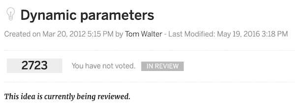
“Dynamic parameters” has been a long-time requested feature by the community.
Tableau has listened to some of our prayers, and we will be able to have dashboards with better usability.
Parameter Actions work when we click or hover over a specific element. We can put the value of that element in a parameter of our choice.
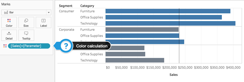
[Example] See how we can change the value of the parameter below by clicking on the bars:
The parameter can be used for many different types of calculations. I the example I am using it to color the bars conditionally.
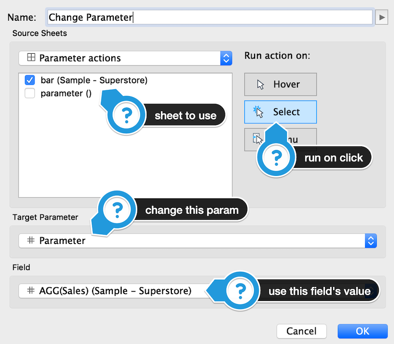
Setting up a parameter action is quite straightforward. First, we need to go to Dashboard/Worksheet > Actions > Add Action > Change Parameter.
A configuration window will pop up. I will try to explain what everything means in the image below:
Parameter actions to filter time-series
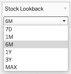
You’ve probably seen this type of stock charts all over the place. With parameter actions we can create buttons to filter to a preset period:
Way better looking than the boring dropdown selector! Right?
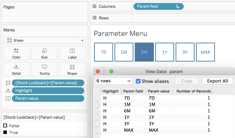
To create the buttons, I’ve used a separate sheet with shapes as buttons. I manually created a data source with the parameter values. If you’re interested to see how I set up the menu, see the screenshot below:
Once we have our sheet, we can add a parameter action just as in the first example.
A while back I wrote an article about zooming-in and sliding on a time-series in Tableau. With parameter actions, we can make it prettier by using buttons instead of a dropdown.
Filtering by Measure Names
Another gem in this release is the ability to add the selected Measure Name in a parameter. Below is a video walkthrough I created with an interesting use case.
Here is the link to the dashboard from the video. I believe this feature has the potential of making our lives so much easier!
Filter to a range using interval selectors
There are cases where filtering with parameters comes in handy. Below is an interval selector I designed to filter ranges:
In this article, there is a tutorial with 3 options of how to create such a thing in Tableau.
Hierarchical Histograms with Parameter Actions
In 2014 Stephen Few, this Jules Verne of data visualization, was imagining a feature that would allow users to equip histograms with multiple hierarchical levels of intervals simultaneously.
Not only that but to have an option of turning it on and off at the click of a button.
In 2019, we can make it happen with Tableau:
This solves the following problem as Few writes in his paper: “Histograms provide a nice overview of a distribution, but interesting details in the shape can be lost when viewing information that has been aggregated into large intervals.”
Technical pointers
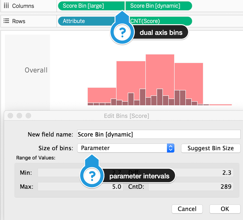
Histograms in Tableau are created by binning a measure’s values into intervals. The creator can manually set the size of the bins, or they can use a parameter’s value.
Here’s how I set up the hierarchical histograms using a dual axis:
With this setup, we can dynamically change the size of the bins via a Parameter Action.
Moving on to a feature that enables even more interactivity.
Show/hide dashboard containers
A lot of you will probably find this useful since you will be able to hide filters and legends so they won’t take up space on a dashboard.
Here’s how it can be used for this purpose:
To make it work, we need a floating container in our dashboard. Here’s how the process of setting this up looks like (15-second video):
Easy peasy!
An example that uses both features
Let’s say you want to allow the end user to choose the background color of a visualization. But, at the same time, you want to keep the design clean and elegant.
Here’s how Parameter Actions can work together with Container Toggle to make this happen (10-second video):
Pretty sweet, right?
Let ‘s go back to an idea from Stephen Few’s paper on improving how we look at distributions!
Toggle Between Proportional and Frequency Displays
Box-plots are great for spotting outliers, comparing medians, seeing where 50% of the data is, etc. But sometimes we might want to observe the shape of the distribution, even temporarily.
With toggle containers we can show the frequency polygon or the histogram version on top of our chart:
In this way, we can see the details on demand, without having to move away from our dashboard.
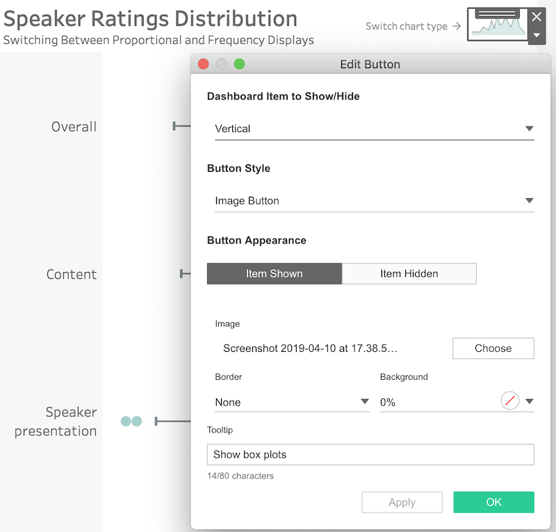
The setup is fairly simple, by applying a toggle button with a custom image. When we click on it we either show or hide the secondary chart:
There is probably more than one way to achieve this in Tableau, but this seems the easiest one now.
Some links from the community
The Tableau community is always hungry for new features. Especially for ones that enable interactivity!
Here are a few links to give you an idea of what else we can achieve:
- Customizable popup charts (Marc Reid)
- More dashboard interactions from Marc Reid
- Scatterplot investigation (Robbin Vernooij)
- Show Overlay with instructions (Marc Reid)
- Synchronized Scrolling (Klaus Schulte)
- Multi-select parameter actions (Marc Reid)
Over to you
These are just a few ideas to get you started and to give you an overview of what we can achieve.
I am looking forward to seeing what else you, the community, come up with!
Highly passionate about data, analysis, visualization, and everything that helps people make informed decisions.
I love what I do! I am working to improve speed in every aspect of my life and that of our clients.
I find comfort in helping people, so if you have a question, give me a shout!
