… all while keeping the overall trend in the view.
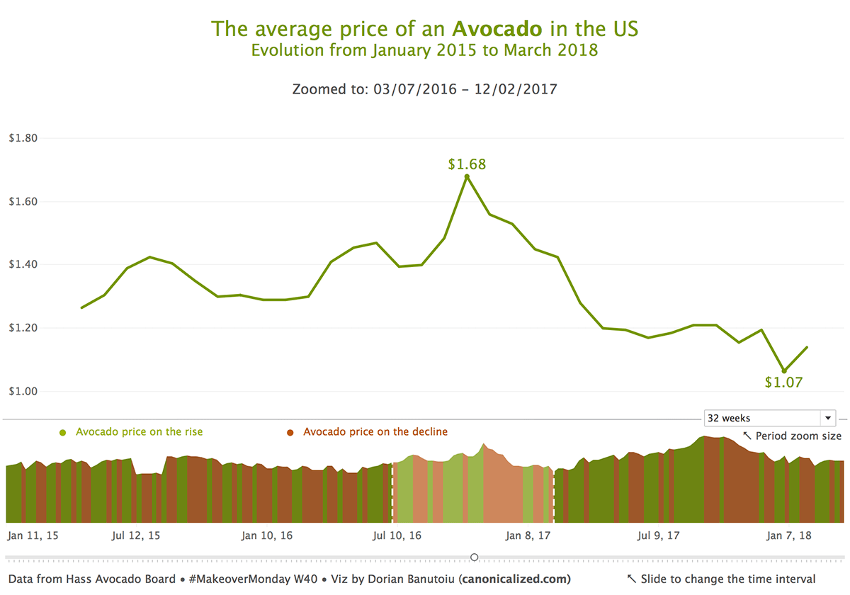
To put it simply, this is what we want to achieve:
The chart shows the average price of an avocado in the US by week (data source).
The line at the top shows the same data as below, only “zoomed” to a predefined period.
I think it’s a pretty useful way of looking at longer-than-usual time series.
I am going to show a few different ways to do it; starting with the easiest method, and going up to the most complex one.
Let’s dig in!
Two-line charts
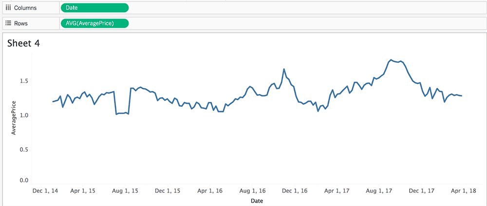
We are going to start with a simple time series showing the average price evolution:
To obtain the highlight effect, we will be using two reference bands.
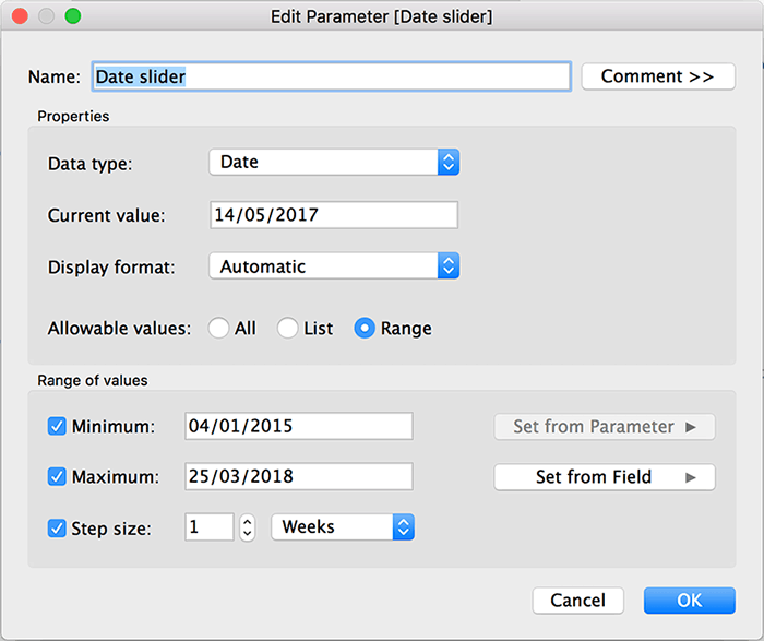
Before adding them to the view, we should create a parameter for the slider functionality. We will be using it to move the highlight across the line chart.
This is how I set it up:
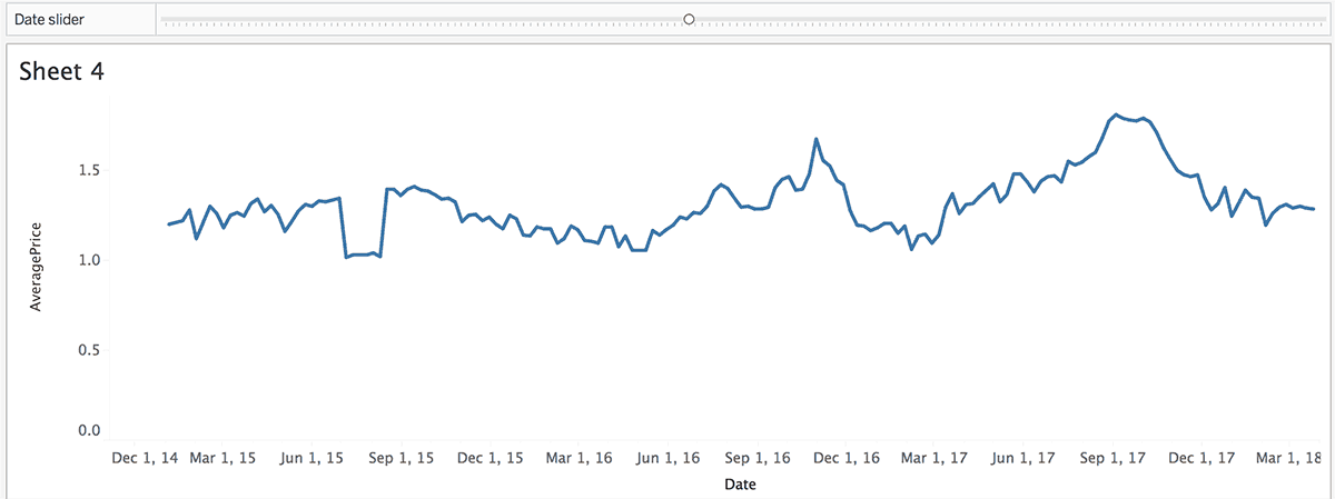
Right click on it, Show Parameter Control, remove the extra elements and align it with the line chart would give us something like this:
The slider looks nice, but at this point, it doesn’t do anything. To give it functionality, we need two create two date calculations.
I want to place the slide button in the middle of the highlight. For this to work the calculated fields would look something like this:
[Lower zoom date]: DATE( DATEADD(‘day’,-int([Zoom to (in days)]/2),[Date slider]) )
[Upper zoom date]: DATE( DATEADD(‘day’,CEILING([Zoom to (in days)]/2),[Date slider]) )
Now you might be wondering why [Zoom to (in days)] is here for.
I am using it to control the size of the zoom. It’s a calculated field based on a parameter.
You can hardcode the period you want to zoom in, but I chose to leave the option open for my audience.
So, for the lower end of the highlight, I am subtracting half of the zoom interval from the date where the slider is positioned. Similarly, for the upper one, I am adding half of the time interval.
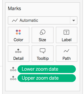
Next, drag the calculations on the Detail shelf (keeping them as exact dates):
Now that we have our calculations, it’s time to add the reference bands.
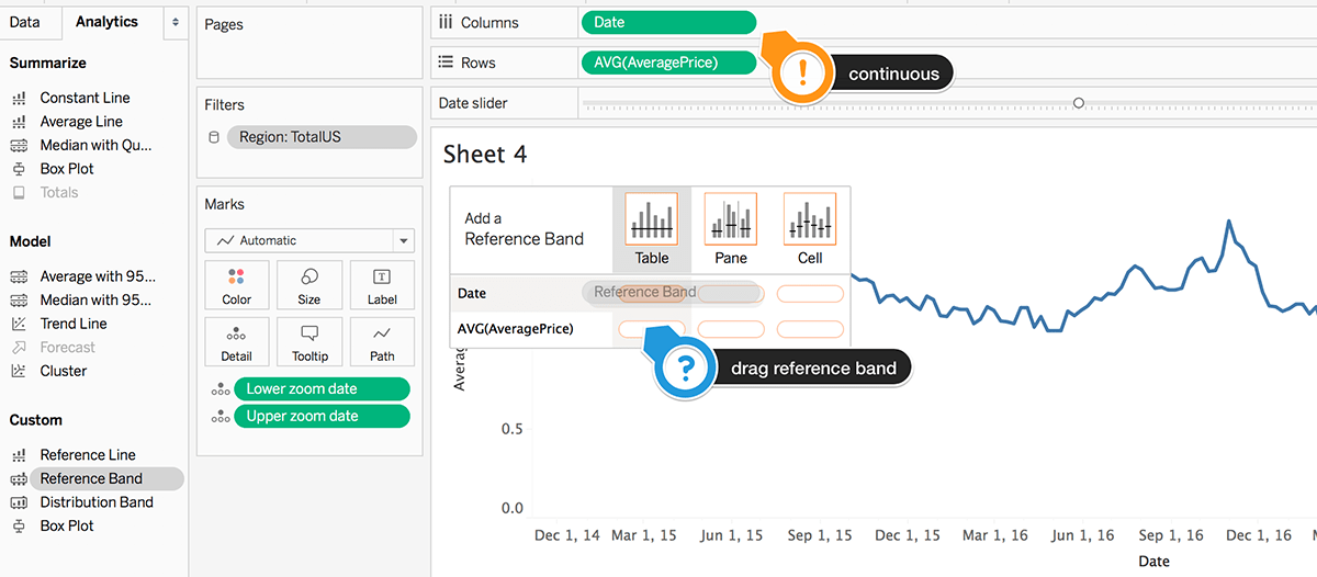
First, we should drag a reference band on the date field. The date field should be continuous (green pill) for this to work.
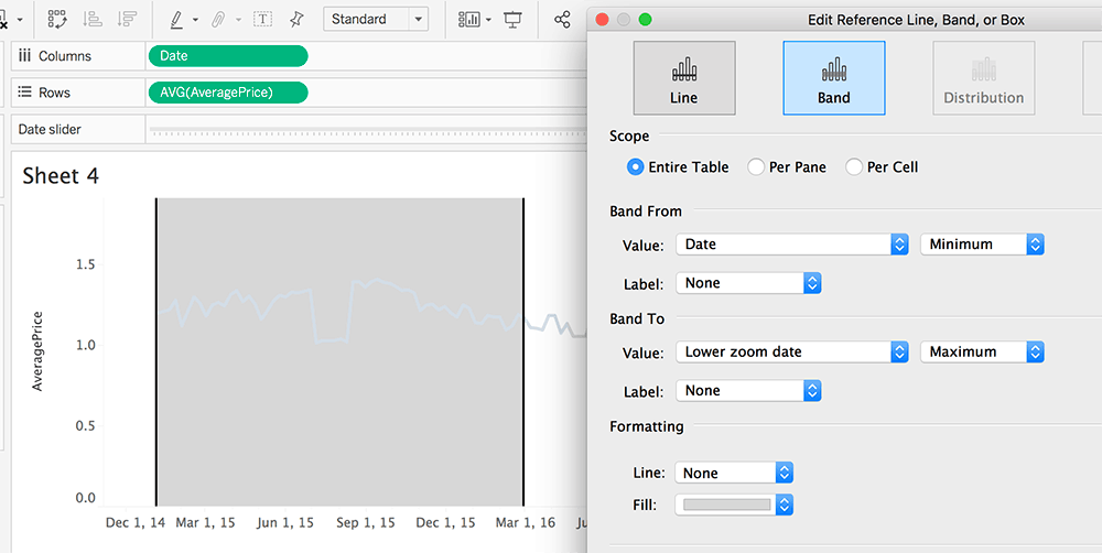
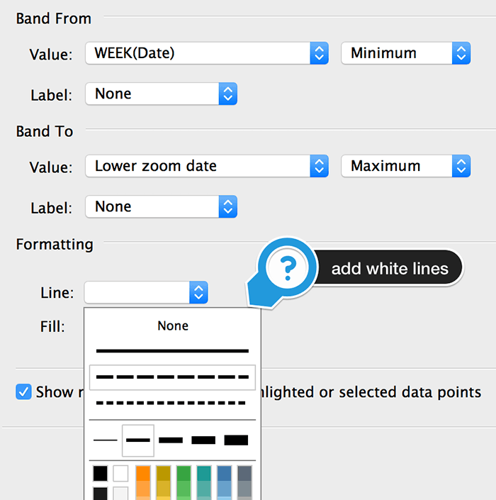
The options for the first reference band are ranging from the minimum date to the maximum of Lower zoom date:
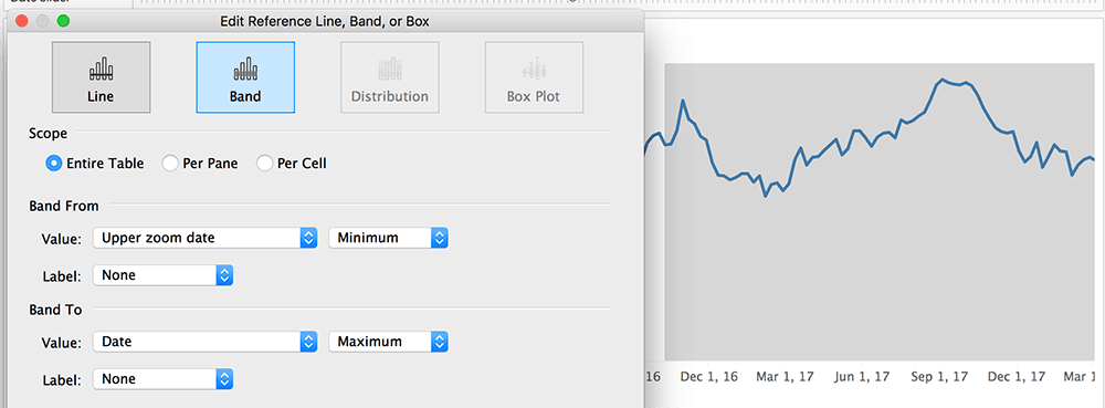
And, for the second one:
We should be looking at something like this now:
We could have used a single reference band to highlight the middle-part only, but I liked it better this way.
Now we have a cute highlight, but there’s not much we can do with it.
By adding a new sheet with just the highlighted part, we are in business.
The zoomed chart
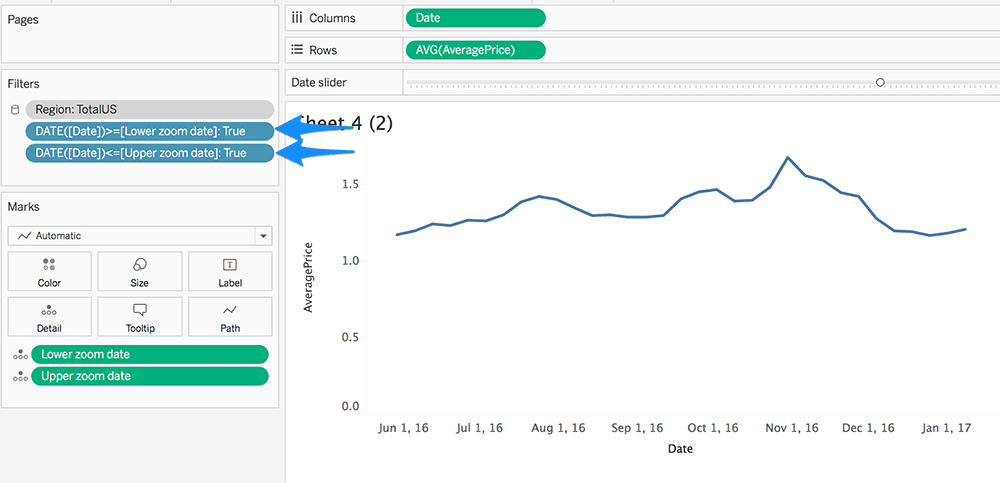
For the zoom part, we can start with the same time-series and add the Lower and Upper date intervals as filters:
Now we can drag everything onto a dashboard, and we pretty much have our highlight and zoom:
Improving the design
We have the basic functionality, but some of us might want to make it look a bit better.
The zoomed line
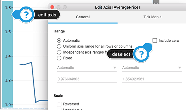
First, let’s get rid of the zero from the axis. It will give us a better picture of the variation from one week to another.
I think it works well since we already have everything in the chart beneath it.
So, right click on axis > “Edit Axis” > deselect “Include zero” option.
At this point, we’re facing a little dilemma. While moving the slider left, and right, the zoomed line’s axis is always changing. It could make it a bit hard to follow.
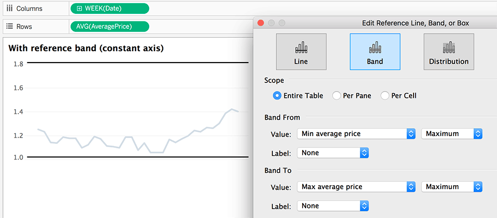
My solution was to add an empty reference band ranging from the all-time minimum to the all-time maximum.
The calculations used:
Max average price: { MAX( {FIXED [Date]: AVG([AveragePrice])} ) }
Min average price: { MIN( {FIXED [Date]: AVG([AveragePrice])} ) }
You could instead fix the axis range, but I wanted to make it as flexible as possible.
Here’s a quick video to exemplify the difference between an axis with a constant range and one that is entirely variable:
Before we move on, there are a few more things to add:
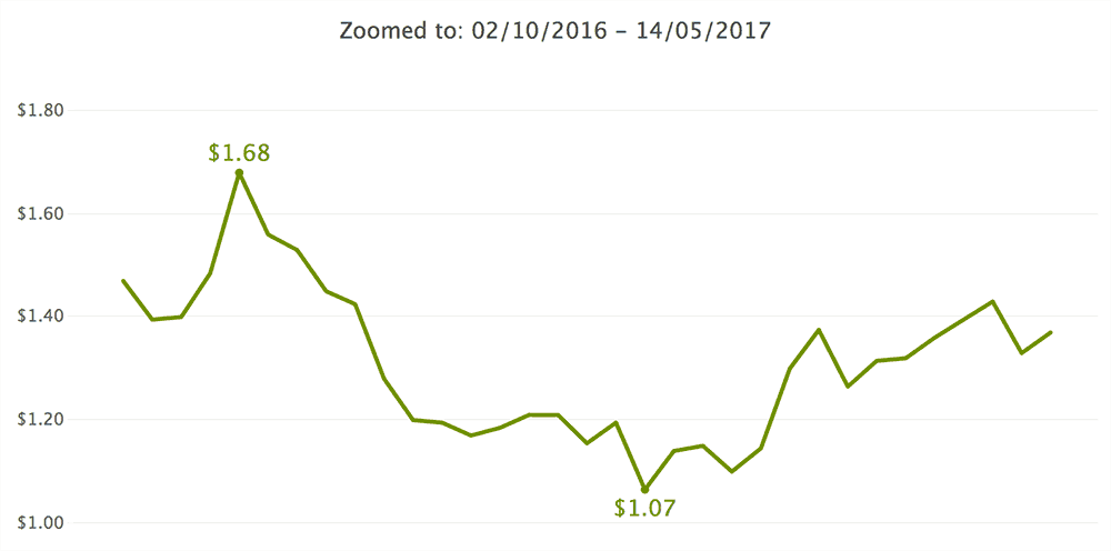
- the min and max values from the view as labels
- a notice that tells us the zoom period
- tooltips
- prices formatted to show two decimals (thank you MakeoverMonday viz review!)
- and last, but not least: color the line with an avocado green
The final version of the zoomed line looks like this:
The timeline
We can easily add an area chart at the back of the line as a dual axis. It would give our timeline a clear indication of its height:
We can even add some white reference lines to the end of the bands:
At this point, we could call it a day and consider our work done.
Complicated stuff
For those of you who enjoy making your lives harder, we will take this a bit further.
We can add colors to highlight the weeks when the prices increased/decreased.
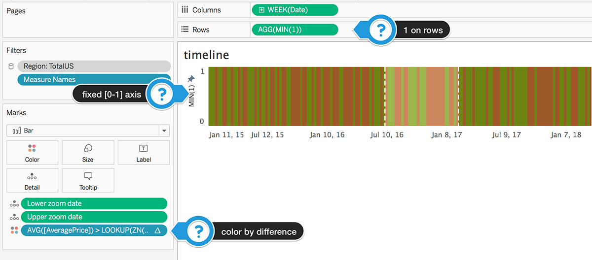
My idea was to use a bar chart for this purpose, which I set up like below:
The color calculation is computed across the view using this formula: AVG([AveragePrice]) > LOOKUP(ZN(AVG([AveragePrice])), -1)
Right now we have just a colorful band; we need the price trend in the view.
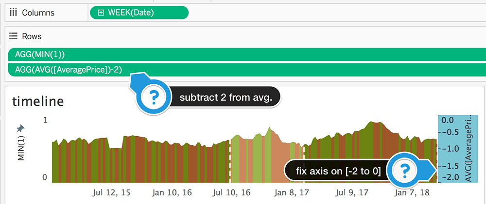
If we bring back the area chart, the view looks like below:
Which is not really what we’re after. We want the bars to show up below the trend.
The only way I could think of to make this work was to fix the area’s Y axis on 2 and subtract 2 from the average price value.
Now I realize that if new data comes in with values out of the [0-2] boundaries, the chart will get messed up.
If you have any idea for a better way to deal with this, please share it!
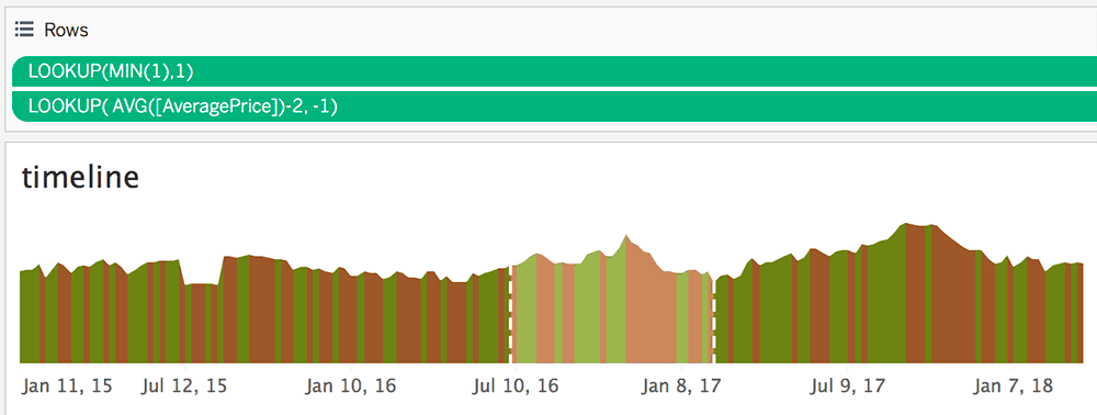
For now, we have to deal with one more thing: lining up the decrease/increase colors precisely below the line it corresponds to. If you pay close attention to the graph, you will notice that the colors are with one date ahead of the line.
So we will replace the values we have on rows with two lookups:
- MIN(1) → LOOKUP(MIN(1),1)
- AVG([AveragePrice])-2 → LOOKUP( AVG([AveragePrice])-2, -1)
Better now?
If you can’t see the difference, there’s no point reading further!
Just kidding! We can only move forward here!
After decluttering and some spit and polish, we’ve reached our initial goal:
Your homework
Since you’ve made it this far into the article, I have two challenges for you:
- For the slider, parameter try to use a 1-100 integer range instead of dates and adapt the Lower zoom date and Upper zoom date calculations accordingly
Useful in cases where new data comes in, and our parameter doesn’t adapt (we don’t have dynamic parameters in Tableau at the moment).
- Use a polygon instead of an area chart (the one placed over the bar charts)
You might have to duplicate the data (union onto itself) to make it work.
Here’s some inspiration from Rody Zakovich of how he used polygons to shade between two lines. Also, Ken Flerlage’s Joy Plot template is an excellent place to start.
You can download the workbook from my Tableau Public profile and work from there.
Hit me up in the comments if you have questions or if you want to show off your work!
Highly passionate about data, analysis, visualization, and everything that helps people make informed decisions.
I love what I do! I am working to improve speed in every aspect of my life and that of our clients.
I find comfort in helping people, so if you have a question, give me a shout!




First of all, thanks for your tutorial it´s great and straightforward. I´m new to Tableau and tried to replicate it but I got into a bump. My first data point does not want to display the colored region under the area, it goes all the way to the predefined value, in your case 1, in my case 40 million. By any chance do you have an idea why this happens and a way to fix it? https://uploads.disquscdn.com/images/5c0853808408a6f566cd08cc0ee530a97acc60a93016f02362e594df21cb8d97.png