Love Google Analytics? Love Tableau? Why not bring them together?
Us & Tableau
We are working with Google Analytics every single day. Sometimes I get the feeling we’re investing too much time into it.
When I re-discovered Tableau, I felt it brought a whole new perspective to our analytics approach.
The first times I tried it, I didn’t feel very comfortable with it. Or I might not have been ready for the power of Tableau.
According to Tony Robbins, if we do the right thing at the wrong time we get pain in return. But the timing was right the last time.
So hop on this ride with us to see how we can use it to supercharge our data!
Advantages of using Tableau with Google Analytics
- The ability to integrate GA data with other sources like marketing tools, CRM, ERP, databases, etc.
Here’s a nice video example of blending GA with MySQL data
- Supercharge your analysis with forecasting, clustering, etc.
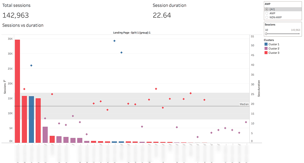
Example 1: Here’s us clustering our content by visitor engagement:
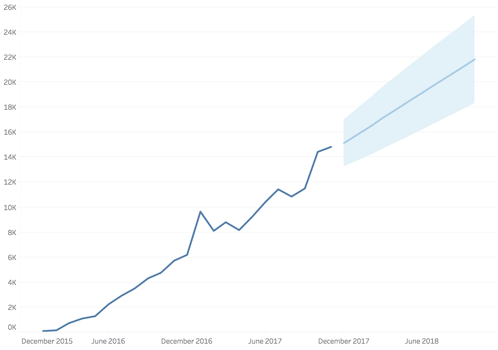
Example 2: use of Tableau’s forecast functionality
- A bit of data cleaning: splitting and grouping
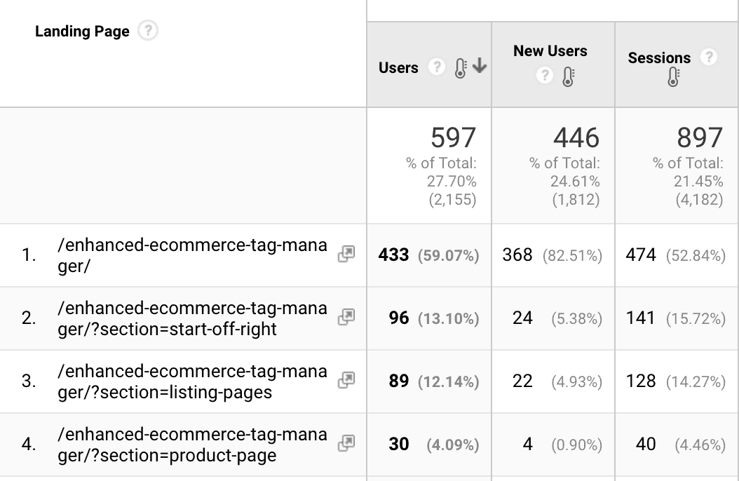
Example 1: you have traffic reaching the same landing page, but with different parameters like below
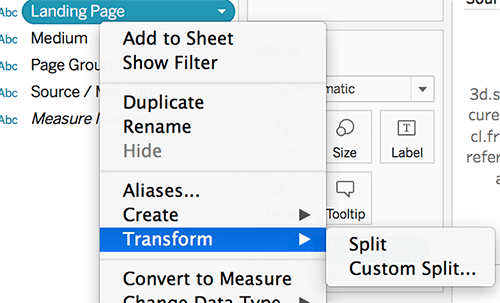
In Tableau, you can use the Split option to have the full data for your landing page.
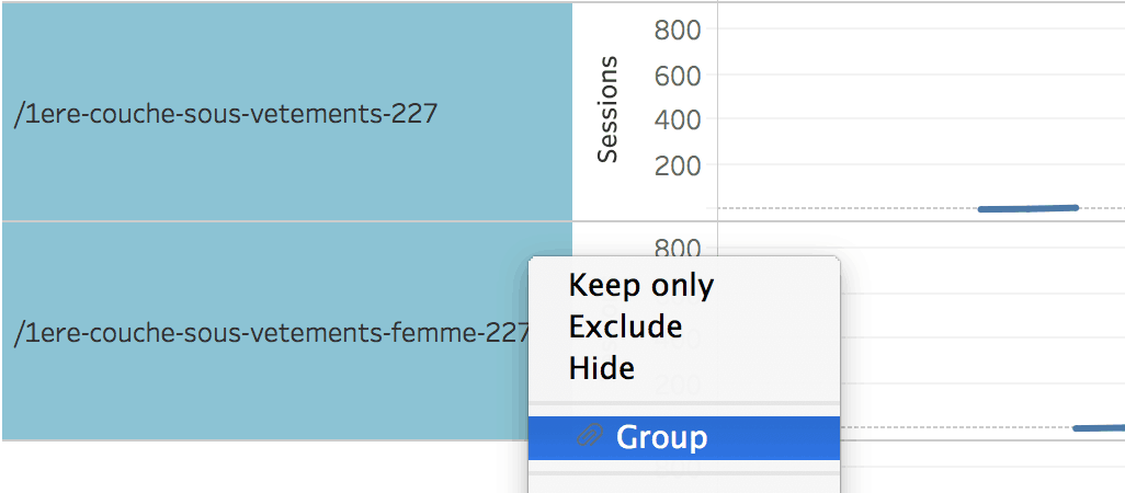
Example 2: you have a page for which you have changed the URL; in Tableau, you can select the old and the new URLs and group them (this way you can look at the full data for your page):
- The ability to calculate your measures
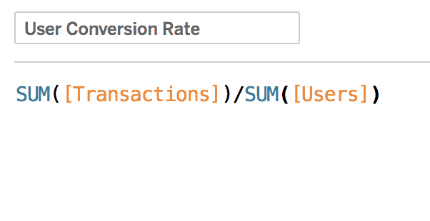
Example: you want to look at User conversion rate instead of the session based one offered by Analytics. In Tableau, we can quickly create a Calculated field. Simple as this:
- Interesting ways of dealing with outliers
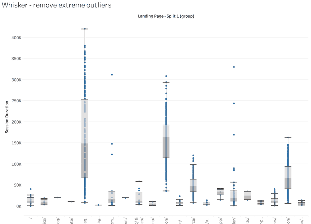
Our favorite way of spotting anomalies is to put the data inside box-plots. Here we can just select and exclude exceptions from our reports:
ConversionXL has an extensive guide on how to deal with outliers. We have also written about ways to discover them in our article on Google Analytics data visualization.
- Automated reporting and alerting if you are using Tableau Online or Server. There are options to do it inside GA, just that the reports are a lot uglier.
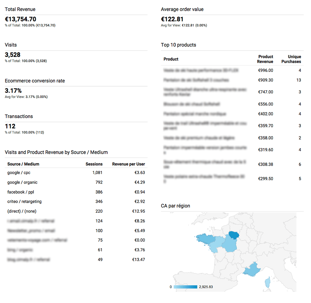
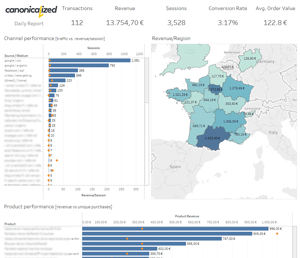
Here’s the same daily report built on Google Analytics vs. Tableau:
- Interactivity in one click
I save the best for last. In my opinion, the best part of Tableau is the ability to filter the dashboards by clicking on the visuals.
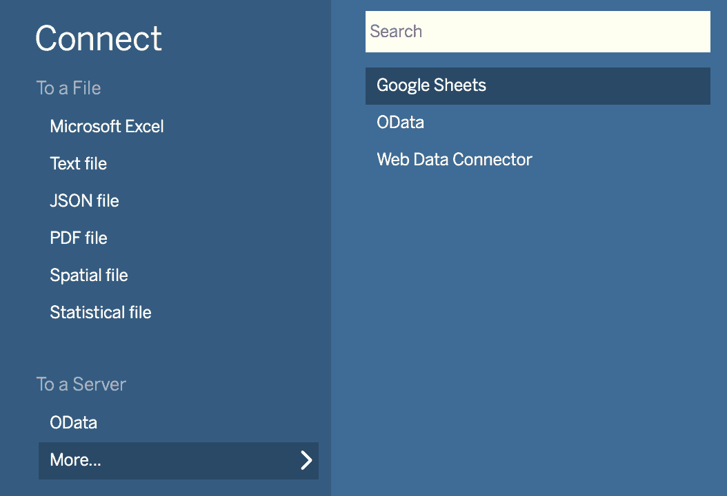
The Tableau Desktop connector
I love the Google Analytics Connector from Tableau! It enables us to pull data quickly to whip up an analysis for any date range.
Note that the connector is only available for paid licenses of Tableau. If you want to use Tableau Public (the free version), you can extract the data into Google Sheets using the
Google Analytics Spreadsheet Add-on and connect to it.
Limitations
- One segment at a time
- If you have complex needs, we recommend going back to Google Analytics to create a segment that includes your desired data. Tableau will let you use any of the custom segments you have in your account.
- One account at a time
- You can play with multiple extracts, but if you want to filter easily by an account, you should start to consider placing all the GA data into a database (warehouse).
- No live connection – it works only as an extract
- You have to refresh the data source to get the latest data.
- No multichannel funnels API
- Google has a different API for working with the MCF data, so you will have to find different ways to analyze assisted conversions. Our option is to use R to extract the Multi-Channel data.
- Could be slow/unreliable
- If you are pulling a lot of data you should be prepared for delays, especially if you’re scheduling extracts.
- No filters on the data source
- This is not a meaningful limitation for us because we like to work with the data in the rawest form and do our filtering inside Tableau.
- As a workaround, we can create a custom segment to replicate a particular filter (it might be useful if you’re working with large amounts of data and the extract takes too long)
- Problems with aggregating users
- Let’s look at the following example: we’re pulling data about visitors by city, but some users will visit our website from different cities; if we want to see the total number of users, some of them will be counted twice. Hence, skewed data
- To overcome this issue, we would have to include the client id inside GA, and use the custom dimension in our queries; check the guide from Simo Ahava for the implementation
- You shouldn’t experience this kind of issues if you’re aggregating metrics such as sessions or new users
Sampled Data Myth
Don’t be fooled by old articles such as this one. They were written a long time ago.
In the technology world, things are changing every day. So has the Tableau Google Analytics Connector.
In my opinion, it’s actually a solid option to avoid the sampling happening in Google Analytics reports.
I agree on the part where they’re talking about filtering, but there is no sampling or incomplete data in the newest versions of Tableau. So, make sure you test before acting on old advice!
Use the API explorer to double-check everything
For me, the API explorer is one of the most delightful gifts from Google. It’s my go-to option to check if anything is wrong with the data I pull.
If the numbers don’t look right in Tableau, I usually start by re-creating the same query in the core reporting API explorer to check if I see the same data in terms of:
- number of results
- metric values
- available dimensions and metrics
- stuff that can’t be queried together
- accounts that don’t have Google Analytics API access (i.e., the Google Demo Account)
And the list could go on.
Recommendations when working with GA data
- Try to get the data in raw form out of Google Analytics
- Calculate your own metrics where it makes sense. For example Conversion Rate, Bounce Rate, etc.
- Avoid User counts if you don’t have Client IDs set up
- Try to have fun!
Using a Google Analytics data warehouse
The data warehouse has some advantages:
- faster extracts and live connections since the slowness of the API no longer binds you
- multiple accounts inside the same database; for those of us who are dealing with multiple accounts it is tremendously useful to be able to filter by account directly in Tableau instead of having to connect to a different data source
- easier data blending and transformation
- all the data in one place
Potential downsides:
- security
- legal stuff
- costs
- you probably need a data integration service like Stitch or Fivetran (also called ETL tools – “extract, transform, load”)
BigQuery is a good option for Premium users of Google Analytics since you can easily export the data.
Here are some thoughts from Justin Cutroni on including GA data into a warehouse from 2011. Unlike the Lunametrics post, this one still applies today.
If you have serious Business Intelligence or Analytics ambitions, you will need a warehouse at some point. Especially if you are trying to build/empower an analytics insight department.
Read more about BI here.
It’s a process that brings a whole new set of issues to the table. But it comes with the territory!
Dashboard Examples by North Star metric
Here are some Tableau – Google Analytics examples of us trying to have fun with the data from Google Analytics.
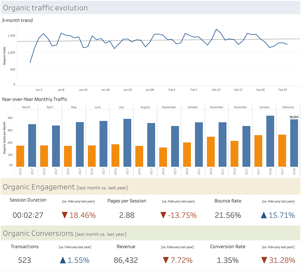
- Here’s an example of a SEO report we’re sending to our clients. The NSM is organic traffic, but we are also looking at the traffic quality indicators and conversions.
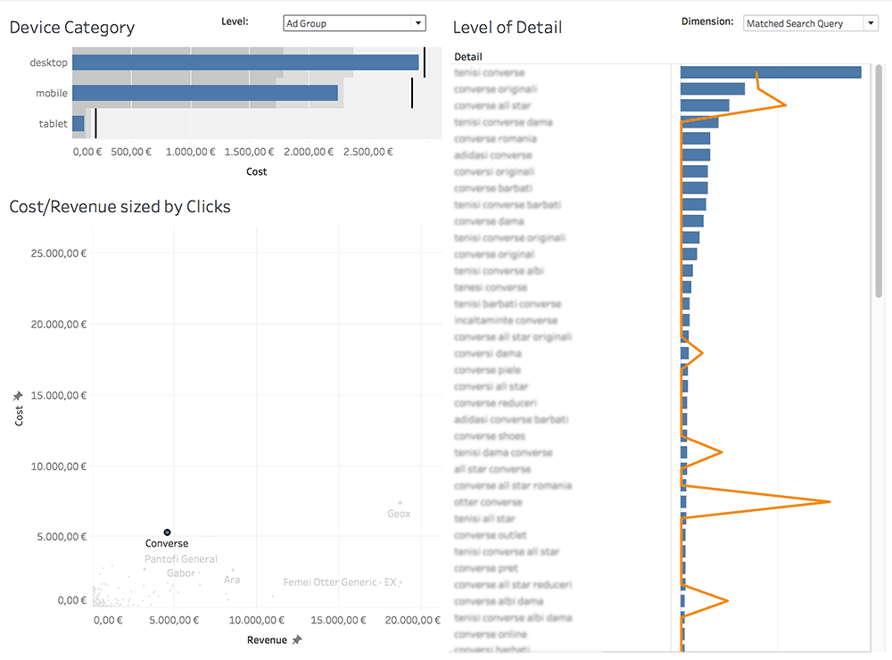
- Below is a dashboard we built to look at the Adwords data we have in Google Analytics. The purpose of the research is to look at Cost per Revenue from any angle we can think of.
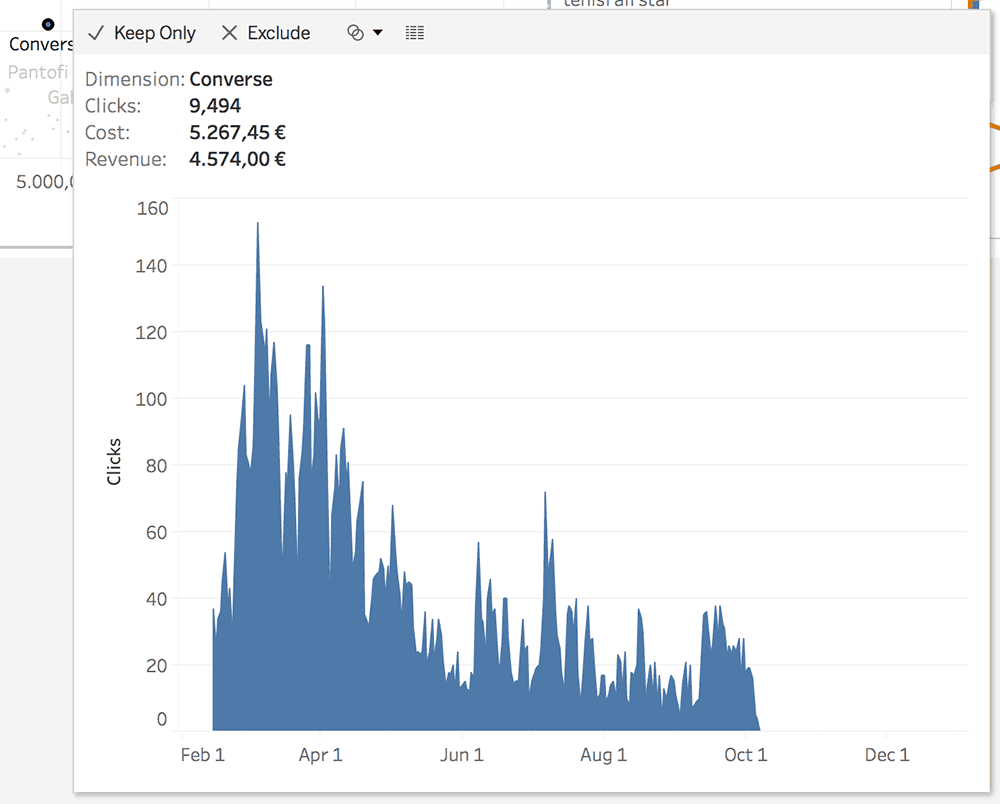
And a cookie from Tableau 10.5: Viz in tooltip. Hovering over an ad group will reveal a subtle evolution graph.
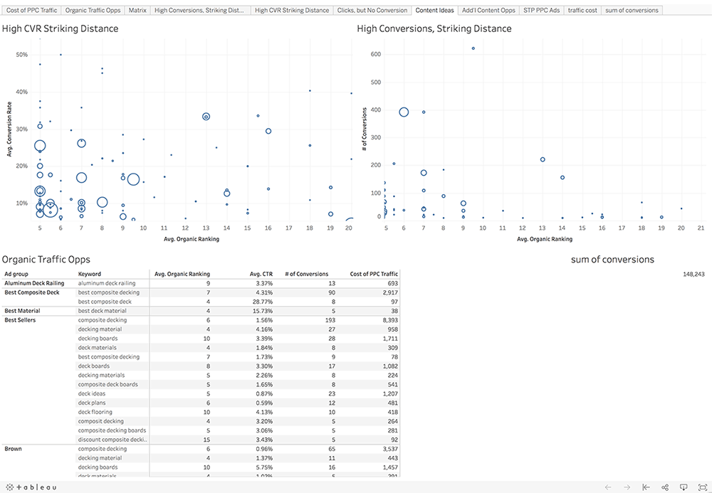
- PPC vs SEO: complete, don’t cannibalize!
We found this great dashboard which shouldn’t go unnoticed.
If you have ranking data, you can easily integrate it with Adwords to get to this level of information
- Social traffic
Alexander Loth created this video on how he built a social media traffic analysis dashboard:
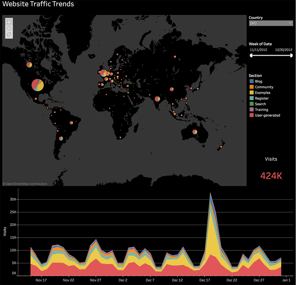
- An example from Tableau: Analyze website traffic trends to optimize results
To be continued …
Google Analytics Data Visualization
In the article about reports that we would like to see inside Google Analytics, we are looking at different ways to re-work data.
We’re employing visualizations such as:
- box plots
- histograms
- averages
- forecasts
- growth graphs
- clusters
- Pareto charts
- bars & lines on the same chart
Check them in the slide deck below or dig into the article!
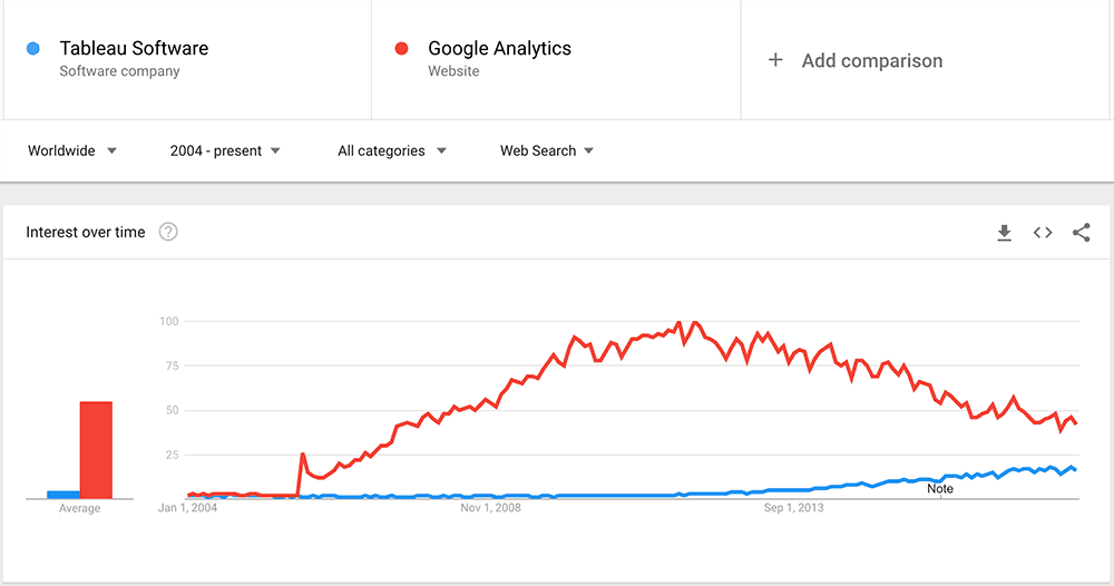
Search Trends
Last, but not least, we wanted to share some trends with you. We leave it to you to conclude.
Highly passionate about data, analysis, visualization, and everything that helps people make informed decisions.
I love what I do! I am working to improve speed in every aspect of my life and that of our clients.
I find comfort in helping people, so if you have a question, give me a shout!
