Business growth is often associated with acquiring new clients. For me personally, the true barometer of business health is how many of them you keep.
For others, it might be the level of user engagement, revenue, or even support tickets received.
Whatever the metric is, it’s essential to have a clear picture of what’s going on. This is where the data comes in!
Cohorts
A cohort is a group of users who share a common characteristic over time.
Why are cohorts useful from a business perspective?
Splitting your user base into groups makes them easier to manage. Comparing cohorts amongst each other is the first step towards finding genuine insights about their behavior.
The problems with common visualizations:
- difficult to read/understand for most people
- difficult to get the data right
- difficult to manage with high volumes of data
What this article is about?
Making it easier to understand cohorts so that you can draw conclusions and take action.
We are laying out different ways to look at data to help you see patterns instead of looking at raw numbers.
Not all are universally applicable. But, hopefully, some of them will help you make sense of what your users are doing.
We employ interactivity to improve the charts’ readability and reduce their time-to-understand.
Although we’re building all of the visualizations in Tableau, you can create them in the tool of your choice. Just keep in mind that we have Tableau tutorials for how to implement most of them.
Let’s start with an example
I want to share with you a real-life situation of how a cohort analysis can be used to draw a meaningful conclusion.
Let’s assume you own a clothing store. You start a loyalty program to incentivize your customers to come back to your store and buy.
You give out loyalty cards when the customer places its first order. Some of the cards carry discounts of 5%, 10% or 15%.
After running the program for a while, you want to see how it’s performing. Are people using their loyalty cards? If so, how often?
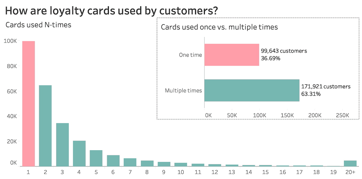
Have a look at the two charts below:
Look at that! More than one in three customers never use their loyalty card after it was issued.
There’s a clear descending trend regarding the number of times customers come back.
After looking at this visualization, would you keep your loyalty program in place? Would you call it a day and move on?
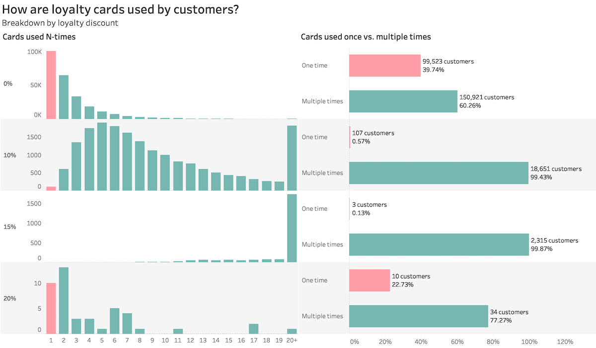
What if we dig deeper and split our customers into groups by their loyalty discount? We can even call them cohorts since they keep their discount over time.
Notice the different patterns for each cohort!
What do you think about your loyalty program now? Pretty sweet, right?
The 15% discount card seems to be really killing it since most customers are returning 20+ times!
You were probably thinking about shutting down the loyalty program. Moreover, getting close to upset some of your most prized clients.
It’s a classic example of how aggregates can hide insights and lead to bad decisions.
I know, you’ve heard before that you should use data to make decisions.
But where would one start? You start by starting!
The Impact Plot
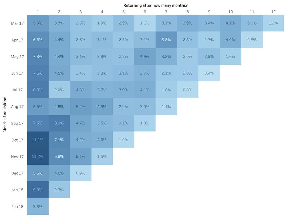
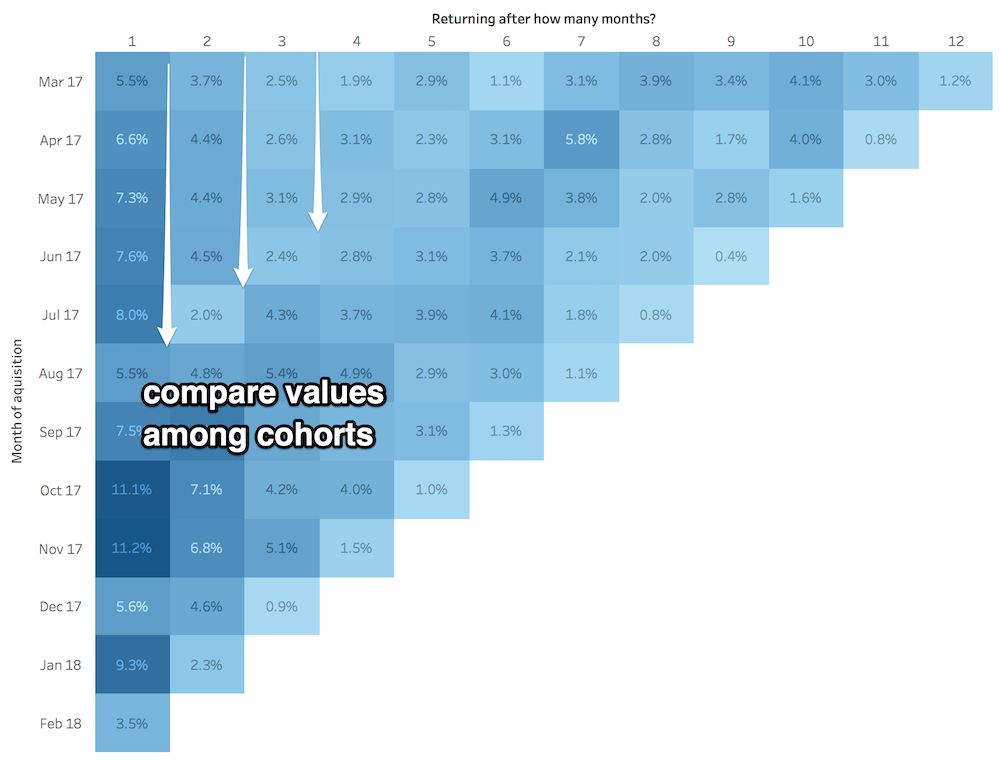
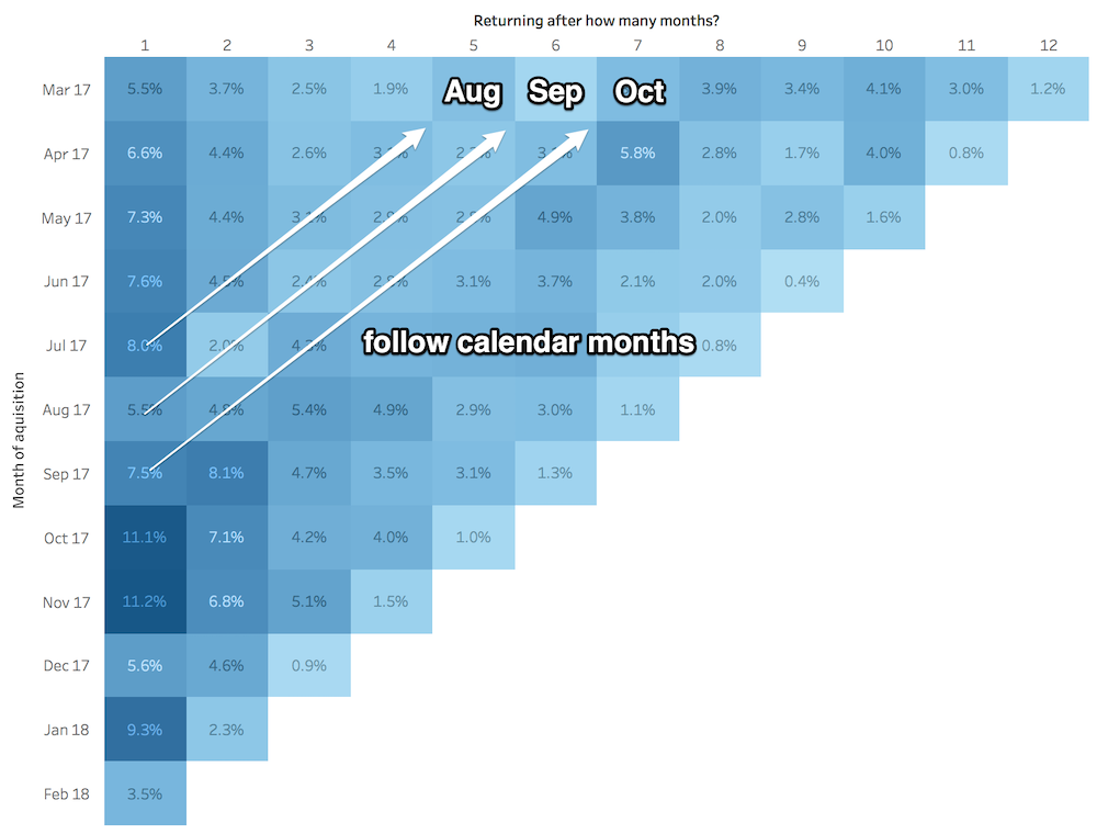
Also called triangle chart. It’s perhaps the most popular way of displaying cohort data nowadays.
Here’s a quick example showing customer retention N months after acquisition:
- on the Y-axis we have the months in which the customers were acquired (the cohorts)
- on the X-axis, we have the number of months after the first interaction (1,2,3, up to 12)
- each square represents the percentage of returning users in a specific month
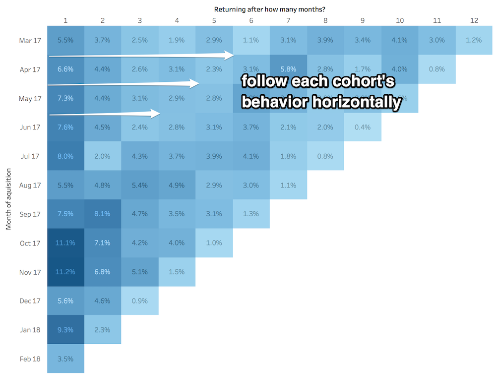
Now how would we read such a thing? There are three main ways.
One is Horizontally to follow each cohort’s behavior across time:
The other way is Vertically to compare values between cohorts:
The third way is Diagonally to look at calendar months (useful to spot issues in specific periods):
While a powerful advantage to look at data in three directions, it could cause understanding problems.
To address some of the issues we came up with this interactive dashboard (click here to interact with it):
Focusing on one slice at a time makes it easier to comprehend. All while adding context with bars and lines popping up.
In this article we share our thought process and Tableau guidelines on how to implement such a visualization.
Cohorts by different dimensions
We can group users by a multitude of dimensions, not just by the time-frame they first signed up.
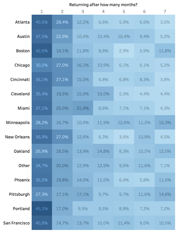
Here’s an example with users grouped by their city:
Our impact plot becomes a highlight table since we have complete data for all the periods.
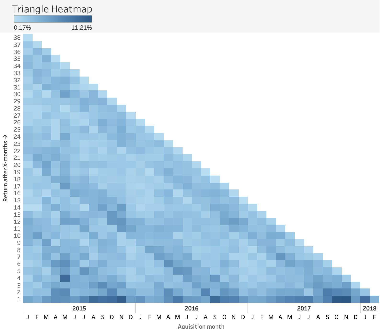
A variation of the impact plot: triangle heatmaps
It is very similar to the impact plot, only rotated 90 degrees counterclockwise (↺). Brighter colors show low retention rates, while darker ones show higher values.
And like the impact plot, we can read it horizontally, vertically, and diagonally.
If you take a close look at this example you might notice some of the following:
- [vertical patterns] for each year the December cohorts seem to have lower values compared to the ones before
- [horizontal pattern] above the 13th month after acquisition there seems to be a lighter color (very subtle)
- [diagonal pattern] useful to spot propagation in specific calendar dates like September 2017 in our case
Here’s how we follow September 2017, using an enhanced legend that adds a bit more context:
The main advantage of this type of chart is that you can see big picture trends. There’s no point in showing the actual numbers because they would hardly fit.
It is apparently used by the Facebook insights team to measure retention.
They have a video explanation on how to read it , which I believe is very good (starts at 3:06) :
The triangle heatmap looks quite lovely, and it does a decent job of highlighting hotspots and uncovering patterns. However, it can’t be used to estimate values over time accurately or to compare areas that are not close together.
Interactivity to the rescue
Let’s say we want to compare the June cohorts for 2015, 2016 and 2017. Our eyeballs would probably move around like crazy.
How about now?
Way better, right? We have the overview in sight, we can filter down to a subset we’re interested in, and get details on demand via tooltips.
Sweet! Now, let’s move on other types of charts.
Line Charts
Cycle Plots
An excellent option to see trends and seasonality across cohorts. It only works when cohorts are defined by measures of time.
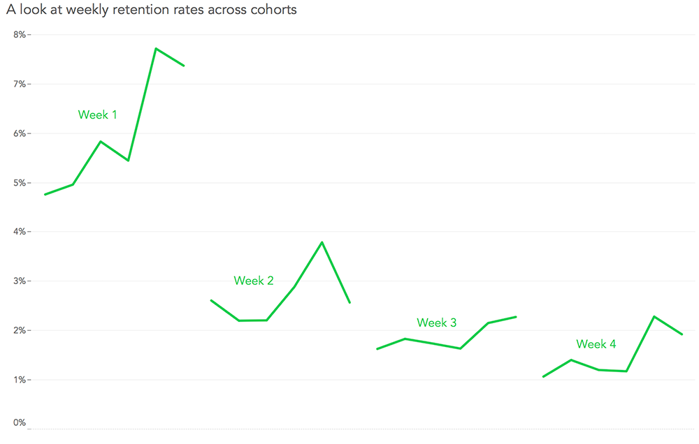
Below is a cycle plot showing retention rate for each week after acquisition. The green lines are connecting the consecutive cohorts from our data:
To follow the retention rate of a cohort we added an interactive element that reveals its path over time.
In this way we can check the evolution on demand:
Here you can find more about cycle plots and the process of building this type of chart in Tableau.
Percent difference from the acquisition date
In case you got bored by retention charts we can try to look at different kind of data.
Let’s say we want a cohort analysis showing how user activity changes over time after signing up for a service.
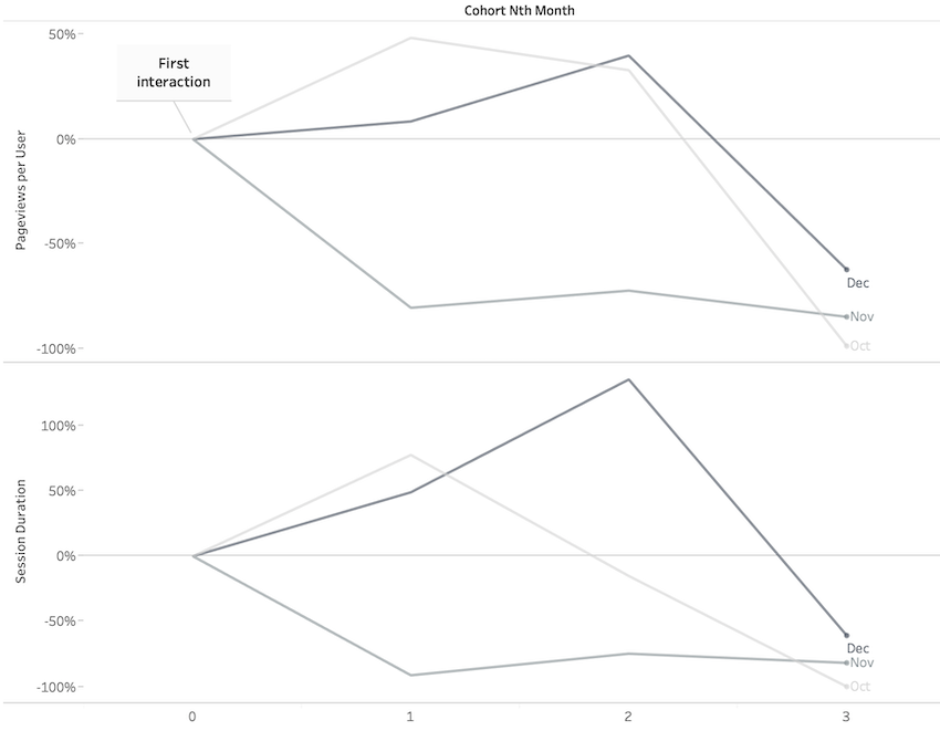
For this purpose we could use a line chart like the one below that compares all the values to the initial one:
We can see how the activity increases (page views, session duration) in the first two months for the users acquired in October and December; also how the November ones are constantly less active.
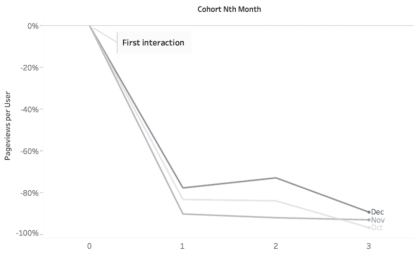
More often than not, you will encounter the data in this form, which could make it a bit more challenging to decode:
Having too many lines (cohorts) might clutter the view. The sweet spot for me is showing 3-4 lines.
Layer Cake
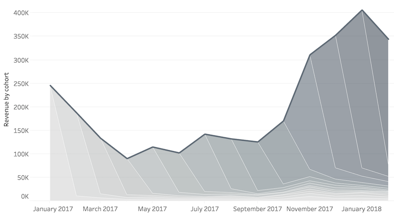
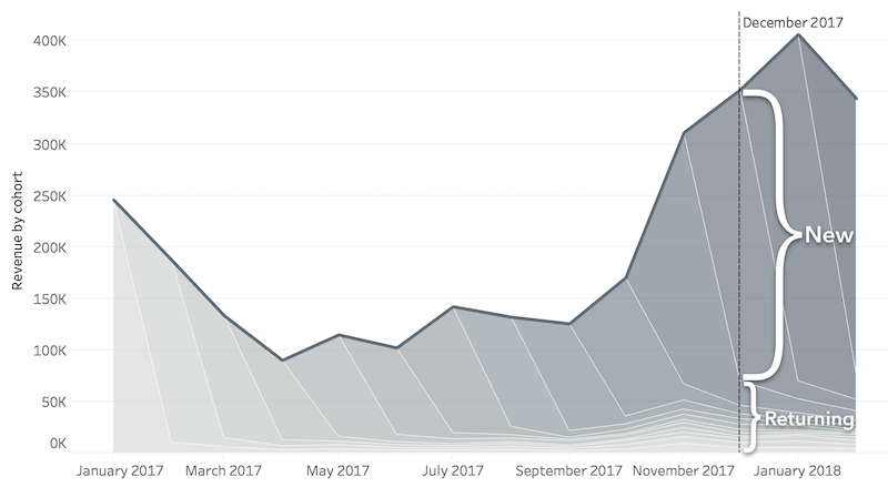
This chart is typically used when people want to show the total values and the breakdown by cohort.
Here’s an example showing revenue over time by month of acquisition:
Aside from the cool look, there are rare cases when this type of chart is useful.
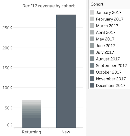
For example, if we want to see which cohorts have contributed to the Dec ’17 revenue we should decode it like this:
Which is much more difficult to do than by looking at something along the lines of:
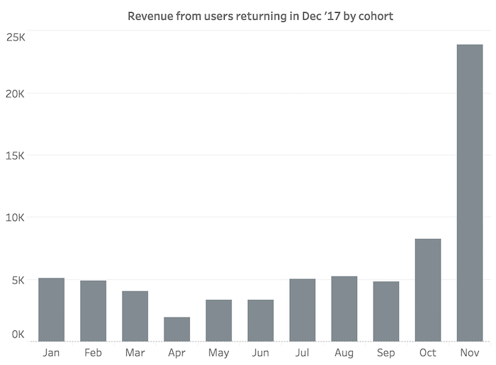
Moreover, if you want to compare returning users by cohort you will need something like:
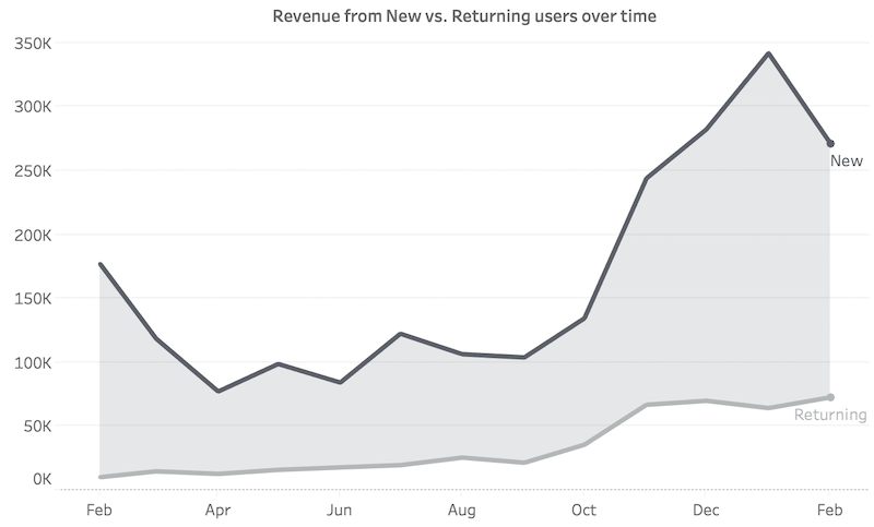
I believe the best way to represent the New vs. Returning user revenue over time would be using a two-line chart:
We can use it to decode three main things:
- the new user revenue evolution over time
- the returning user revenue evolution over time
- get a feeling for the difference between the two measures
The layer cake is definitely eye-catching! If your purpose is to better communicate the data, simplicity is the way to go. Which in many cases is difficult to achieve.
Gap Charts
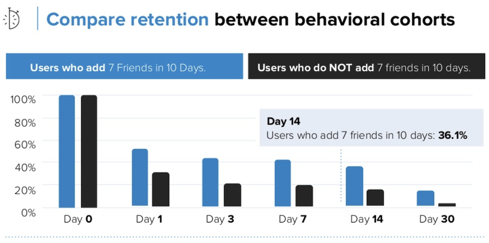
A chart from Amplitude caught my attention recently:
They split their user base into two cohorts: users that perform an action and users that don’t.
The story here is compelling since it leaves you with a clear goal: make it easier for users to add 7 friends in the first 10 days.
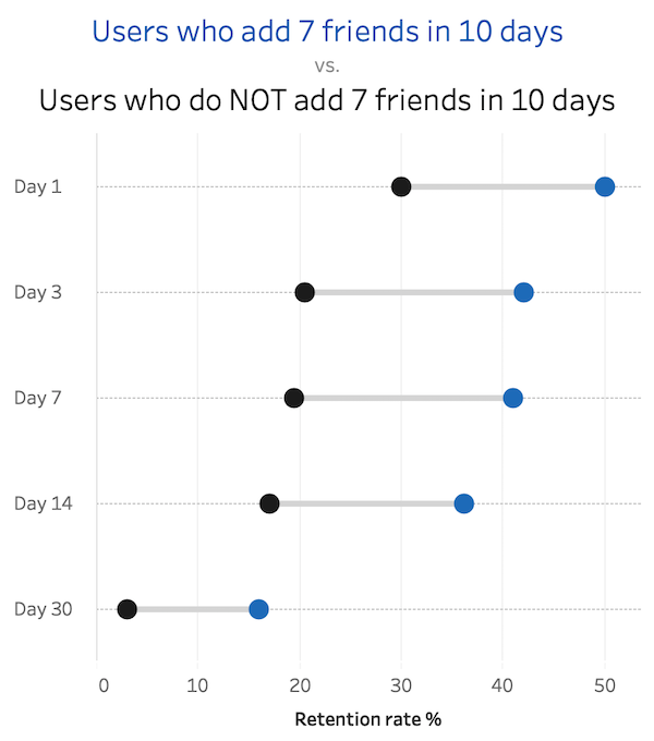
Here’s how I would prefer to look at the same data:
I believe that in this chart it’s easier to see the patterns for the two cohorts at one glance. We also get to keep in sight the length of the gap between the cohorts.
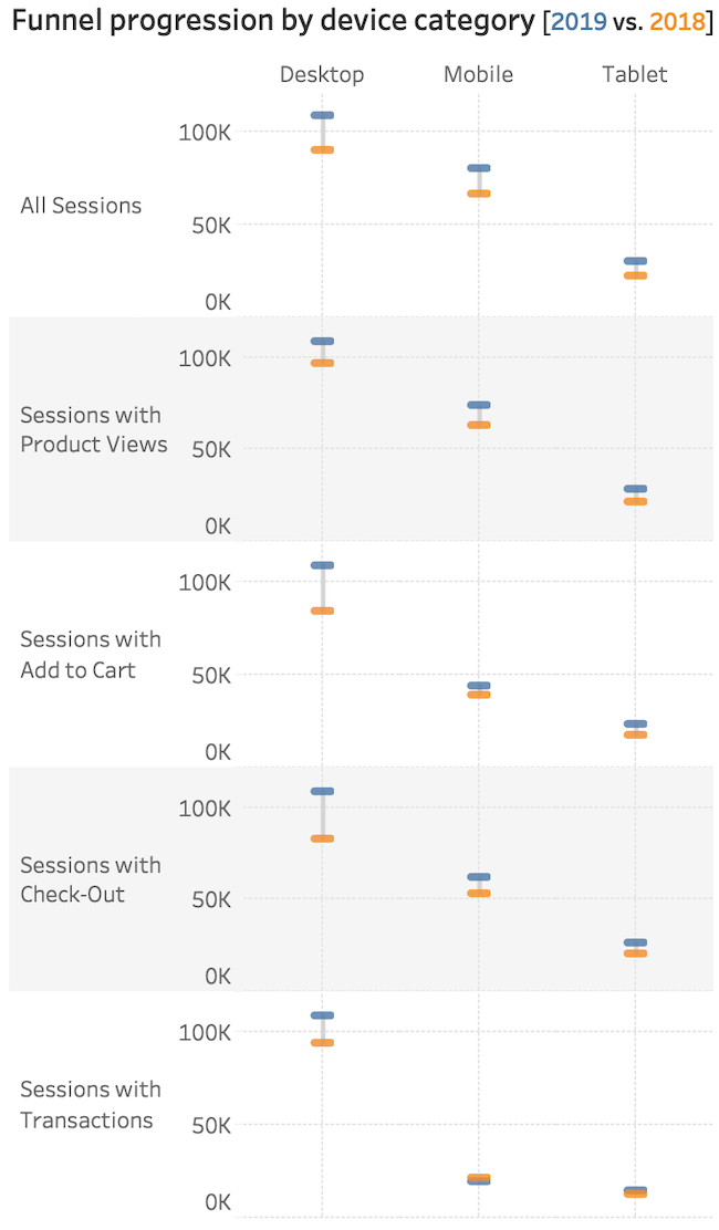
Another use case for the gap chart would be to look at eCommerce behavior. Below, we are showing funnel data for the visitors of an online store split by their browsing device:
Our “funnel” is split into 5 stages according to the where the users are in the buying process:
- visited website
- viewed products
- added products to cart
- entered the checkout
- completed a transaction
The goal of the visualization is to compare behavior by device at each stage of the funnel year over year.
You can see how most values are improving in 2019, except for transactions on mobile devices. This is something the person in charge should check out!
The chart works well when we look at each stage. However, if we want to have a more big-picture view, we have to reconsider our options.
Parallel coordinates version
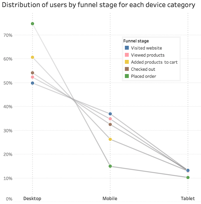
The chart below represents the percent of users at each stage of the funnel by device category:
Let’s compare the Desktop-Mobile slopes for “Visited website” and “Placed order”. Maybe even to “Added products to cart”. We can once again spot our problem with transactions on mobile devices.
People are checking out, but they are not placing their orders. It might also be worth checking out why fewer people are adding to cart on mobile.
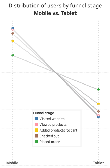
The tablet part of the chart is not very readable. If we focus on the Mobile vs. Tablet comparison we can see how much better Tablet users are performing:
We also end up with a slope chart instead of a parallel coordinate one, which answers our question.
We don’t show anything over time our slope/parallel coordinates cohort analysis. We are just looking at the different stages reached by users.
Scatterplots: looking for correlations
Let’s have a look at demographic data for an eCommerce store.
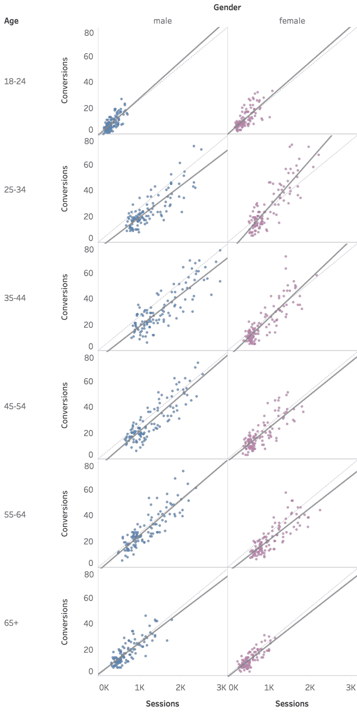
We’ve split our user base into cohorts by gender and age group. Each dot represents a week of data, positioned by traffic and conversions:
We added trend lines to guide us through potential correlations between traffic and conversions.
The trends are revealing two insights we can use to adjust our marketing approach:
- the ones with larger slopes like 25-34 females point to high performance (more conversions with less traffic)
- the ones with smaller slopes like 65+ men represent less performing cohorts (we need more traffic to get those conversions)
Summarize to conclude
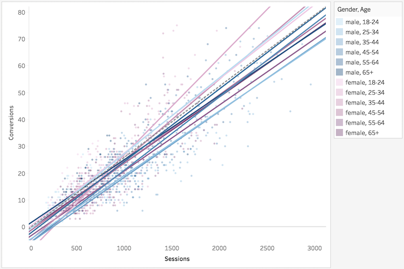
Sometimes it could be easier to compare trend lines if we place them all on a single graph. You will have to interact with it to understand which is which.
Working with scatterplots is not a walk in the park:
- they could difficult to understand/explain
- trends are not always applicable
- not all values might be relevant for our analysis (deciding what to keep could be complicated)
- outliers might mess up the analysis
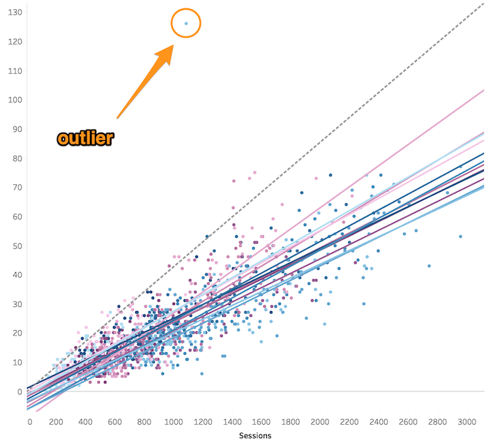
Let me share a secret with you. There was a massive outlier in the data we used to build the scatterplot. Here’s how it would look like if we wouldn’t have filtered that out:
I believe there’s value in looking closer at outliers. In our case, it would have messed up the analysis. We wouldn’t have been able to draw any conclusions other than “everything is bad”.
Stacked Bar Charts
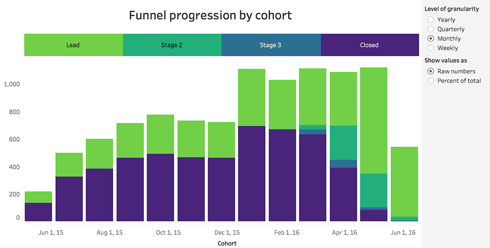
I want to share with you another cohort analysis example! This time we used stacked bar charts to look at sales pipeline data.
Each bar shows how many leads are at each stage of the funnel for a specific time frame:
(*cohorts are defined by months of acquisition):
The visualization works well if we want to evaluate the total users from each cohort and the “Closed” ones.
If we want to compare users with the status “Stage 2”, things become difficult.
Luckily, there’s a way way can fix that with interactivity:
By selectively moving our segment of interest at the bottom, we can make accurate comparisons.
We also implemented a way to switch between actual and absolute values quickly.
In this article we expand on our thoughts and how to re-create the interactivity in Tableau.
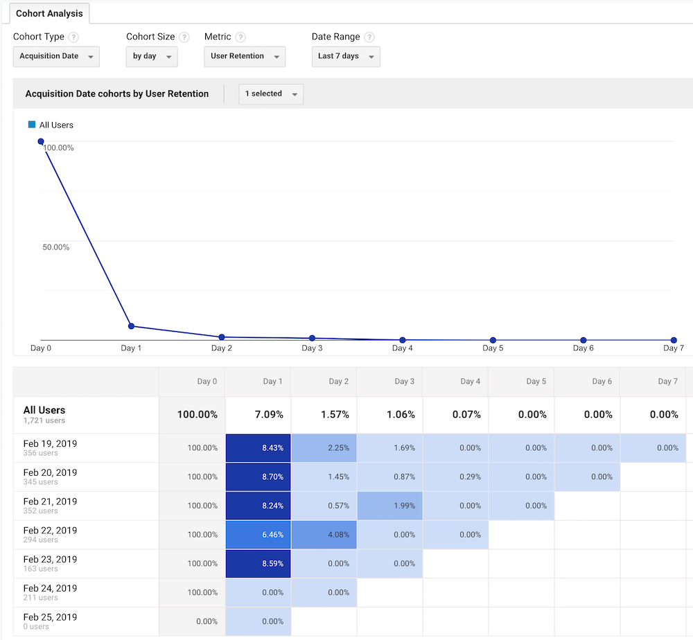
The Cohort Analysis Report from Google Analytics
This is the one:
Want to look at cohort data for your website or app without using “fancy” tools like Tableau? Want to keep your cohort analysis inside Google Analytics?
That’s perfectly fine! There are plenty of articles out there showing how to work with cohort reports.
All we want to do is to show you a few ways you could extend those. You just have to be open to taking data out of Google Analytics and work with a visualization tool.
When I think of Google Analytics, I imagine it as a big database from which I can extract data to analyze.
It is a sort of “data warehouse” packed with website or app user stats.
A few things about the Google Analytics functionality
Limitations (the cohort report is in beta, Google will probably improve it in the future):
- 3-months max window of data
- you can define cohorts only by acquisition date
- unable to view the cohort table without scrolling if there are too many days selected (more than 12 for me)
- we only have access to website data: challenging to blend with other details about our users
Advantages:
- lots of metrics to choose from
- we can apply and compare custom segments
- we can even click on a table cell to quickly create new segments, which we can then apply to other reports
With that in mind let’s have a look at some reports we created with Google Analytics data.
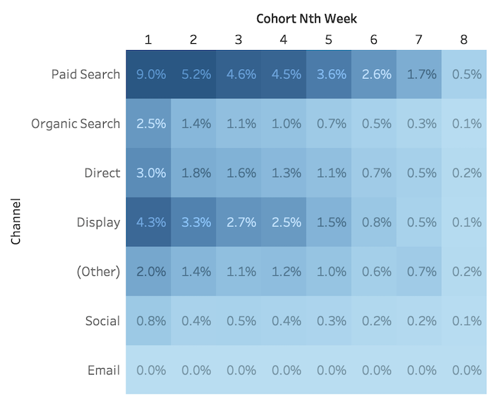
Acquisition channel cohorts returning by week (yes, you can do this via the API):
Notice the darker areas for the Paid Search channel followed by Display advertising. Cool!
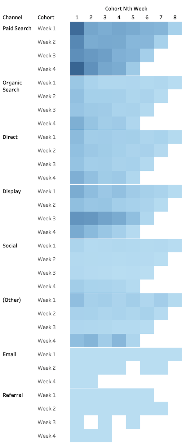
Cool! Can we split the cohorts further?
Sure, here’s a view showing cohorts by channel and acquisition week:
Here we can see that “Paid Search” maintains a pretty constant retention rate across all weeks. “Display” has a higher than average pattern for Week 3.
With this insight in our hands, we should find out what we did that worked so well in that week and try to build upon it.
Comparing cohorts
There are many cases where business data shows seasonal patterns. Comparing to the equivalent period of last year could be revealing in a lot of those situations.
Unfortunately, you can’t do that in Google Analytics. But you can manage if you are able to handle their API.
Case in point:
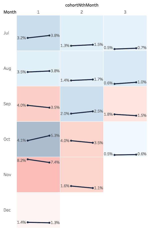
This multiple slope chart is comparing retention rates year over year by month of acquisition. The right dot represents the data for the current year, while the left dot holds last year’s values.
We also colored their backgrounds according to the decrease/increase in values.
It’s not easy to comprehend at first glance, but it can hold powerful insights.
Remember the diagonal patterns we talked about earlier in the article? It’s time to use them!
Notice how the December retention rates have decreased compared to last year.
Major red flag! Propagation usually points to a problem in a specific calendar month.
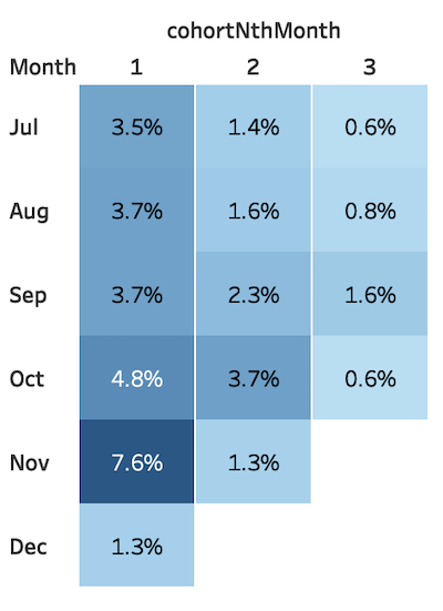
If we had looked at a traditional cohort analysis what do you think we would have noticed?
Perhaps that December is the strongest month in regards to retention. Which is true, but without too much actionable value.
There are probably some of you who are still wondering why can’t you use the GA reports and avoid all this hassle.
Of course, you can! You’ll just miss out on being able to answer more in-depth questions faster.
Final thought
I want to point out that cohorts are groups of people. All that we are doing here is analyzing their patterns of behavior.
Just something to keep in mind!
Highly passionate about data, analysis, visualization, and everything that helps people make informed decisions.
I love what I do! I am working to improve speed in every aspect of my life and that of our clients.
I find comfort in helping people, so if you have a question, give me a shout!
