In this article, I am going to pick apart and try to improve on a prevalent chart type used to analyze cohort retention: the impact plot (also called triangle chart).
It is basically a highlight table, or a heat map with the numbers displayed.
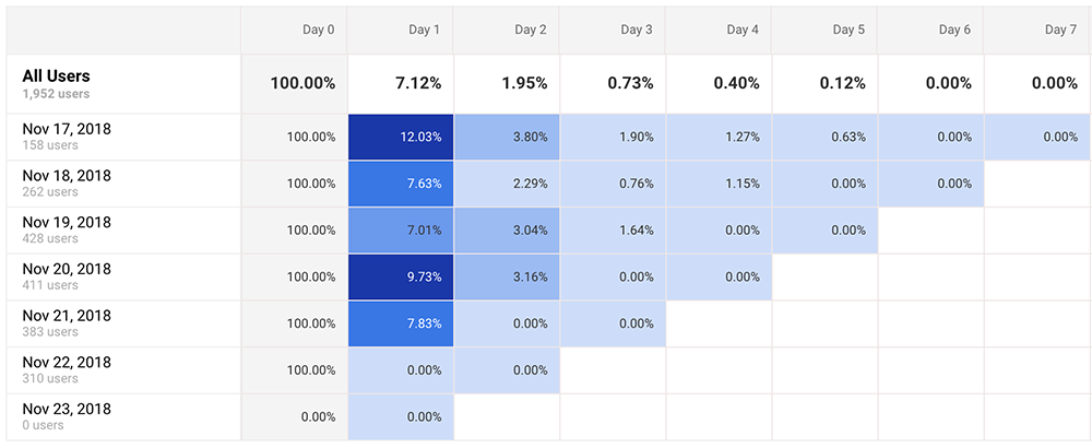
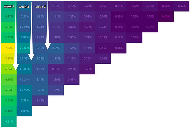
Here are a couple of examples:
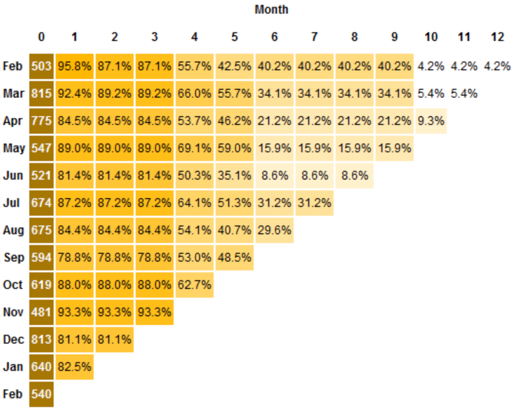
This graph type that is often difficult to understand. Especially by people who are seeing it for the first time in their lives.
Time is present on both axes. In these examples, each row represents one cohort (by acquisition time frame), and the columns show the percentage of users that are retained X days/months after they have been acquired.
I believe the primary purpose of this type of chart is to show hotspots. To direct our attention towards areas with higher than average retention rates. In some cases, these are easy to notice, while in other cases not so much.
Quantity encoded colors are not so straightforward to compare. Displaying the actual values doesn’t solve the visual problem, it just shows some numbers.
My Tableau approach
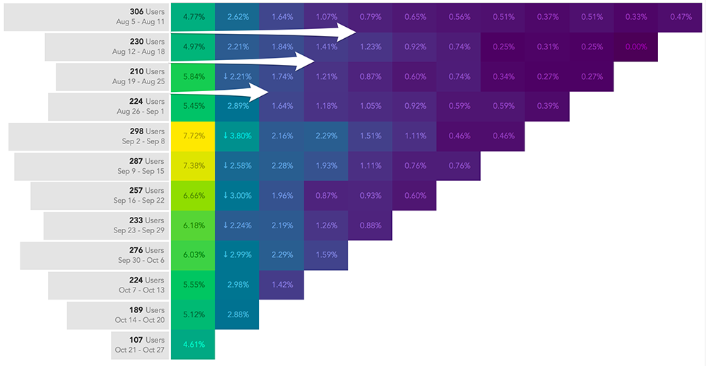
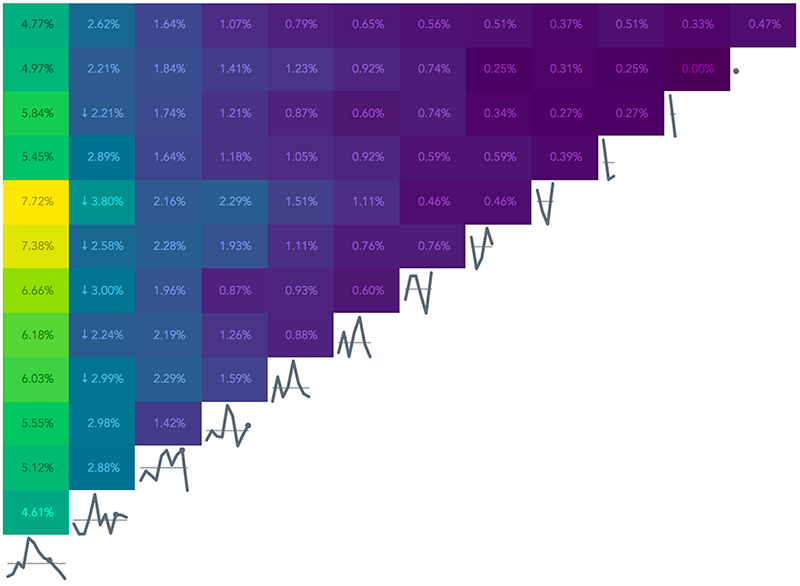
I took a stab at building one of these impact plots in Tableau, and this is how it looks like:
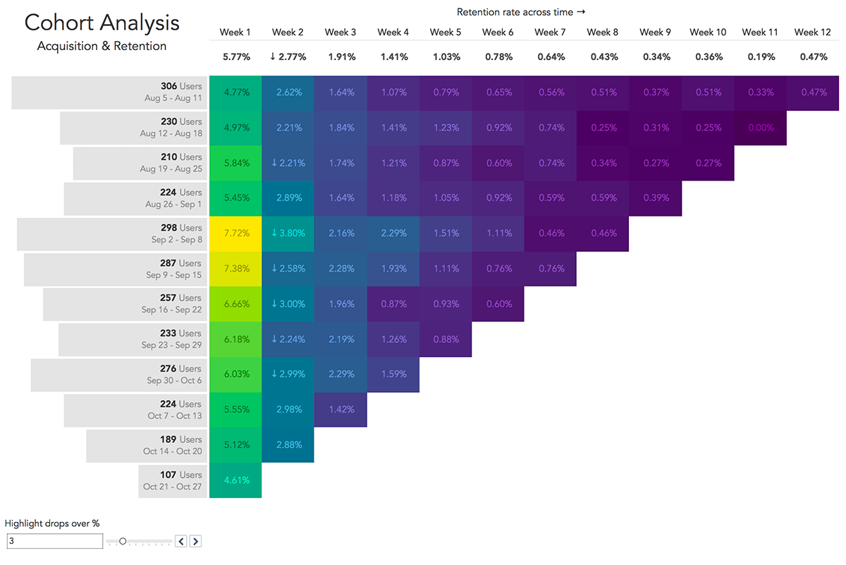
I made a couple of adjustments to the traditional way of display:
- added bars to be able to compare the number of users in each cohort visually; used a light grey color for them since this part of the story is not the focus of our analysis
- dimmed down the contrast on the number colors; I believe the exact numbers shouldn’t be our focus either
- added arrows to highlight big drops from one month to another; these are adjustable by the user
- used a diverging 3-color palette for the heat map; I think it shows the hotspots better than a standard one-color gradient would:
I know, the changes don’t make a huge difference. It’s pretty much the same chart with some sprinkles.
But hold on! The fun is just starting!
Adding Interactivity with Tableau Set Actions
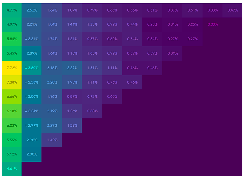
Let’s take a moment and think about how we should read this type of chart.
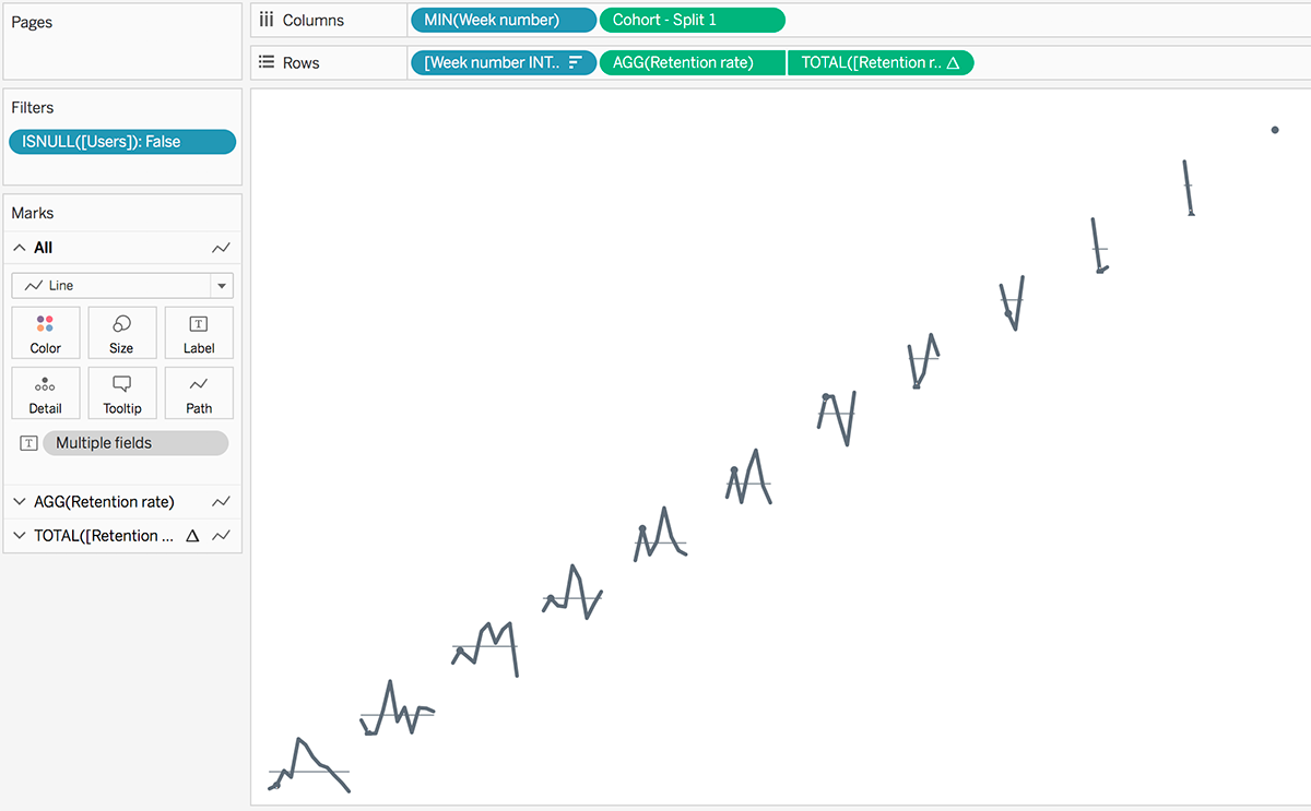
The first direction is vertical
Our eyes move this way when comparing the retention rates in a particular week across cohorts:
Some points I tried to improve by adding interactivity:
- focus on one week at a time
- look at a more accurate evolution across cohorts for a particular week
- compare the trend and a specific value to the weekly average
Here’s what I came up with:
Notice how it’s highlighting the current cohort with a dot in the sparkline beneath each week.
Update
Shortly after publishing this post I got a comment which I really dig! Both the comment and the fact that people are sharing their opinions publicly.
Sparking up discussions will only lead to progress, and I encourage you to speak your mind whenever you get the chance!
As far as the comment goes, Daniel pointed out two possible problems he found with my approach.
First, cohorts are discrete variables which cannot be connected with lines as I did with the sparklines that are showing up beneath the table.
You should (almost) never connect discrete variables with lines or areas. But in our case, the cohorts are represented by measures of time (week of acquisition). Which is why I consider my approach acceptable.
If the cohorts would be defined by discrete categorical groups such as user location, acquisition channel, etc. the cohorts values would be better represented with bars or dots.
Here’s how the interactivity would look like with tiny bar charts:
Notice that the bar charts are vertically oriented. This was another thing pointed out in the comment: since the cohorts are vertically aligned in the highlight table, horizontally reading their evolution might arise problems for end-user.
I usually read time-series horizontally, so for me, it works. But it’s also acceptable to visualize them vertically.
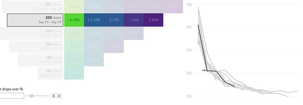
We can also read it horizontally when we want to follow the path of a specific cohort.
Interactivity to the rescue once again!
We can focus on each row at a time using a highlight action. And we have some perspective with the line chart popping up on the right bottom corner.
The big drops are pointed out in the line chart as well to draw attention to potential problems.
How to pointers
You can always download the workbook from Tableau Public to see how it works, but I want to share with you some ideas.
1. Set Actions are the primary driver of this dashboard’s interactivity. Although I have used a basic highlight on the table, the lines that show up are powered by set actions:
- adding color to the sparklines
- highlighting the hovered cohort in the right-side line chart
- displaying a dot for the week in focus
If you want to stay current, I recommend having a look at Lindsey Poulter’s blog. She’s been on a high-kick lately showing us how to make use of Set Actions!
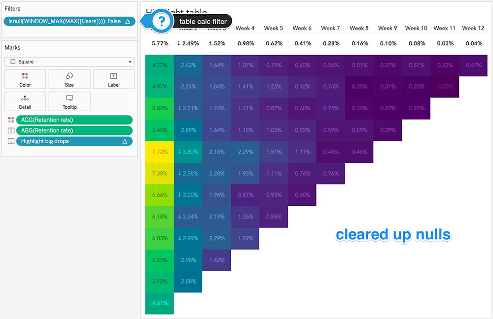
2. Transparent sheets
By disabling the highlight table’s background, I was able to show the sparklines at the bottom of every column.
As you can see, this wouldn’t have been possible without excluding the null values from the table:
I was able to hide the nulls using a table calculation filter:
For the sparklines I had to create a new sheet and align it “perfectly” behind the cohort table on the dashboard:
I colored all of the lines white and displayed only the one in focus with some set actions magic.
If we were to use a regular heatmap, we wouldn’t need a transparent background for it.
3. Filtering entire sheets
As you might have noticed, the line chart on the right only shows up when you hover on a bar item:
I pulled this off with a filter action set up like so:
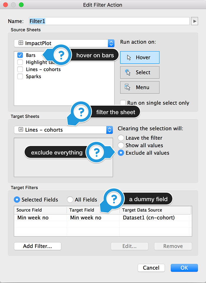
I used a dummy field that doesn’t affect the sheets in any way. We just need the selection to clear when we move our mouse away from the bars.
4. Other ways to approach the interactivity
I feel quite comfortable with how this dashboard works.
I would be interested to see how it would look if we were to highlight horizontally and vertically at the same time. Matt Chambers has recently written a guide on how to do it.
This is my challenge to you, Tableau enthusiast!
If you manage to do it or if you have other ideas to improve, ping me in the comments, on the live chat or on social media!
Context
They say that context is king nowadays. I believe that statement is very close to the truth.
It’s quite challenging to execute in real-life situations, but trying to put matters into perspective can help our visualizations a great deal.
I also believe that every audience has their preference. I feel obligated to point out the available options for you to choose from.
I hope I did a decent job with that!
Highly passionate about data, analysis, visualization, and everything that helps people make informed decisions.
I love what I do! I am working to improve speed in every aspect of my life and that of our clients.
I find comfort in helping people, so if you have a question, give me a shout!