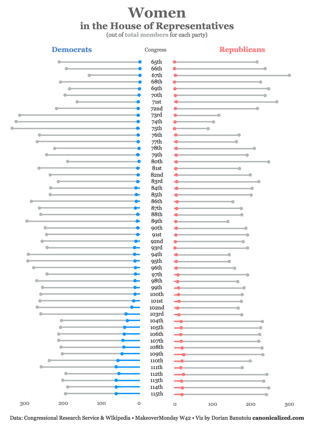
… or concurrent lollipops and dumbbells chart.
For this week’s MakeoverMonday we looked at women representation in the House of Representatives (no pun intended).
I came up with a population pyramid style chart. I put Democrats versus Republicans, where we would typically have men and women diverging to the left and right.
So here’s the final version of the visualization after implementing the feedback I got in Viz Review:
(*click on the image to interact with it in Tableau Public)
If you like it, keep going!
Why this chart?
I wanted to compare side by side the number of democratic and republican women for each Congress while keeping in context the overall count of members per party.
Even though the total number of members is not the main focus, I felt it was useful to keep in sight.
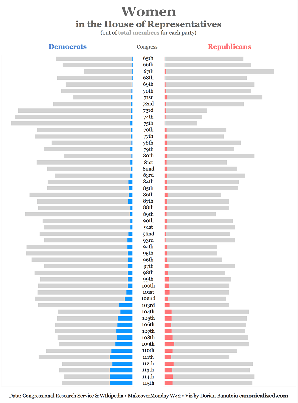
Why not keep it as a stacked bar chart?
The speed of iterating in Tableau is phenomenal! You can switch between different visualization types in a blink of an eye.
With this in mind and 30 seconds later, I tested how the stacked bar chart would look like:
I think it’s ok. However, by making the bars thinner and by adding the dots you get the feeling of progress towards a goal. In this case the progress towards diversity in the Congress.
Also, comparing the position of the dots as opposed to the length of the bars feels more natural.
Moving on to the technical stuff!
How to do it?
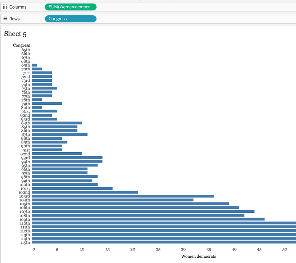
- We can start with a simple bar chart showing the number of women Democrats for each Congress:
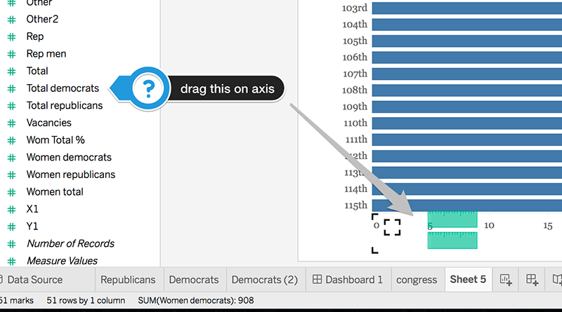
- Next, we drag the total number of Democrats on the X-axis to create a multiple measure chart:
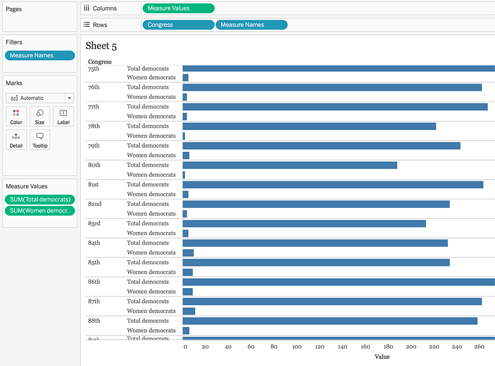
Tableau adds the Measure Names and Measure Values pills in the view like so:
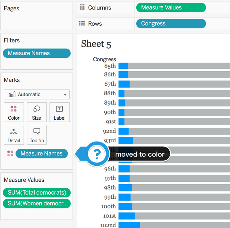
- We move the Measure Names pill from the Rows to the Color shelf:
At this point, we’re left with a stacked bar chart. Tableau will default to stacking everything on top of each other.
Since we’re using the total number and women as Measure Values, our totals would get messed up.
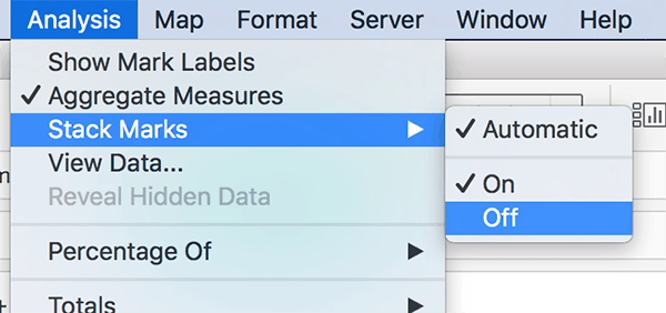
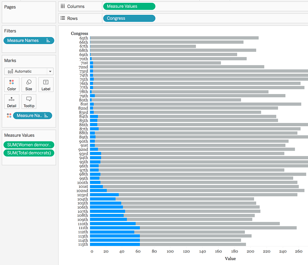
- If we turn off the stack marks option, we will obtain the correct position for the bars:
If you want to avoid turning off the Stack Marks, you can create a calculated field with the difference between the total number of members and the number of women.
So here’s our bar chart for the Democrats:
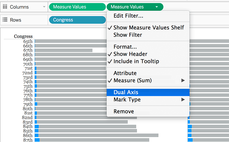
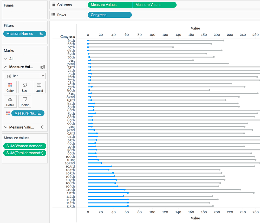
- We duplicate the Measure Values pill (CTRL/CMD + drag) and set it to dual axis:
- Quick steps:
- synchronize axis
- change the first pill’s graph to bar
- keep the second pill’s graph to circle
- reduce the size of the bars until you get your desired effect
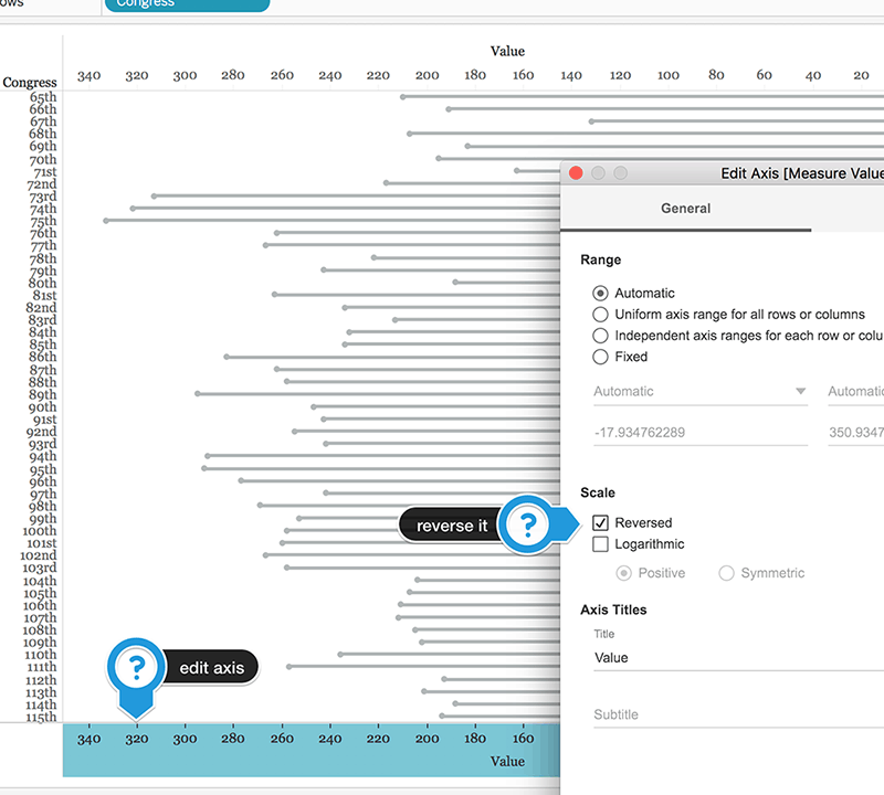
- In our dashboard we have the Democrats on the left side, so we need to reverse our axis:
Now that we have our Democrats, we’re left to do the same process for the Republicans except for reversing the axis.
At this stage, we can all figure out how to get them onto a dashboard side by side.
There’s one thing I want to point out before we finish off: in most cases, the scales would differ from left to right.
We have to make sure we’re visualizing on the same scale. We can either fix the axis and manually enter minimum and maximum values for it, or we can add transparent reference lines with the overall maximum from both sheets.
The feedback
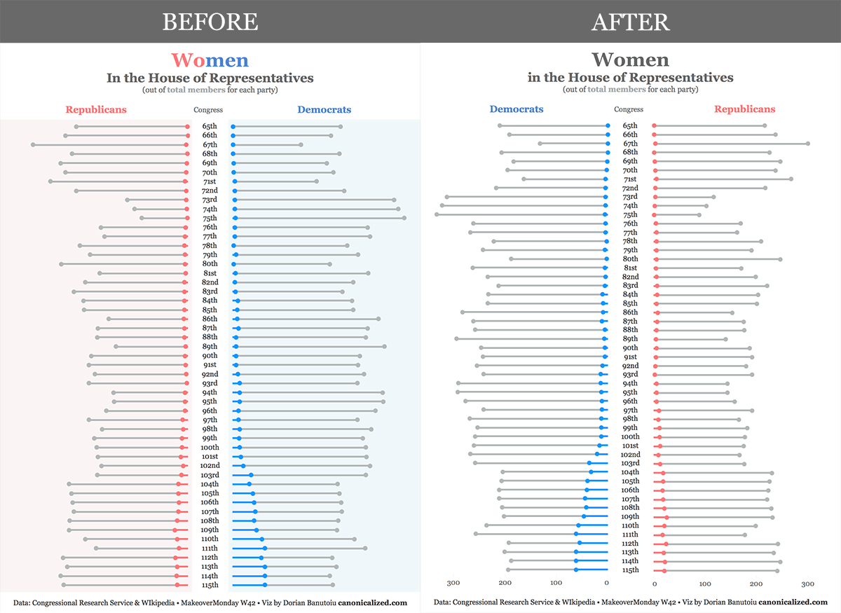
Before we call it a day, I want to show you the initial version of my viz and how it I changed according to the feedback I got from Andy and Eva in the MakeoverMonday Viz Review.
I am convinced you can spot the differences on your own. Let me know how impactful you think they are!
Highly passionate about data, analysis, visualization, and everything that helps people make informed decisions.
I love what I do! I am working to improve speed in every aspect of my life and that of our clients.
I find comfort in helping people, so if you have a question, give me a shout!
