“Know your customer!” This might be the most common business advice out there. We read about it on blogs, social media, we see it in presentations, we hear it from experts.
I’m not too fond of this advice. It makes me cringe when I hear it.
Mainly because it leads to ambiguous questions like “how?” or “where to start?”.
I don’t blame the people who are asking these questions; I blame those who give truncated advice.
They tell us we should know our customer and in 90% of cases, they leave it at that.
I want to share some ideas of how we helped a client find out more about their customers.
It might not apply to your case entirely, but I hope it will provide you with the inspiration you need to make progress.
How to start?
You start with a question or with a hypothesis along the lines of:
- what’s the most common age of our customers?
- do we sell more to women or men?
- I believe our customers are mainly young women
Make no mistake: the only way to start is by starting. Not by overthinking what might happen.
It’s a simple mental switch.
Once you kick off, you will figure it out! You just have to be willing to put in the effort.
How to find customer demographics?
There is absolutely no way you don’t have data about your customer’s age, gender, location, etc. laying around in a corner somewhere!
There’s no problem if you don’t. However, if you don’t start collecting it right now in one way or another, you are missing out!
Missing the point with Microsoft Excel
The client wanted to look at customer age and gender for each of their products.
The main goal was to improve product development by finding gaps in their catalog. The secondary one was to find out the best way to market each product.
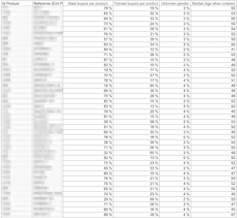
They wanted the data in the form of an Excel table. Here’s how a soul-crushing crosstab looks:
If you want to try to decode such a thing, be my guest. I have nothing against tables as long as your only purpose is to look up precise values.
But if you want to do more and reveal interesting patterns, there are better options.
My main problem with the table is the median age column. The differences among products seem so small! One might be led to believe that most customers have ages between 40 and 55.
If Excel could easily connect to a database, this article would probably have been a short remark. Fortunately, not all business people are willing to spend their time learning something like Power Query.
So we got to use Tableau to be able to look at the underlying data in a more meaningful way. And I always love that!
- How can firms use customer demographics to market to their customers better?
- How can companies use customer insights for product development?
- How can organizations use data to make informed decisions?
It’s not that complicated. All you have to do is …
Let the data tell its story!
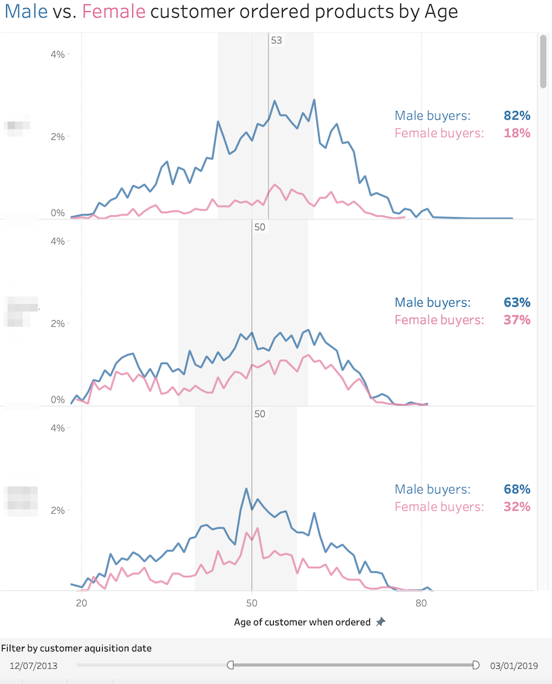
Below is the dashboard we came up with. The median age and gender distribution are in place.
We just added visual details to reveal the actual shapes of the distributions.
This type of line charts are called frequency polygons (very similar to histograms).
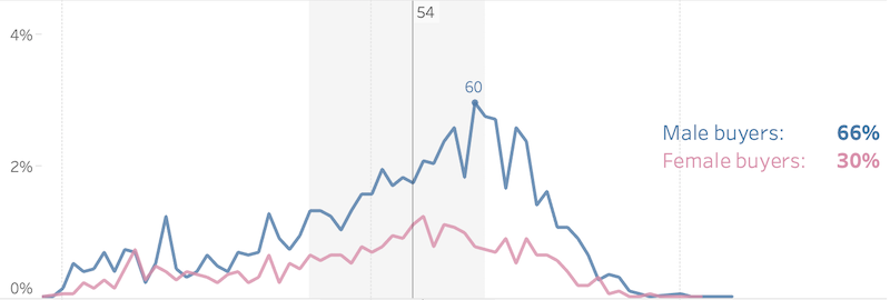
Each row represents the Male vs. Female customer distribution by age for one specific product.
Way better right? We were able to bring this data to life with the help of Tableau!
In this design, we can scroll down and inspect the distributions for each product.
Here are some interesting findings:
1. Visually contradicting false assumptions is refreshing
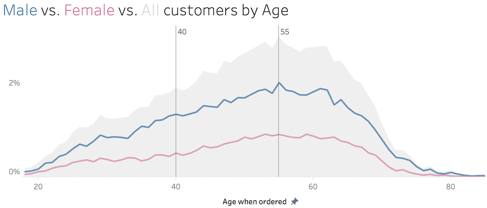
The myth that most customers are aged between 40 and 55 is totally busted. This is the age distribution for all the customers:
2. Averages can hide insights in a big way
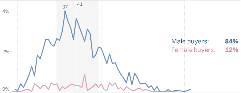
Have a look at the pattern for the product below. The median age is 41, but we can see that there is a big chunk of customers aged between 30 and 50. Also, the peak age is 37, which is quite far from 41.
Here’s another example. This time have a look at how the ages greater than the median go up, peaking at 60:
3. Good data visualization can spark discussions leading to healthy decisions
Armed with this information, we got to talk to the operations manager. We were mostly curious about why women tend to buy products that are designed for men.
My initial thought was that women might be buying the products for their significant other.
Surprisingly, no!
Women are buying men products simply because there are more exciting options regarding design and colors.
Beautiful piece of information! More than that, its utility is not limited to product development and marketing.
The CEO was thinking about siloing their products by genre. It was purely based based on intuition and uninformed third party advice.
This would have made it more difficult for women to access the male part of the catalog. Someone would have ended up annoying some prized customers.
Bad decision avoided!
4. Data visualization leads to research ideas
Some of you might want to dig deeper into matters. Let’s say that you want to create marketing personas for your customer groups, but you don’t have the full spectrum of data.
What can one do? How to research customer demographics?
Survey your customers! You can even offer them incentives to fill in gaps in the data such as:
- income
- employment status
- education
- what they like to do
- what do they read
- how they spend their time
- etc.
It will pay off in the long term!
5. Good data visualization leads to ideas
We also got to talk to the marketing manager who had an alluring question after seeing the initial dashboard.
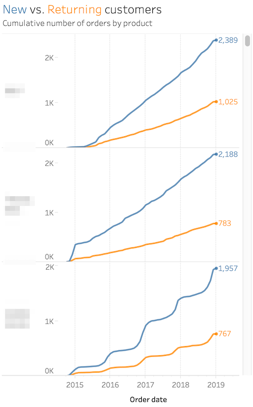
She was interested in looking at new vs. returning customers by product. The purpose was to understand how marketing efforts are performing in bringing in new customers as opposed to selling to existing ones.
Here’s how such a visualization might look like:
Are you already spotting patterns? That’s good. It means that the data is doing its job!
Seeing is believing
Keep in mind that the best way to understand data is almost always visually.
Anyone can do this kind of analysis, and everyone should do it!
If you do, please share your story! Together we can make the world a more objective place!
Highly passionate about data, analysis, visualization, and everything that helps people make informed decisions.
I love what I do! I am working to improve speed in every aspect of my life and that of our clients.
I find comfort in helping people, so if you have a question, give me a shout!
