I am proud to announce the launch of Financial DataViz, a collection of data visualizations targeted towards the finance industry, created by Dorian Banutoiu. This project is an effort to delve deeper into the topic of finance and bring forth valuable insights through data visualization.
To achieve this goal, I will be exploring various topics, visualizations, and datasets within the finance industry, using Tableau as my primary tool. From time to time, I will share my findings through new visualizations created in Tableau, guiding you through the entire process, from gathering data to creating charts and dashboards.
My aim is to make complex financial data easier to understand, by presenting it in a visually appealing and easily digestible manner. The focus will be on exploring various aspects of finance, including investments, economics, personal finance, and more.
The visualizations created will not only showcase the insights hidden in the data, but also demonstrate how to use Tableau to create similar visualizations. This will provide an opportunity for individuals and organizations in the finance industry to enhance their data analysis skills and take their visualizations to the next level.
I am excited to embark on this journey and look forward to sharing my findings with you. Stay tuned for more updates and insights from Financial DataViz!
Why Focus on Finance?
In my experience and observations, financial data is often presented in tables, lacking the visual appeal and simplicity of a data visualization. That’s why I’m embarking on this project – to bring to light the value of visualizing financial data.
As a big fan of financial charts and dashboards, I believe that these visualizations can be not only beautiful, but also meaningful and useful in providing insights.
My ultimate goal is to create a comprehensive collection of financial visualizations that can serve as a go-to resource for myself and anyone else interested.
I have high hopes for this project and am confident that the value it brings will go beyond the screen. I hope you find it as valuable as I do, as this is a true labor of love.
Before we start
There are a lot of resources out there! Here you will read about my perspective on things. Please don’t agree with it, as I love a good debate!
Feedback is of extreme importance to me. If you have any thoughts, please share them loud! Constructive criticism can only lead to progress.
If you want to viz along with me, you are more than welcome to do it. The only way to learn is by doing!
So let’s get started!
First up, stocks!
In this section, I will reproduce some of my favorite stock and trading chart types. I will try to explain why they work well and expose some of their weaknesses.
Of course, you can use them beyond financial data once you understand what works well about them.
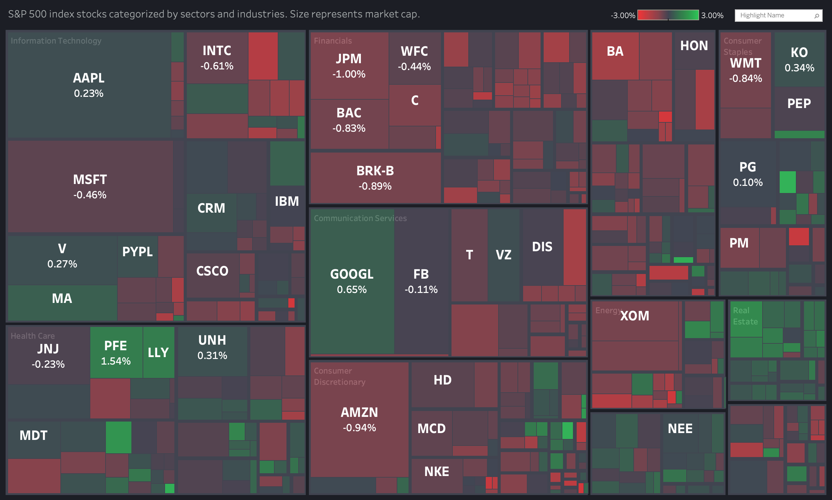
#1: S&P 500 stock market overview
(click on the image to interact with the visualization on Tableau Public ⇡)
What I love about this dashboard
- it offers at a glance performance overview of the whole market
- displaying complex hierarchies is an excellent use case for treemaps; I dug up some old articles on how treemaps should be used, and I feel that this article from Jeff Shaffer sums it up nicely
- it adds additional context in tooltips (showing up when we hold our mouse over a specific stock)
Weaknesses
- the red-green color palette which seems widely accepted in the financial data world is making this dashboard unusable for colorblind people (I recommend using red-blue if you care about this)
- it’s difficult to make accurate comparisons based on color and irregular box sizes (I’m okay with it as long as the purpose of the dashboard is to show the market overview)
The Data
Collected from Yahoo! Finance using Python. There is no need for API keys or paid subscriptions.
You can find the code in this Github folder (the main script is in the getSandP.py file).
How to create this dashboard in Tableau
Update Shortly after publishing the visualization, it was featured as Viz of the Day on Tableau Public.
I am taking this acknowledgment as an obligation to do more and better work!
So let’s move on to the next challenge!
#2: Historical evolution of the stock market
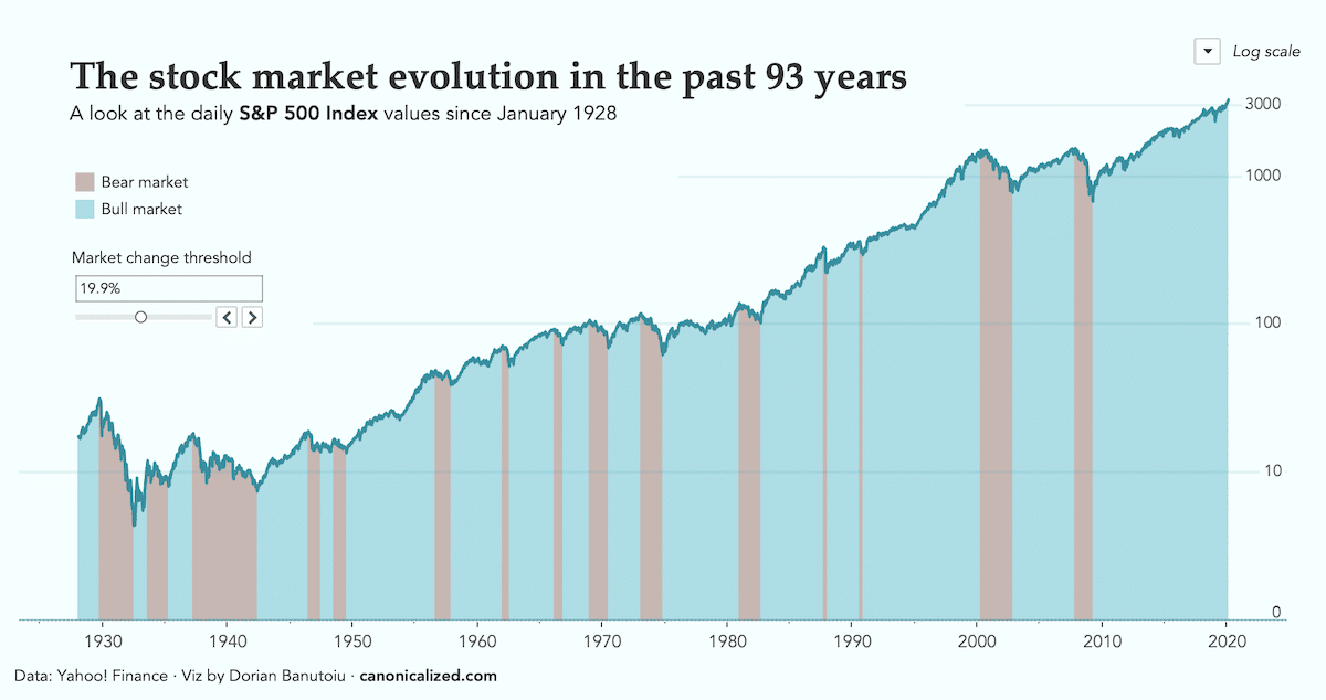
This week we are looking at how the stock market has evolved since 1928.
Now, why would we do that?
First of all, for fun! Also, those who don’t know their history are doomed to repeat it.
So I set some time aside to try and understand some facts.
Below is the dashboard I ended up with:
(click on the image to interact with the visualization on Tableau Public ⇡)
The chart shows the daily values of the S&P 500 Index since 1928 with different colors for Bear and Bull markets.
My inspiration for this chart comes from an article I read in The Economist a while back. It’s pretty much a reproduction of that in Tableau.
I am in love with The Economist graphics. They are informative, their look is super clean, and they complement the written article perfectly!
My only problem is that most of them are static. My friends often surprise me with a ruler or cardboard pieces trying to make sense of the charts.
I know, I’m weird!
For this chart, I added two interactive elements I felt the need for.
The first is a threshold controller for when a market is considered Bull or Bear.
The article mentions a brief Bear market in 1990 that some argue it didn’t reach the technical threshold of 20%. The market dropped by 19.9% from the previous high, which technically isn’t Bear.
Using a parameter, we can now move that threshold to see what would happen at 20%, 19.9%, 19%, and so on.
I also wanted is a switcher between logarithmic and classic linear axes.
Many people don’t get log scales. But from what I am seeing, they seem to be widely accepted in the trading world.
I would guess that the reason behind it is their usefulness for comparing rates of change over time.
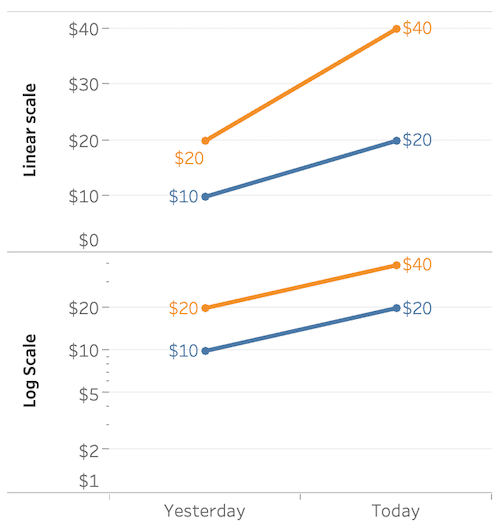
For example, the distances between $10 – $20 and $20 – $40 are the same on a log scale. Both scenarios represent 100% growth. Hence their slopes are equal as you can see below:
A linear scale would give us a better indication of the magnitude of evolution.
Let’s take January 23, 2020, as an example. The S&P 500 index surged past 3300 for the first time in history!
Not very easy to notice in the log-scaled chart.
Using a linear scale would give us a better feeling of how the market has exploded in the past decade:
With the linear scale, we can’t see how the market was changing in the early days. Offering our audience an easy way to switch back and forth would fix both problems.
This is also something Viz Animations (the new to be released feature of Tableau) would help with understanding. Sliding from one state to another gives us a better feeling of what is going on.
The Data
The data comes from Yahoo! Finance, which you can find at this address.
How to video tutorial
It might seem easy to develop at first sight, but it was not a walk in the park.
I did everything in Tableau to practice more with Table Calculations, and to show what the software can really do.
I believe that these techniques will be useful in other cases as well. It’s a great way to look at dense time-series data!
Hopefully, this video will save you some time if you’re trying to do something similar!
#3: Financial results by business segment in a Small Multiples Dashboard
I’m taking a break from stocks this week to have a look at Sony’s financial results.
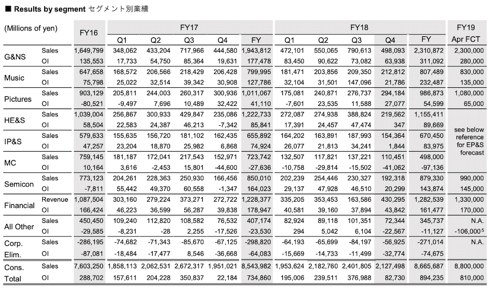
First, let’s have a look at how the company is showing the data. You guessed it. It’s a table with numbers.
While I can certainly see the value it might have for finance professionals. I want to try a different way of visualizing the data.
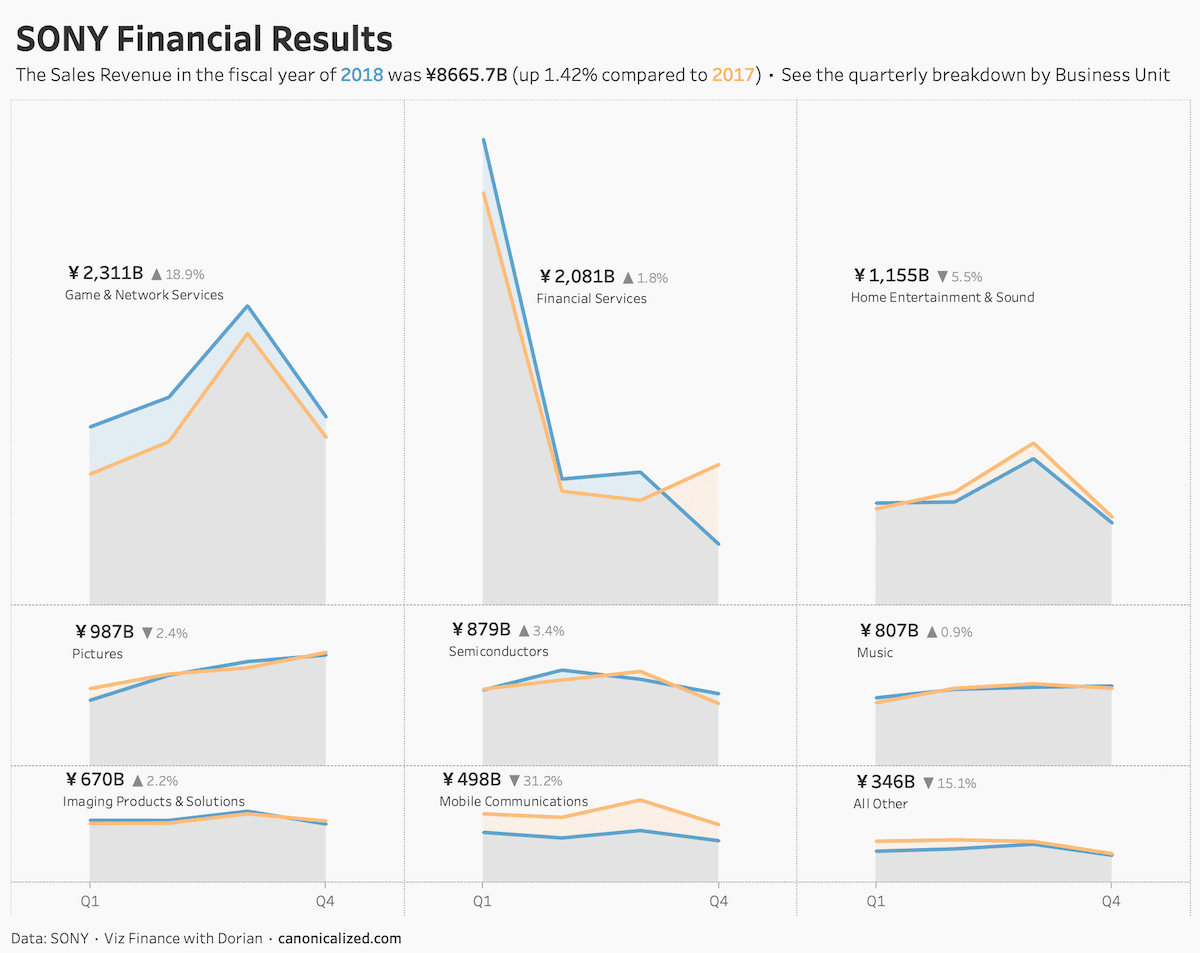
Below is what I came up with:
(click on the image to see the dashboard on Tableau Public)
The dashboard tells a few exciting stories that would be difficult to distinguish from looking at the table, such as:
- the Game & Network Services segment is growing big time (probably powered by PlayStation sales)
- Financial Services shows an interesting pattern with a high in Q1; additional question: why is Q4 of 2018 so much lower than 2017?
- Home Entertainment is winding down; additional question: could the decreasing interest in Sony TVs cause this?
- mobile communications is down 30%; apparently Sony’s mobile phones are not catching on
What I love about this kind of visualization is its potential to spark conversations around data. By using Tableau, we can answer a lot of questions on the spot. And here is where real progress can be achieved!
Should I company that’s making thousands of billions invest a few yen in helping their users understand the data at a glance?
One can only hope!
Finance people love their tables. But what if we display the dashboard alongside the crosstabs? Maybe we can convince a few of them to give data visualization a chance.
What we can do is keep trying. And that is what I’m going to do!
A few thoughts on the chart type
I arranged all the business units in a small multiple layout to be able to see everything on one screen. You might also call it by the name of “panel chart” or “trellis”.
What you might not notice is that the height of the rows is not the same.
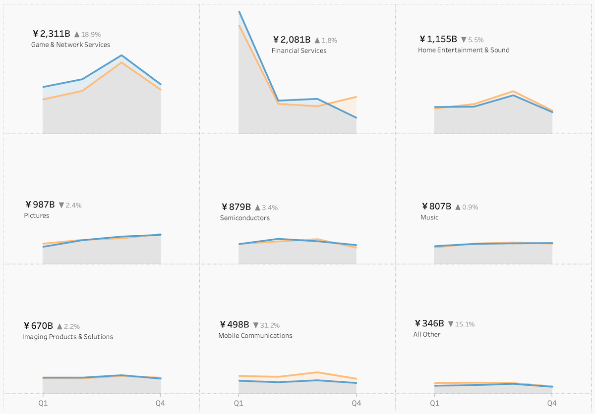
By default, Tableau creates equally sized cells. Here’s how my dashboard would look by default:
Some might argue that this is a waste of space.
I somewhat agree, especially for dashboards with lots of segments to display.
But they obviously haven’t heard about Klaus Schulte’s method of getting rid of the grid. I am adapting his solution to size each row differently.
See the video below for more details (including color trick I used to shade between the lines)!
Video with implementation details
And now if I may take a small dig at the PowerBI users complaining about this. Anyone can download this workbook for free from my Tableau Public profile and use it in their work.
But I also want to thank them for inspiring me to work on this!
The Data
The data comes from SONY’s website, which you can find in this PDF doc on page 3.
#4: Improving the way we interact with time series
Welcome to the 4th week of my journey to visualize financial data in Tableau!
Today we’re looking at the Tesla stock evolution. The company’s share price has surged in the past two-three weeks, and I wanted to see for myself how that happened.
There’s no chart is better than a line chart to see evolution across time. And this is precisely what I used!
Here’s the interactive version of the dashboard:
(open the dashboard on Tableau public)
Simplicity was essential for me here. Even though the chart type is super simple, the complexity comes with the interactivity I built into it.
Now if you’ll take a second to play around with it, you’ll notice that:
- you can filter to predefined periods ranging from one day to the maximum available
- the date level changes according to the length of the period (hourly data for one day, daily for five days to one year, and weekly for 5+ years)
- you can hover your mouse anywhere across the chart area and a reference line will show up with more details about that date
The interactivity is possible thanks to parameter actions, available in Tableau since 2019.2
After exploring the dashboard a bit, we can start to get some real insights.
- for example, we can see that there was a vast increase starting with Monday (Feb 3rd), reaching an all-time high of $887 the next day
- we can also filter back to one year and see the downward trend ending in June of 2019
- we can look at hourly data from yesterday, which doesn’t say much to me, but it might to the passionate traders out there
- and we can have the whole picture from IPO to yesterday, which shows the magnitude of growth that happened recently; huge!
Walkthrough video with technical details
The Data
Collected using the Alpha Vantage API via R. It’s the only resource I found that offers intraday data for free. You can register here to get one too. The R code I used is on my Github profile.
If you have difficulties in getting the data, reach out to me, and I’ll try to help!
#5: Encoding change in bar charts
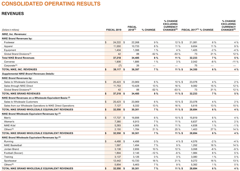
This week I am rethinking one of NIKE’s revenue reports for the fiscal year of 2019. Below is a screenshot of the table I found on the SEC website:
The report looks at the revenue for the last 3 years and breaks it down in a few different ways.
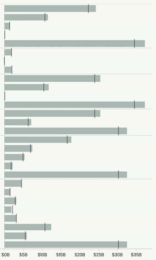
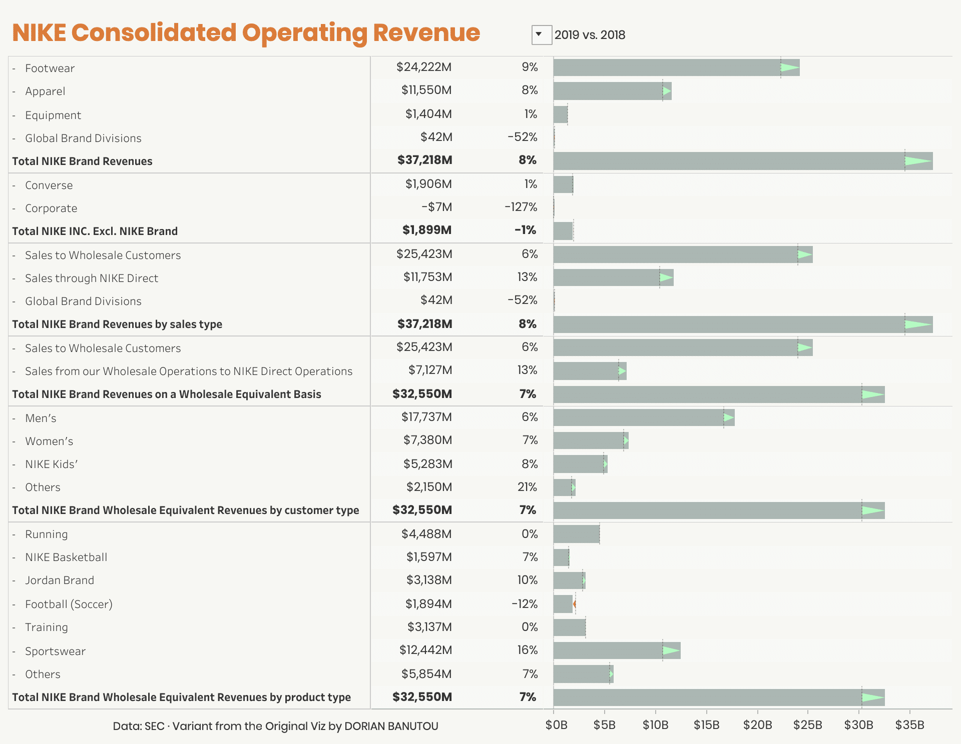
Without further ado, here’s how I visualized the data in Tableau:
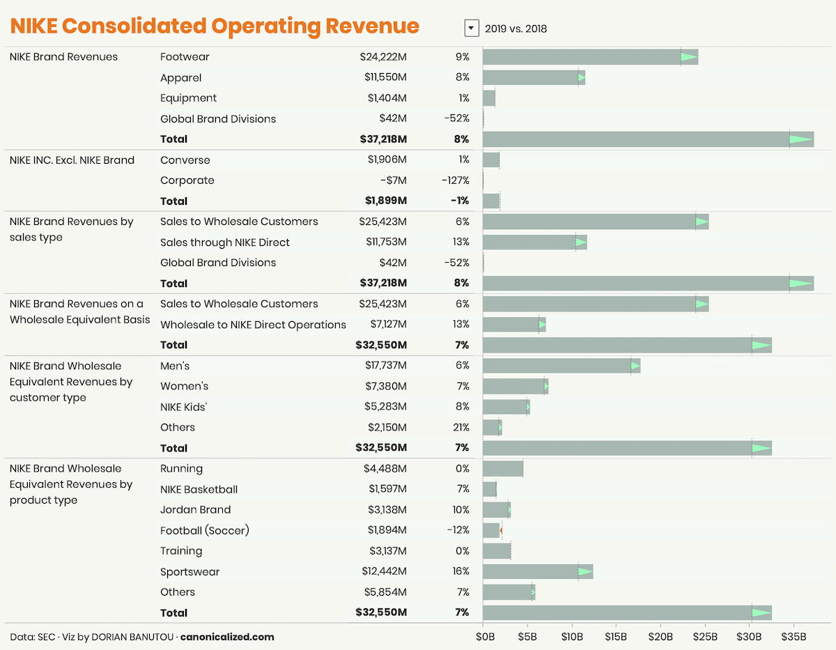
(click on the image to see the interactive version on Tableau Public)
A tad more insightful, I’m sure you would agree!
My goal was to create a dashboard that anyone can use to understand the data at a glance.
The numbers are there for the taking, and I added the bars for visual context.
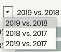
There’s also a selector at the top we can use to compare different years.
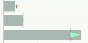
On the bar charts, I wanted to have something the shows the direction and magnitude of change.
I noticed that this type of arrows is often used in the financial world, and I wanted to give it a try. And I am quite pleased with the result. Here is how I would usually go about it:
It’s not bad at all, but I think the arrows direct my attention faster to the significant changes.
To see how I created the arrows, you can go ahead and download the workbook from Tableau Public and reverse engineer or see the video tutorial below.
Instructions on to build such a thing
The Data
The data comes from the SEC website, which you can find at this link.
Update I want to share a not-so-slightly changed version of the NIKE Revenue dashboard.
Shortly after publishing my version, Rosario Gauna (Tableau Zen Master) reached out to show me a way to integrate the section titles in the totals.
It involves some additional work, but the end result is something that makes much more sense for accounting/finance people.
There is a blog post with details about the technique by Rosario and Klaus Schulte. They called it “internal data densification”.
Don’t get frightened by the name, the principle is not that scary!
Klaus recently wrote a blog post on custom sub-totals offering not one, not two, not three, but four methods for implementation.
I want to thank both of them for the work they’re putting in for the community!
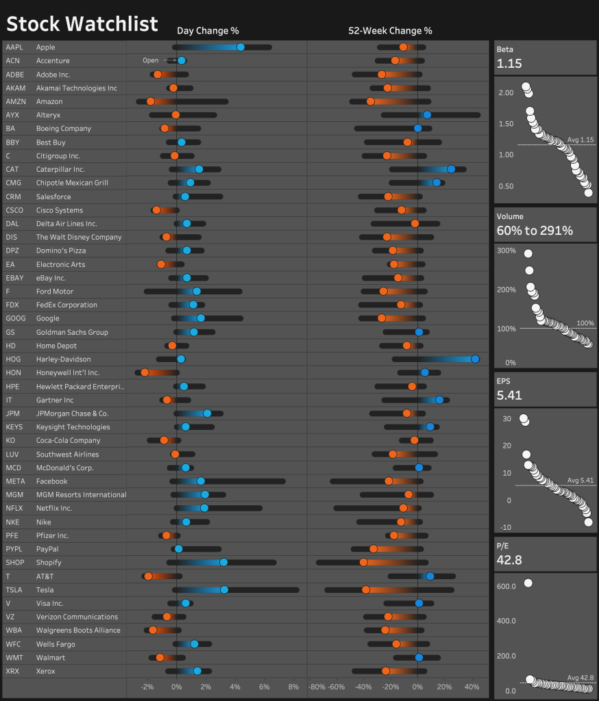
#6: Stock Watchlist Dashboard
(click on the image to interact with the visualization on Tableau Public ⇡)
What I love about this dashboard
- It provides a comprehensive overview of multiple stocks, making it easy to compare their performance
- The interactivity allows us to explore details of a specific stock by simply clicking on it and expanding the space
- The combination of charts and tables on the right side provides additional context for each stock
Weaknesses
- The dashboard is only as up to date as the data source, which in this case is Google Sheets and may not reflect real-time stock information
- Using Tableau Public requires extracting the data which can be updated automatically once a day or on demand; to be able to use a live connection you need to use Tableau Cloud or Server
- The layout may appear overwhelming for some users, with a lot of information packed into one dashboard
The Data
The data for this dashboard is sourced from Google Sheets and updated every 5 minutes using the GOOGLEFINANCE function. No API key or authentication is needed, making it accessible to everyone.
To create your own watchlist, all you need to do is to fill in the company name and ticker in a new row in the Google Sheets template. It’s important to type the ticker correctly as it is used in the function that downloads the data.
The Tableau Part
Once you have connected Tableau to Google Sheets, you can start working with the data. The first step is to connect Tableau to the Google spreadsheet by selecting ‘Google Drive’ under ‘Connect’ (To a Server).
After authenticating through the browser, you can search for your Google Drive files in Tableau.
The Visualization
The stock watchlist dashboard displays a lot of information about multiple stocks, including their relative change for the past day and past 52 weeks.
The left side shows the change for each stock, while the right side provides additional context through charts and tables, including Beta (risk metric), volume traded, EPS (earnings per share), and P/E (price to earnings ratio).
The interactivity allows us to explore the details of a specific stock by clicking on it and expanding the space, which also highlights the item on the right-side charts. This feature makes it easy to compare the details of different stocks and understand how they fit into the broader context.
You can read more about this dashboard in the article titled “How I built my own Stock Watchlist Dashboard in Tableau via Google Sheets”
Highly passionate about data, analysis, visualization, and everything that helps people make informed decisions.
I love what I do! I am working to improve speed in every aspect of my life and that of our clients.
I find comfort in helping people, so if you have a question, give me a shout!
 (
(