Tableau 2018.3 was officially released today, October 30th. Set Actions is one of the most intriguing features I’ve been waiting for.
From my point of view, it enables a whole new universe of use cases.
Just today I found a way to employ them while working on a cohort analysis.
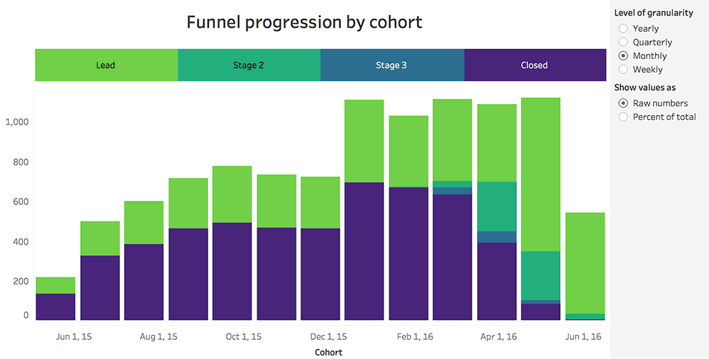
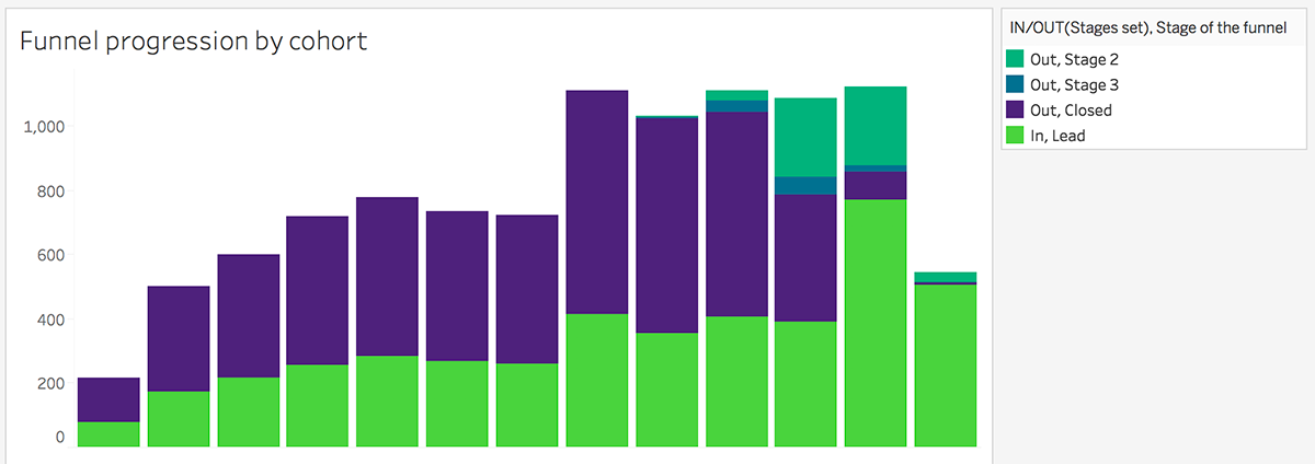
Here’s a stacked bar chart showing how users are progressing through a sales funnel by their acquisition date:
*Also called a column chart when the bars are vertically oriented.
The problem
It’s quite easy to analyze “Closed” leads (the dark violet part of the bars) and the totals. The situation becomes difficult when we try to compare the other stages amongst themselves (“Stage 2”, “Stage 3”, and “Lead”).
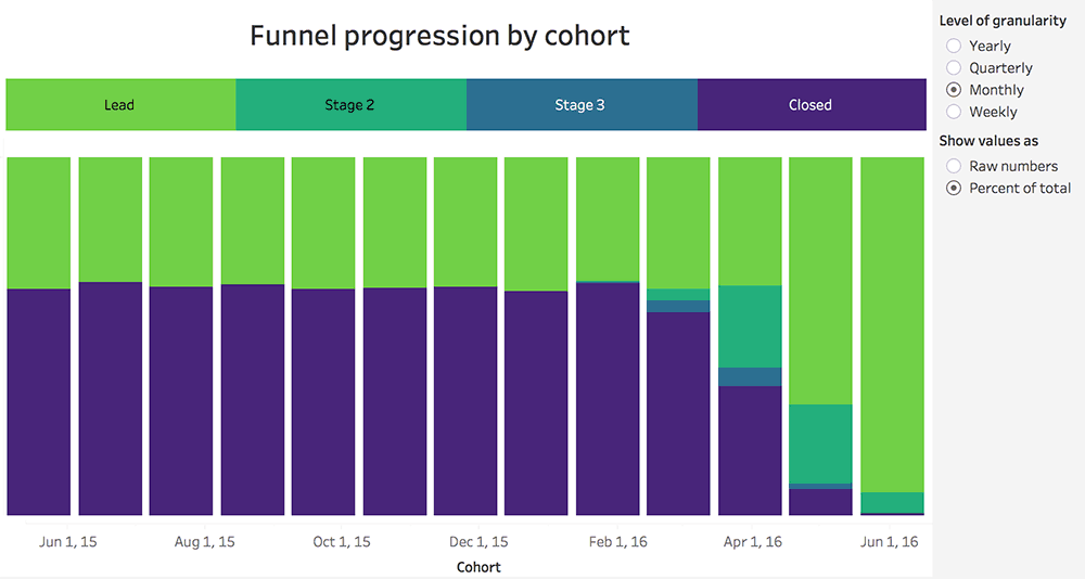
One thing we can do is to use percentages instead of the actual values. Comparing people in the “Lead” segment becomes easier, but we lose track of the totals, and we still have difficulties with the middle stages (“Stage 2” and “Stage 3”):
Enter Set Actions
To focus on one category at a time while keeping the others in sight, I implemented an interactive component.
Notice how we can move the bars we’re interested in at the bottom by merely clicking on a particular stage “button”:
Now it’s much easier to compare the different groups since we can quickly place them on a common baseline.
With this new feature, we can change the values within a set by clicking or hovering on certain dashboard elements.
Update: I discovered this article by Steve Wexler where he deals with the stacked bar issue in a similar way using parameters. He also offers some examples where stacked bars work very well. A must read!
Go forward if you want to see how you can do it on your own!
The technical part
The process is quite accessible.
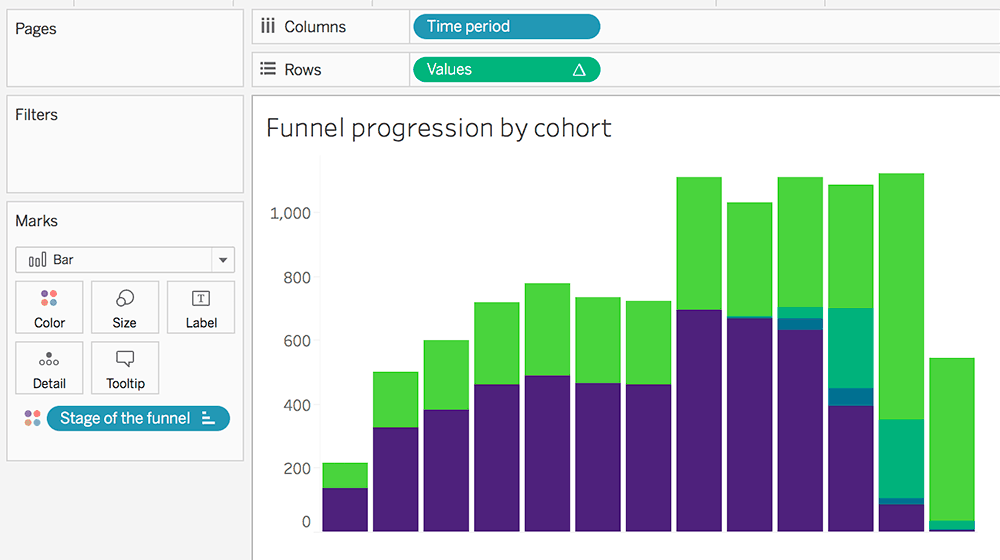
Let’s start with a regular stacked bar chart over a time period:
Part 1: the set
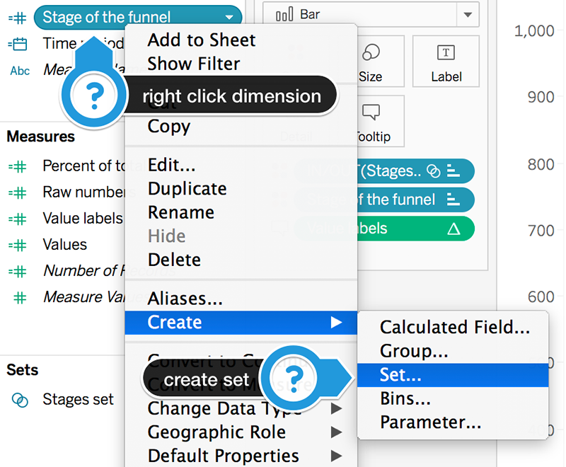
Step 1: We first need to create a set with the categories (stages in our case).
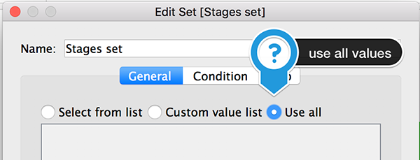
Step 2: Make sure you select the “Use all” option for the set (Tableau will default to these values when the set action is cleared):
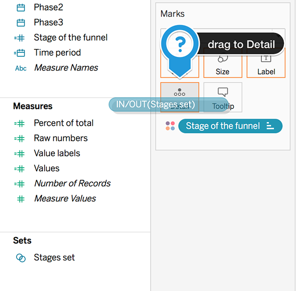
Step 3: drag the newly created set to the Detail shelf (placing it on the Color shelf would remove the current dimension from there, and we don’t want that)
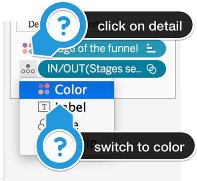
Step 4: Change set mark type to Color (this will keep both pills on the Color shelf)
At this point, you’ll notice your colors will get messed up (you can just set them up once again).
Now that we have our set in place, we need some “buttons” to drive our interactivity.
Part 2: the set action controller
Step 1: For the buttons we shall create a new sheet with a horizontal dummy bar chart.
This is how I set them up:
Step 2: Clean them up, drop them onto a dashboard, line everything up and we have our viz:
It’s just missing the cool interactivity. Step 3: add it!
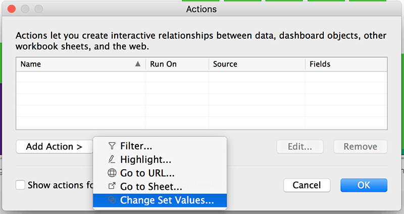
Go to Dashboard > Actions, click on Add Action, next on Change Set Values:
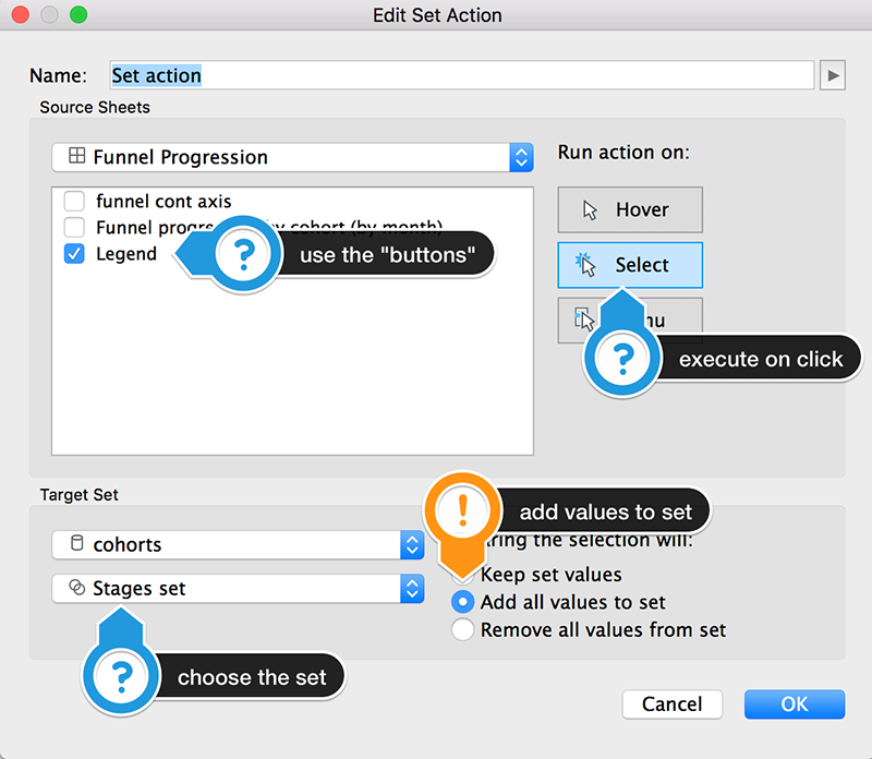
Step 4: Configure the Set Action; here’s how:
At this point the action should become functional:
As you can notice, there are two glitches:
- the highlighted parts are at the top
- the colors for the non-highlighted portions are messed up
No to worry! We should go back to our stacked bar worksheet and do some changes.
Part 3:
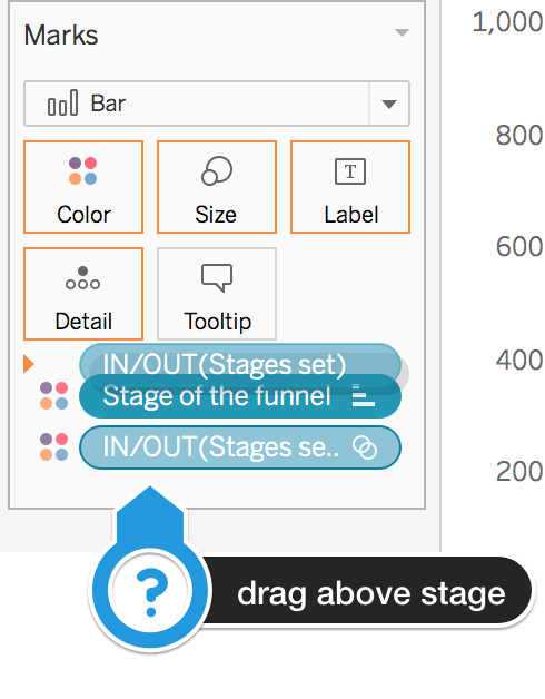
Step 1: make sure the set resides above the categorical dimension!
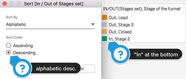
Step 2: Sort the set value so that “In” resides below “Out”.
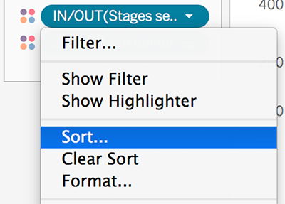
Right click on set and choose the “Sort” option.
The most reliable option would be to sort the Set alphabetically in descending order. Confirm by looking at the color legend while clicking the controller “buttons”.
Step 3: the highlight colors
We could set the colors for each stage-set combination individually, or we can try a neat trick I learned from Jeff Shaffer.
First, we set the same colors for the “Out” values as we would for the “In” ones:
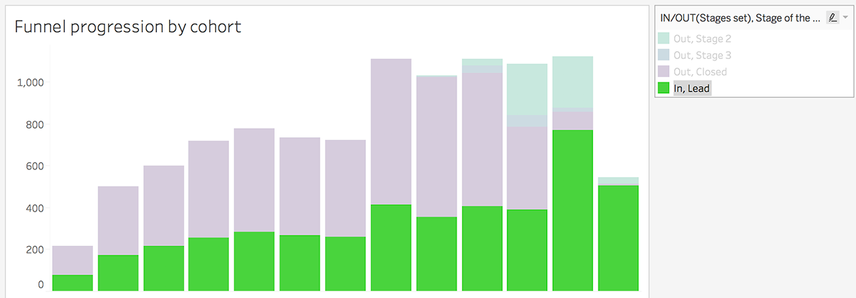
Secondly, we turn on the highlighter on the legend, and we click on the “In” value:
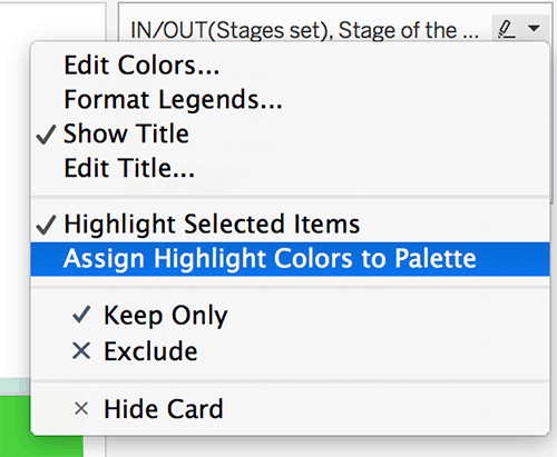
Next, we open up the legend options and click on “Assign Highlight Colors to Palette”.
We have to repeat this process once after selecting a different stage (category) to make sure that all the colors are right.
And this is it!
It might seem like a lot of work, but aside from the set sorting, the process is pretty straightforward.
Inspiration and final thoughts
I first noticed this kind of interactive stacked bar in a GIF tweeted by Rody Zakovich.
If you have been following my Tableau content, you might have noticed that I like reverse engineering data visualization stuff like stream graphs, bee swarms, and more to come.
This was another one of those eye-opening situations.
If you want to learn more about what you can do with set actions I recommend Mark Reid’s article, Andy Cotgreave’s tips on proportional highlighting, Chris Love’s viz on Titanic survivors, and Simon Beaumont’s dashboard on Premier League Players origins.
These are probably just scratching the surface. There’s a whole new world to explore, so time to roll up our sleeves and dig in!
I hope you can put some of these ideas to work! If you need any help, let me know!
[Update] Using the legend to stack the bar chart
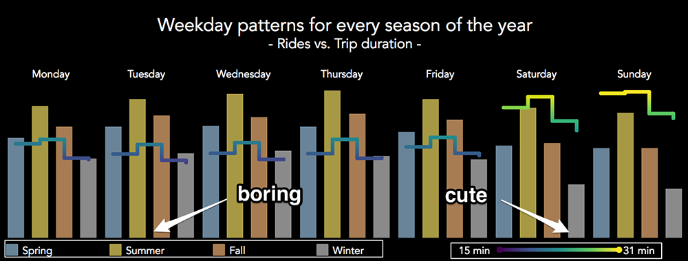
First, legends are boring! Well, not all of them, but most are.
I can exemplify with a chart of my own:
On that note, I got some inspiration from this Flourish article not only to replace the legend by colored words in the subtitle but also to use them as filters.
Here’s an example chart I built for Makeover Monday regarding the cost of a date night out in different cities around the world:
Notice how the subtitle “legend” does more than just filtering the chart. You can select/deselect categories for which you want to display the data.
Tableau implementation
There are a couple of headaches to overcome.
First, for the Set Actions interactivity to work we need to create a set and a sheet for each category.
Lindsey Poulter, my favorite interactivity innovator, has a guide with the implementation details.
Secondly, there’s a glitch when clicking on text in Tableau.
Here’s what I mean:
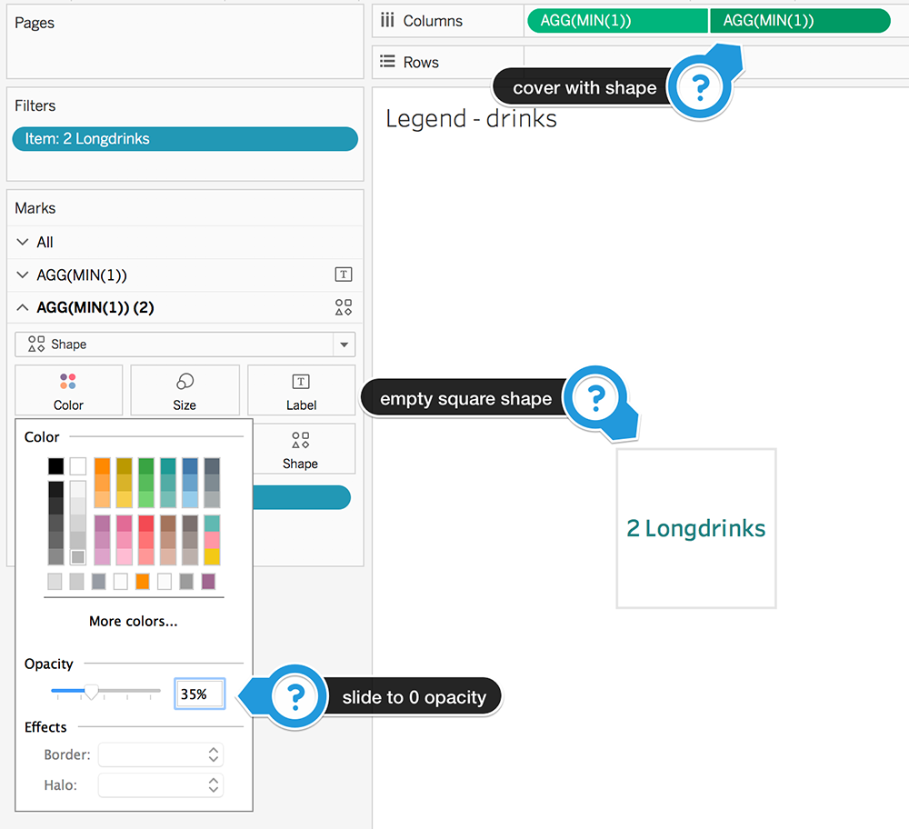
There’s a sort of highlight which I utterly dislike. To avoid this from happening I added shapes in front of the text using a dual axis.
This is a process we have to repeat for each label and align the sheets manually in the final dashboard.
As you can see, the process involves a bit of manual work and some unorthodox tricks.
However, I believe that allowing the end user to “build their own chart” is quite powerful. It’s also a cool way to interact with the data!
Highly passionate about data, analysis, visualization, and everything that helps people make informed decisions.
I love what I do! I am working to improve speed in every aspect of my life and that of our clients.
I find comfort in helping people, so if you have a question, give me a shout!
