We want to share with you a sleek case study where we take a crappy Tableau dashboard, and we turn it around for the better.
In the first part of the article, we are going to focus on the technical details of improving the loading and interacting speed.
Towards the end, we will include a sneak peek of the new improved version we’re working on.
Before anything else, how do we define performance? For us, it’s how fast we can get from question to answer.
There are two sides to this story: the actual speed of the dashboard and the time it takes for the user to understand it.
The quality of the question has a direct influence on the quality of the answer. We see it as a part of the performance optimization process.
Let’s have a look of what we had to deal with!
Starting point
Marketing company with multiple clients sending out a monthly update.
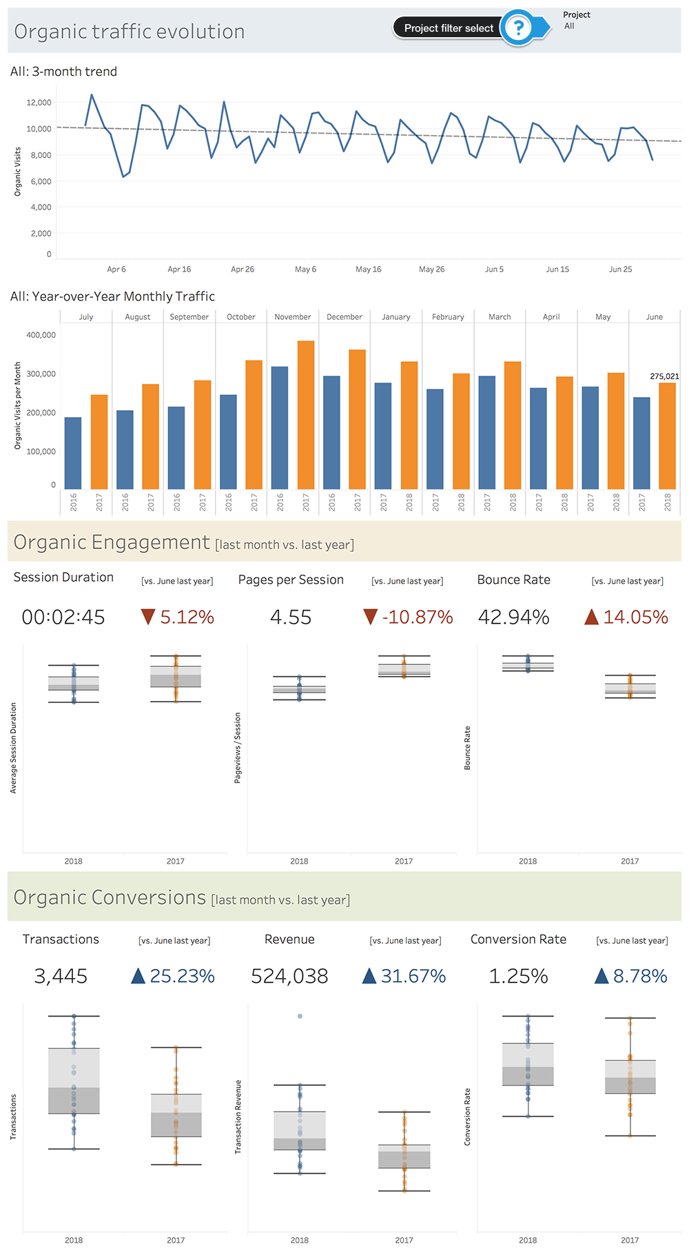
The dashboard tries to answer the question of how well the client performed in the previous month from an SEO standpoint.
All the data is kept in a PostgreSQL database. Tableau is plugged-in using a live connection.
The viz in question:
We are going to base our analysis on the “Project” filter. Mainly because we want to be able to switch between different clients as fast as possible.
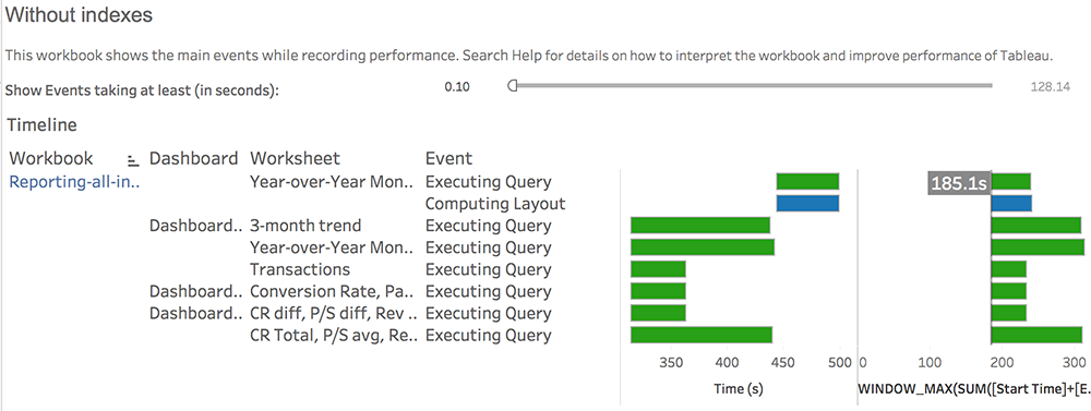
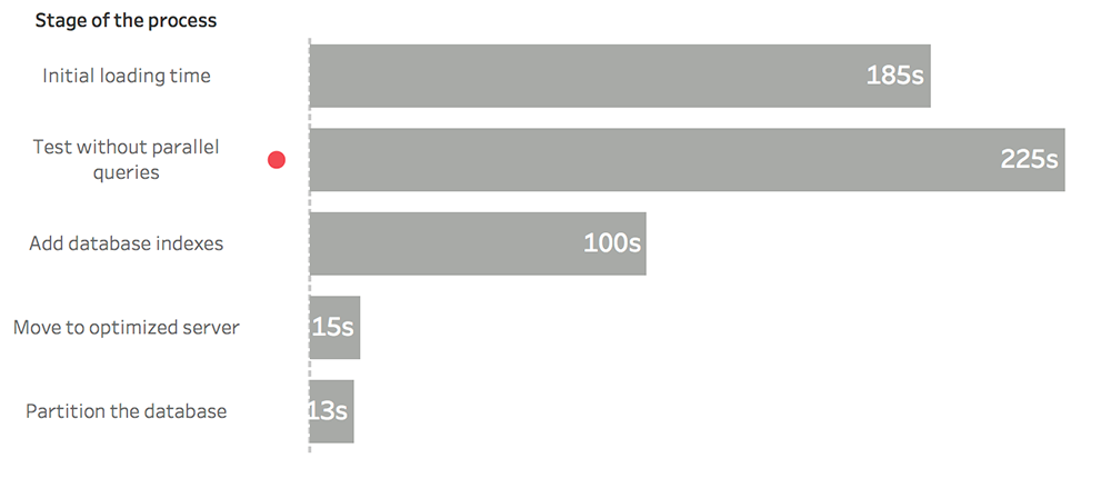
The initial loading time when switching to a new project is about 3 minutes (185 seconds).
Subjective thought: if you have to wait 3 mins for a dashboard to load, it better be worth it!
Well, it’s not. The dash is not the worst of all, but it’s not great either.
No worries, we can only go but up from here. Where others might see an unusable dashboard, we see the potential.
After all, we can only go up from here. Think of all that opportunity!
We’re following the “Do your thing first, optimize after” credo. There’s no problem with a poor performing dashboard as long as we plan to iterate on it.
Defining KPIs based on speed goals
First, we need to clearly define who is viewing the dashboard.
There is the analyst who interacts with the dashboard on the Tableau Desktop and Online environments and the client who is receiving the report by email.
For the analyst, it’s essential that the dashboard loads fast and it’s easy to interact with.
For the clients on the other side, these factors are irrelevant. They receive a static report by email.
Get them their answer as soon as possible!
But for now, let’s see how we can optimize our dashboard’s speed.
We are going to use the Tableau Desktop built-in performance recorder as our primary tool for analysis.
What I love most about it is that you get the speed data in a new Tableau Workbook. We can play around with the reports to find whatever is causing loading issues.
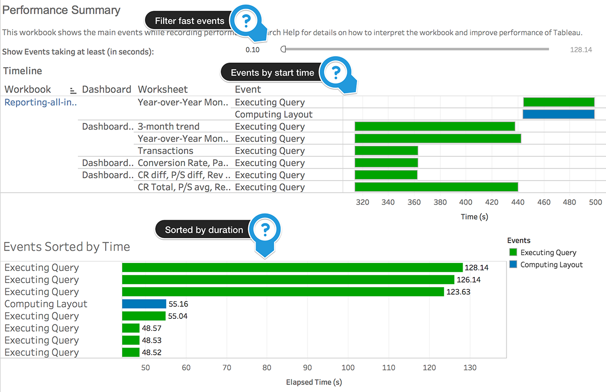
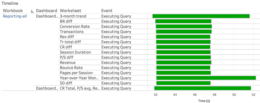
Here is our initial report:
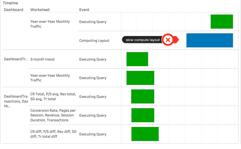
The green bars are slow queries, and the blue ones are computing layout processes.
We have a timeline that shows the events by starting time and below they are sorted by duration.
Notice the filter at the top that reduces the view to events that last over 0.1 seconds.
We will keep this filter throughout our analysis so we can focus on the central part of the problem.
Now for the KPIs:
- interacting with the dashboard (looking at events longer than 0.1s)
- start to finish time
- number of queries
- layout indicators
- number of slow computing layout events
- number of sheets in the dashboard
- data volume
- extract duration
- number of records
- datasource size (Mb)
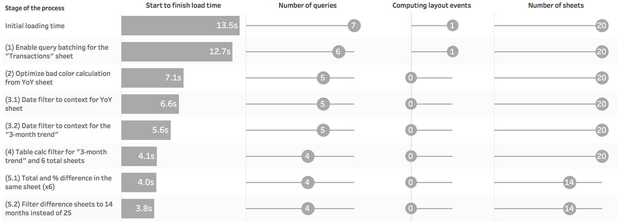
Based on these, we are going to start the step-by-step speed optimization process. We will measure the progress at the end of each section with a visualization built in nothing else but Tableau.
Optimizing at the database level
It’s not recommended to work with a live DB connection.
So obviously we had to do it!
We will eventually move on to an extract, but we feel there is value in optimizing at the database level:
- there are cases where people are compelled to use live connections
- finding ways to speed up the extract durations
- Tableau translates our actions into SQL queries that we get to see inside the performance reports (for a lot of us an SQL query is a lot easier to understand as opposed to XML ones used on Tableau extracts)
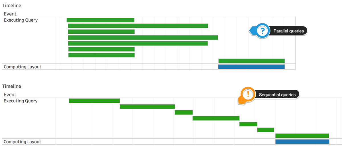
Before doing anything, make sure queries are running in parallel.
This feature should be enabled by default since Tableau 9.0. If you haven’t manually altered the connection-configs.xml file on your machine, you should be good to go.
Visual difference:
In our case, the version with the paralleled queries was about 20% faster.
First step: adding indexes
This is one of the easiest and effective adjustments you can make at the database level.
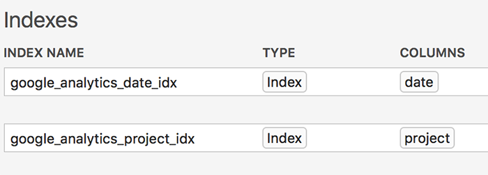
On our setup, we added indexes for the “date” and “project” fields (the ones that are often used for filtering).
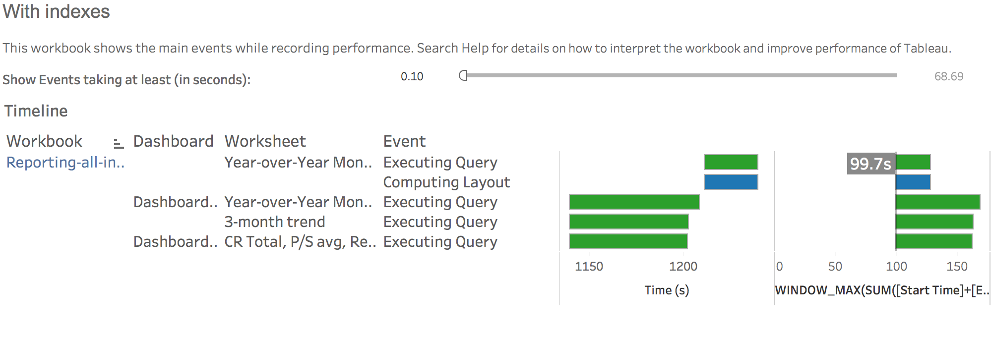
When comparing the difference visually, we get this:
A 46% gain just by indexing two columns. Nice!
The indexes don’t seem to have an impact on the extract duration so we can use them without dwelling too much.
Step 2: move the database to an optimized server
Both 185 seconds and 100 seconds translate to the same thing in our case: slow.
By moving the database from our crappy single-CPU/1GB RAM server to a 4-core/8GB RAM, we get a nice improvement.
Down to a 15 seconds loading time to be more specific. There’s still a long way down, but we’re getting closer.
To partition or not to partition
If you are going to keep the live connection, we recommend splitting the database into multiple parts.
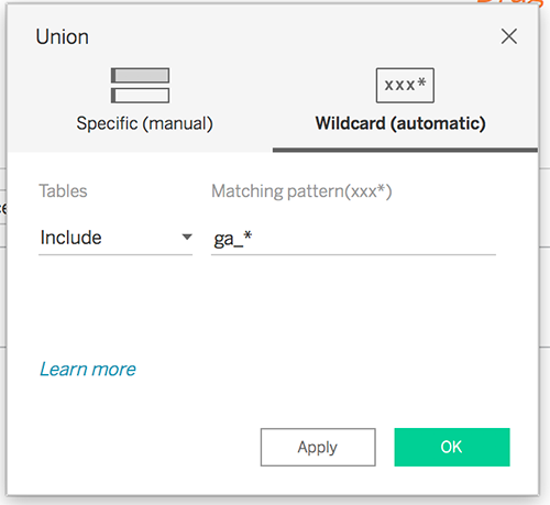
In our case, we tried to move every project’s data into its own table. We then brought the data back into Tableau using a wildcard union.
By using the partitioned database, we got the loading time down to 13 seconds.
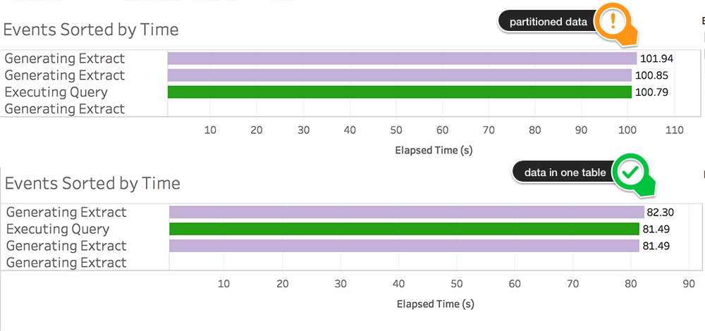
Since the performance recorder can show how much time it takes to generate the extract, we took the time to compare the two as well.
Extracting from multiple tables seems to take 20 seconds longer.
We already mentioned that we will eventually use an extract, so we’ll keep all the data in one table.
There are more details about extracts in the data volume section below.
tl;dr
Let’s move on to the actual optimization!
The Tableau logic of things
To sum up our dashboard, we have 20 sheets to work with:
- a 3-month traffic trend
- a Year-over-Year comparison for the last 12 months
- indicators for the previous month: session duration, bounce rate, pageviews/session, transactions, conversion rate and revenue; for each of these we have 3 sheets:
- one for the last month’s total
- one for the difference vs. the previous year
- one for the box-plot comparison vs. the previous year
Step 1: Query batching
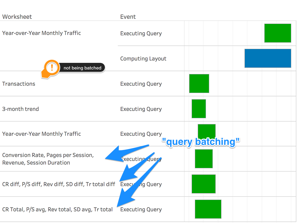
In the initial performance recording, I noticed something a tad peculiar. Even though we have 20 sheets, there are only 7 slow queries.
This happens because Tableau recognizes worksheets that are on the same level of detail and groups their queries into a single one.
Smart huh? We just have to be careful enough not to break it!
Looks like the “Transactions” box-plot is not being batched. Let’s investigate why!
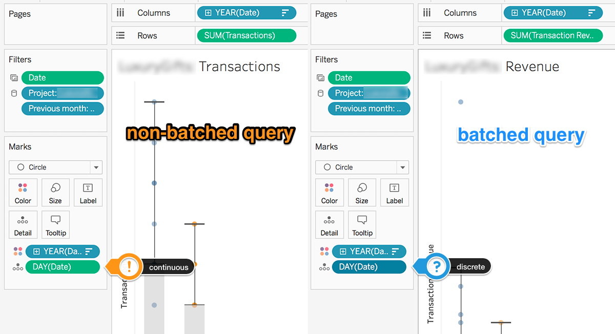
Just by looking at a sheet for which the query batching is working and comparing it to our troubled one we can see a subtle difference.
The “Transactions” sheet has a continuous date field on the detail marks card while all the other ones are using discrete fields:
Change it to discrete, bada bing bada bum, we’re down to 6 queries!
If you were to have compulsive tendencies like I seem to have, you could start thinking about what you should use between discrete and continuous.
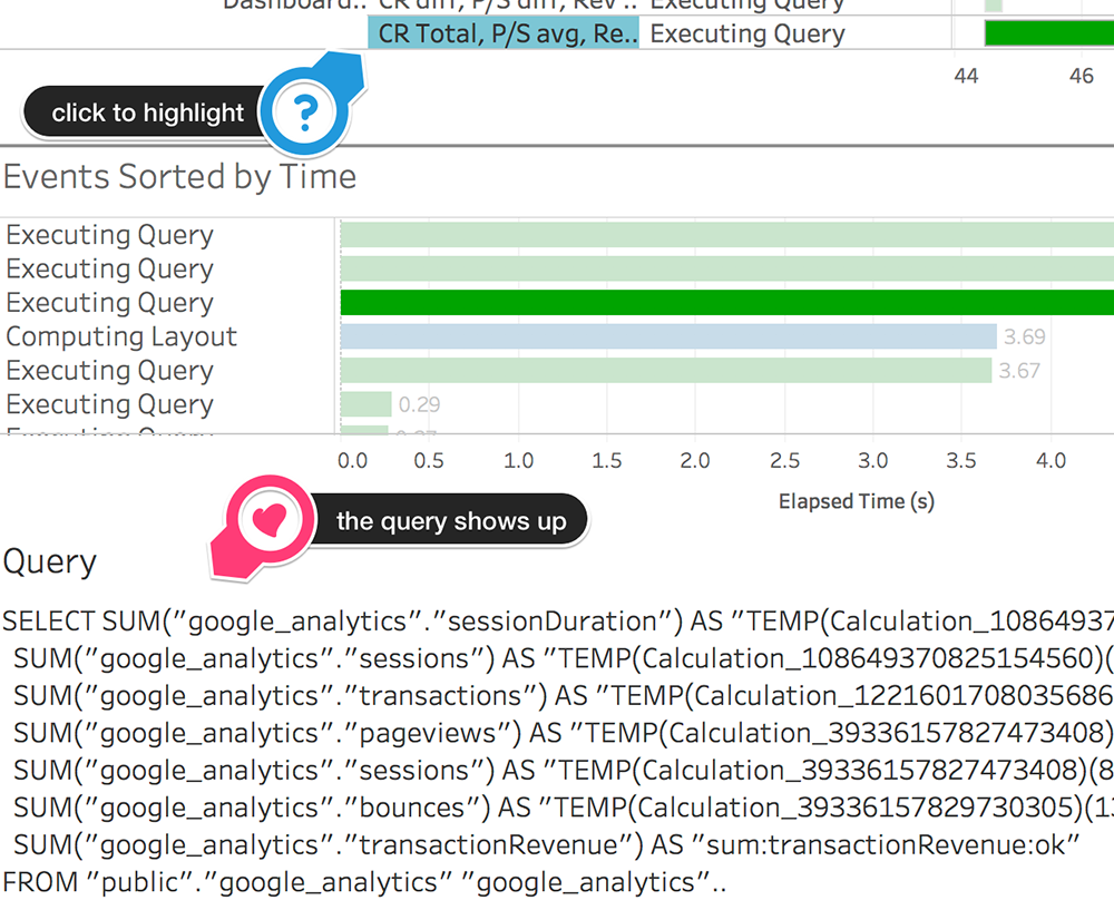
Luckily the Tableau performance recorder shows the actual query that is being sent to the database:
So discrete or continuous?
The exact same query is being sent to the database in both cases. Personal debate ended!
Step 2: Computing layout
The second thing that pops into my view is the blue bar from the top right side:
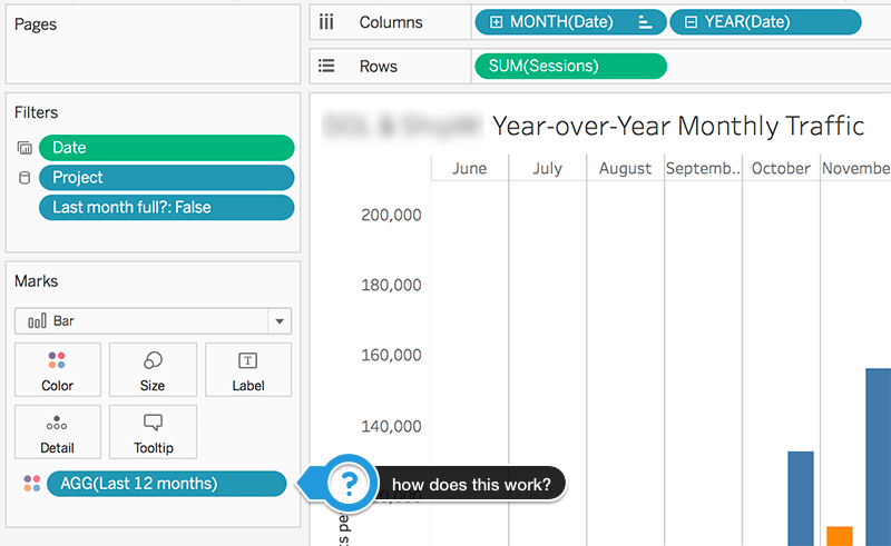
From looking at the worksheet, I got suspicious about the calculated field used for color.
Here’s the calculation:
We need a color for the latest 12 months and a different one for all the previous ones.
We can safely remove the MAX() function applied to the date and return booleans instead of integers.
Our calculated field becomes something like this:
Let’s do a performance recording to see if anything happened:
Would you look at that! No more slow layout computation. More than that, we’re down to 5 queries.
I’m not sure if you noticed in the previous performance reports, but the lousy color calculation was forcing Tableau to send two queries for the Year-over-Year worksheet.
Not anymore!
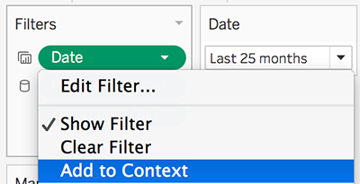
Step 3: Context filters
Adding a filter to context is recommended if it reduces the size of the dataset by at least 10%.
Here’s how the Tableau peeps describe them:
You can think of a context filter as being an independent filter. Any other filters that you set are defined as dependent filters because they process only the data that passes through the context filter.
Trial and error
Our sheets have filters in place to show data for 25 months at the most.
By adding the date filter to context for a handful of sheets, we ended up with this:
It broke our query batching!
This is precisely the kind of moment that shows the value of testing stuff out.
Best practice is a good starting point, but every dashboard is different, and it has special needs.
Smaller steps
Since the Year-over-Year comparison and the 3-month trend are not being batched, I wanted to test context filters for each of them individually.
By adding the 25-month date filter to the context for the YoY worksheet, I notice a tiny improvement.
To make sure it’s valid, I grabbed the exact queries to compare them side-by-side:
By testing the queries directly on the database, we see a 10% improvement in speed:
- regular filter query takes 2.9s to execute
- context filter query takes 2.6s to execute
Not only that, but Tableau brings in only the data it needs for the analysis. The other filters and calculations are performed on a smaller input.
Secondly, for our 3-month trend, we only need about 3-4 months of data. Adding this filter to context shows a more noticeable gain in speed. You’ll see it in the summary chart at the end of this section.
Step 4: replacing slow filters with table calculations
Table calculations are performed on the view without filtering the underlying data.
We definitely have to try them out in our worksheets!
Aside from the project and date filters, there’s one more that uses a LOD (level of detail) expression – “Last month full?”.
Let’s have a look at the formula:
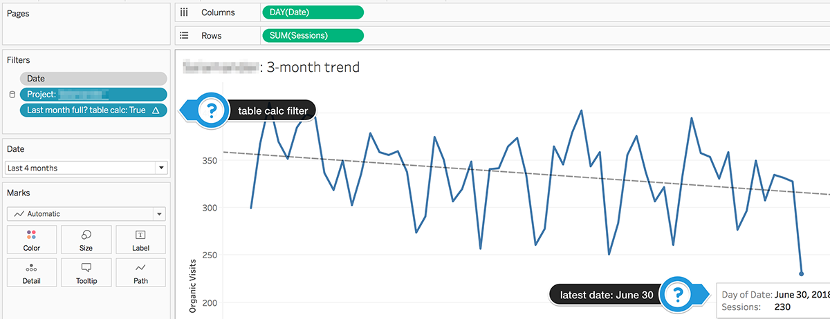
It tries to filter out data points for the latest month if it hasn’t ended yet. For example, we have data up to July 4th, but we only want to look at data before June 30th (the latest complete month).
Anyway, what we need to keep in mind is that it’s slow.
This is what I came up with to do the same thing:
And it seems to work like a charm:
The query duration inside Tableau went down from 4s to a whopping 2s!
Wow! We should do this every time we get the chance.
The new computing table calculation event showed up inside the performance recorder, but absolutely nothing to worry about speed-wise (less than 0.001s).
With this new information in mind, let’s try the technique for the other worksheets as well!
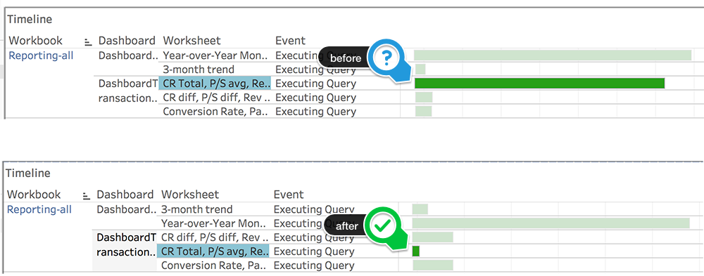
How one of the slowest queries became the fastest one
We changed the LOD filter for all of the sheets in this batch to use a table calculation.
Take a glance below to see how we achieved it:
Two more failed experiments
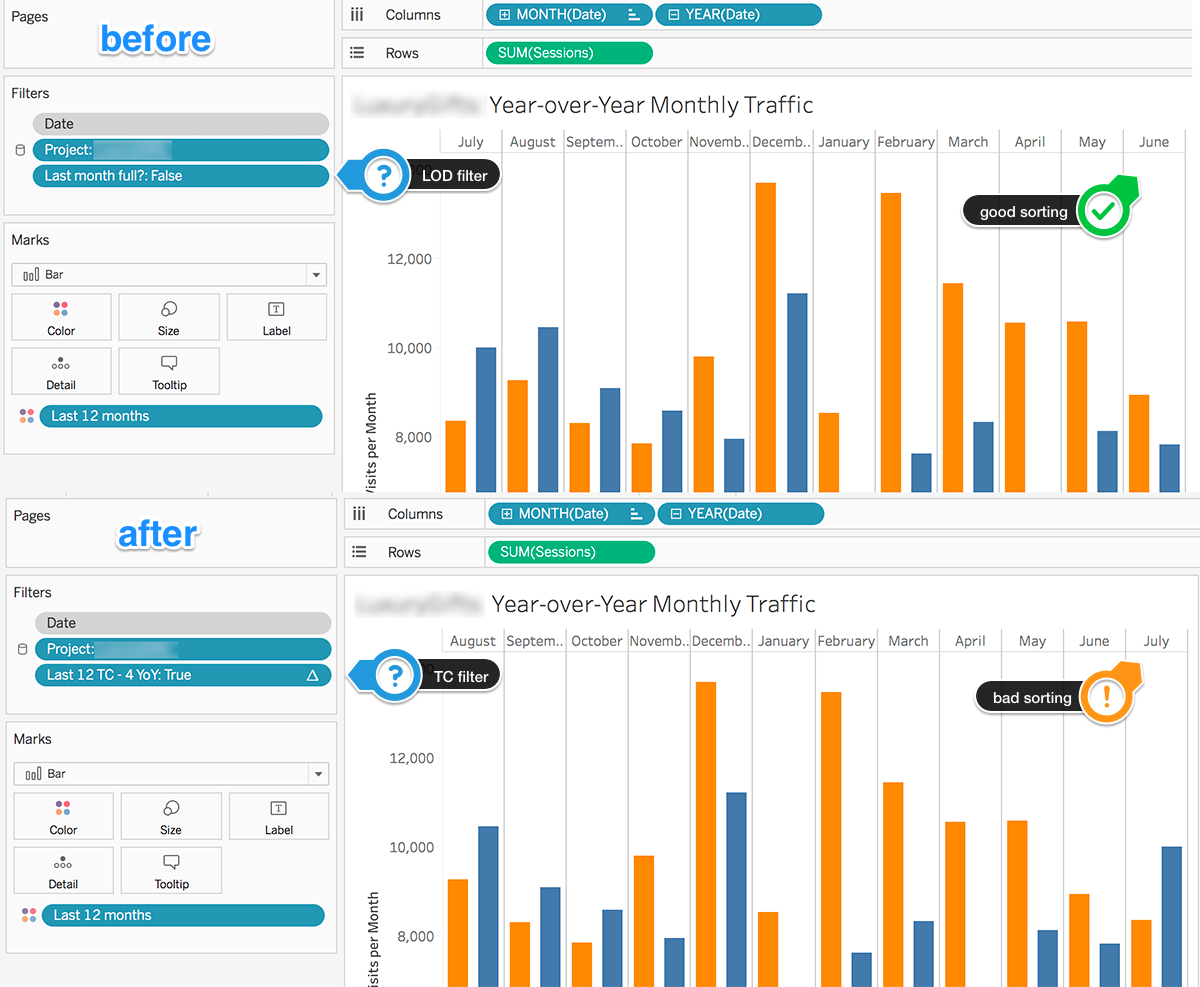
First attempt: trying table calculation filters for the YoY comparison
It does the job regarding the speed, but it messes up our sorting. This happens because the sort is computed before the table calculation runs.
Have a look at the actual difference:
We could find another way to sort by a table calculation, but it would be hackish at best.
In this case, we decided to do a temporary tradeoff: ease of implementation instead of performance.
We’re not giving up, we’ll just keep in mind to find a workaround for this problem. anchor link
Second attempt: add the LOD filter at data source level
Long story short: it’s terrible!
When comparing the query before and after adding the data source filter we get this:
It seems like Tableau adds a JOIN statement. When testing the speed on the database, we noticed that a 115 ms query becomes a 3-second query.
Not good!
Our suggestion would be to create a table in the database that contains only the data needed for the analysis. This way we can get rid of all the LOD and table calc filters.
But that should happen outside of Tableau.
We are planning to use a data extract, so no worries for now. We’ll deal with this problem later on.
Let’s move forward for now!
Step 5: Bring the difference in the same sheet with the total
It’s always recommended to reduce the number of sheets used in a dashboard.
We found a way to keep the total and the year over year difference within the same worksheet.
And it worked very well for us:
- shaved off one second of the total loading time
- got rid of a query
- reduced the number of sheets from 20 to 14
Check out the video below to see how we did it:
While working on the totals, we realized we’re using data for the last 25 months. When we actually need no more than 14-15 months on these sheets.
Updated the filters and got a ~5% increase in performance.
Every bit counts!
tl;dr
Extract your data
It’s probably the most common recommendation you’ll get from performance specialists.
Extracts are definitely something you can’t live without in 90% of cases.
But doing it at the start of the optimization process could cover up some underlying issues. And these might bite you in the ass later on.
Since we’ve done everything we could think of on our live connection, it’s time to chop up the data extracts.
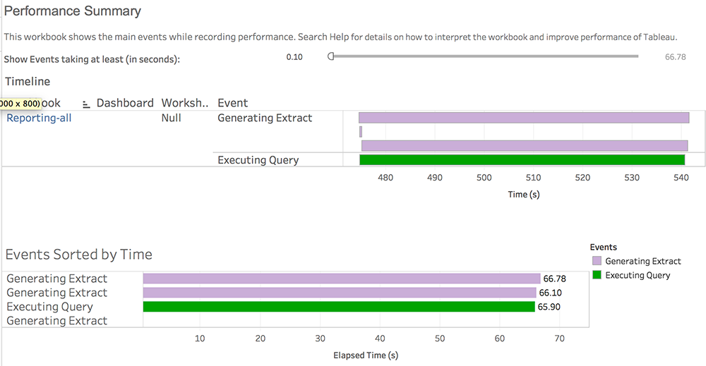
We have their duration in the performance recording. It would be easy to compare how much time it takes to generate the extract.
Here’s an example recording of the extract process:
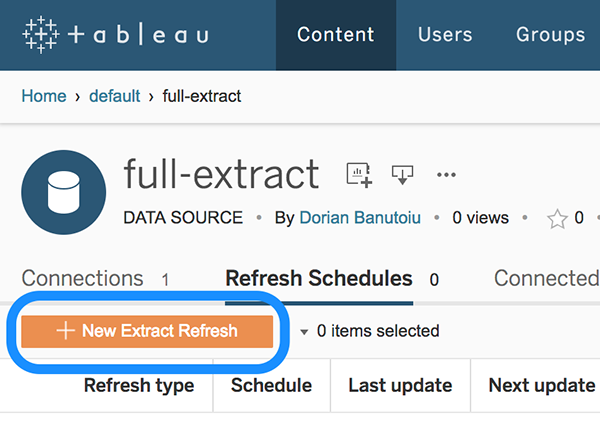
The bad news is that the extracts take some time to complete. The good news is that you can have them update automatically in the cloud so you won’t need to do it manually.
It’s easy to make it happen by publishing the extract (right-click on the data source and hit Publish to server)
At the server level (Tableau Server/Online) you can set up a refresh schedule:
Tip: don’t publish packaged workbooks on the server! It’s smarter to publish an extract that multiple users can connect to rather than having each person uploading large size packaged workbooks.
Now let’s see how much we can reduce the volume of data present in the extract!
Step 1: filter incomplete months
Remember our LOD filter headache earlier in the article? Time to say goodbye to it!
I’m very excited to add filters at the extract level!
Be careful to confuse them with data source filters. We’ve seen before how one of these messed up our speed.
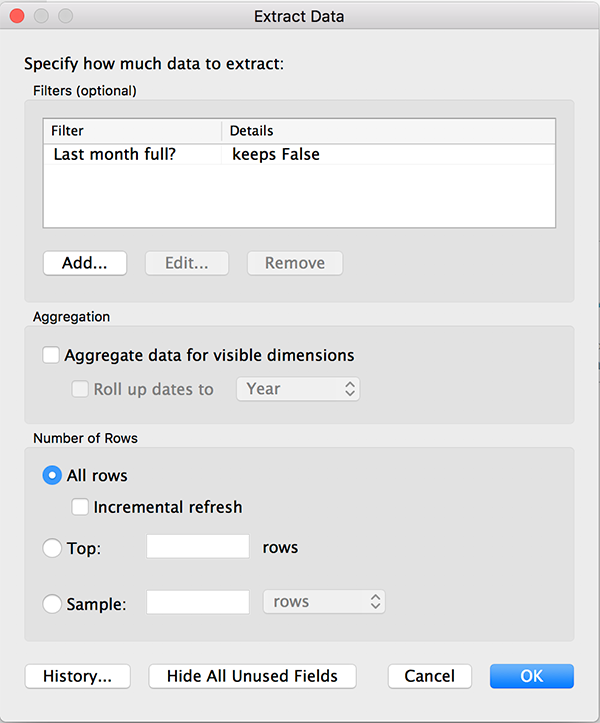
So we just pop our LOD expression filter (the slow one) into the extract “Edit” window:
This optimization isn’t meant to significantly reduce the volume of the data, but to help us get rid of complicated filters that slow down our dashboard.
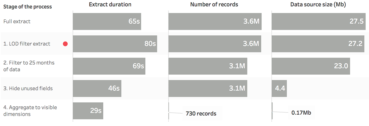
It will actually increase the extract duration to about 80s, but don’t worry because we’ll deal with this as well.
Step 2: keep the latest 25 months of data
The database could contain data from dark ages, but we’re only interested in the last two years.
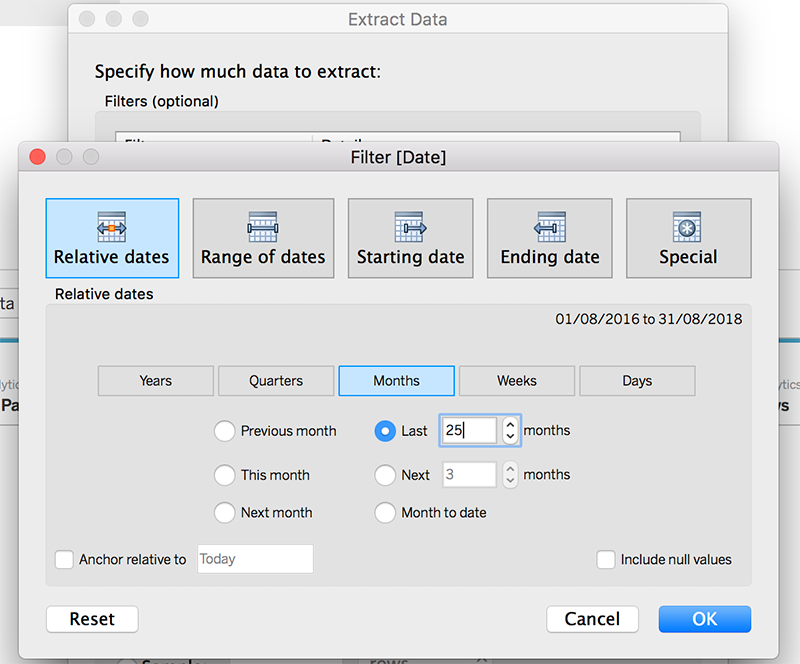
So let’s add another filter to make it happen! This time it’s a relative date one:
We’ve decreased the data volume a bit, but it barely makes a dent.
Let’s keep working!
Step 3: hide unused fields
I don’t know how it is for other people, but when I’m done with a dashboard, I usually find myself with a bunch of useless fields and sheets.
Luckily Tableau has a quick fix for this as well!
First I would start by cleaning up any sheet I’m not using:
- right-click on every dashboard and hide their sheets
- delete any sheet that remained visible
- depending on your preference, you can un-hide the ones used in your dashboards
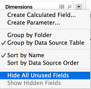
Secondly, I hit the “Hide All Unused Fields” button either on the extract window or right in the data pane.
The reason I’m cleaning up the sheets first is because Tableau will only hide fields that are not present in any worksheet.
The best time to do this step would be at the end of the process when you feel you’re done working on your dashboard(s).
This step brought quite the shrinkage in terms of data source size! Down to 4.4Mb from 23Mb.
For the second breakthrough, let’s move over to the final step!
Step 4: Aggregating the extract
This is even easier than the previous one.
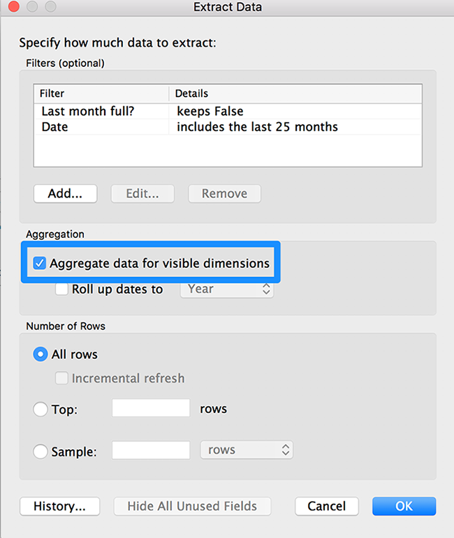
We just have to check the “Aggregate to visible dimensions” option from the same Extract window:
Our data source size is now 172kb. Now that’s performance!
tl;dr
The final speed of our dashboard is now under one second for local extracts (almost invisible to the naked eye).
The performance recorder doesn’t pick up anything over 0.1s:
Also, we get a loading time and around 1.5s when connecting live to remotely hosted extracts (it varies a lot depending on the network speed, server load, and so on).
Improved design
Iterating on the model based on customer feedback is essential. After all, they are the main character in this story.
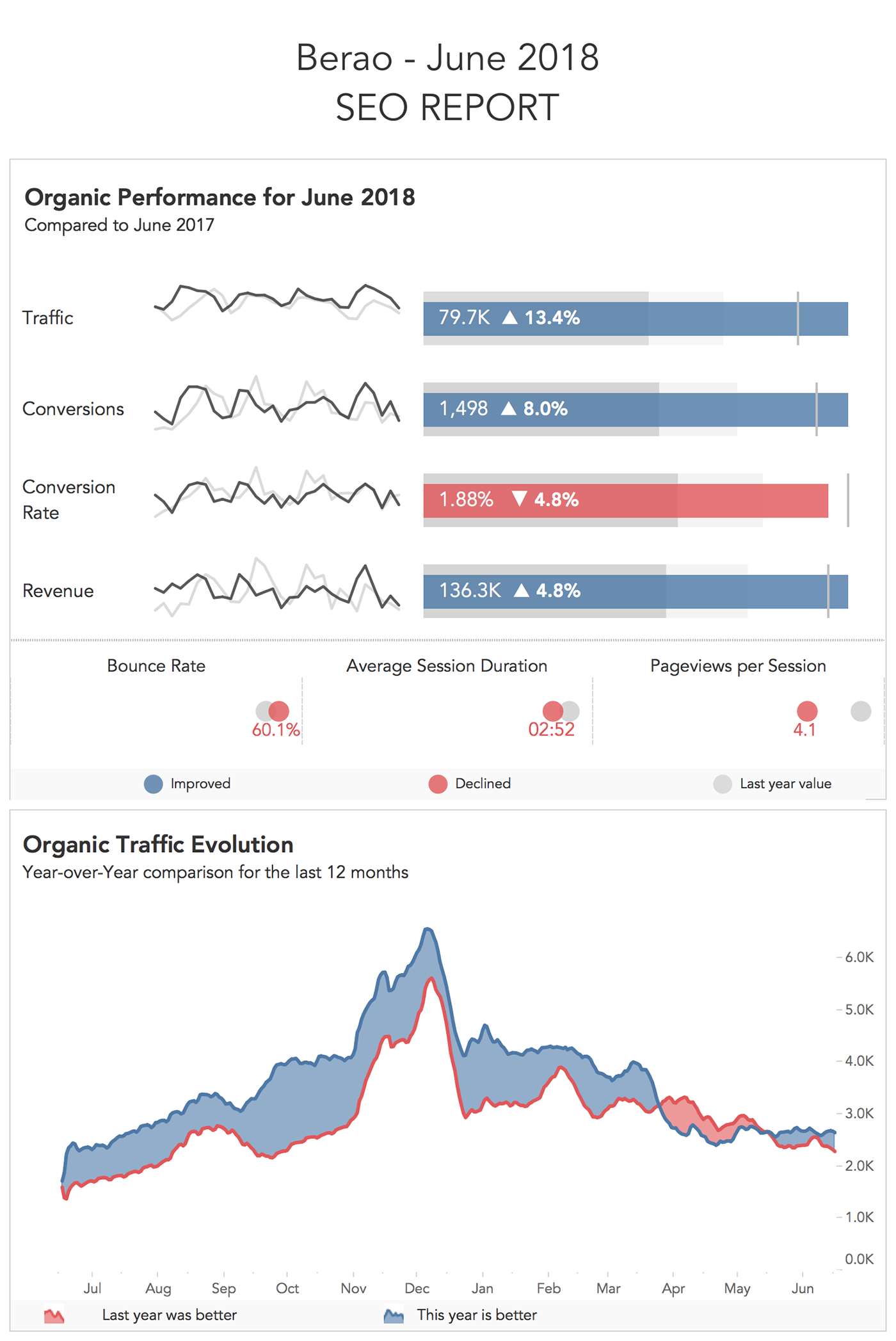
Here’s how we reworked the viz (the data shown is entirely fictitious):
As you can see, it’s a lot easier on the eyes.
Here are some thoughts on it:
- we moved the primary performance indicators at the top
- we’re now using bullet charts and sparklines to show the Year-over-Year difference (seem a bit more adequate)
- we got rid of the box-plots because most clients found them difficult to understand
- bounce rate, session duration, and pageviews/session play a more secondary role (we’re using dot plots for them)
- instead of the Year-over-Year monthly comparison and the 3-month trend, we’re now using a single chart (inspired from the historical work of William Playfair)
- we’ve colored the declines with red and the growths with blue throughout the visualization
- we’ve separated more clearly the two main sections
- we’ve added dynamic titles that update each month
For me personally, it seems that it’s saying a way better story with fewer words.
Conclusion
Don’t take anything we talked about here as a rule of thumb! This is just what worked in our case.
We’ve tested everything thoroughly to see what works best for our particular dashboard.
Also, the process of making it easier to understand for a group of people is not a walk in the park. We feel that we need to continuously iterate on our visualizations to make them better.
They should require a minimum amount of brain power and effort from the end user.
I hope you get some value out of our experience! If you have any feedback, don’t hesitate to share it with us!
Recommendations to dive in deeper into Tableau performance
Highly passionate about data, analysis, visualization, and everything that helps people make informed decisions.
I love what I do! I am working to improve speed in every aspect of my life and that of our clients.
I find comfort in helping people, so if you have a question, give me a shout!

