Say what?
What I am trying to achieve is quite simple: offer the ability to filter a range using parameters, make it easy to use and give it a clean look.
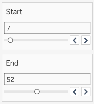
Before parameter actions (pre Tableau 2019.2) we would do something along the lines of:
The obvious problem with this approach is that the start can be higher than the end. The user might end up in front of a blank screen.
Not to mention that we have to use two sliders which doesn’t seem very user-friendly.
Here’s my proposed design in action:
It’s not a slider per se since you don’t slide anything but click to select intervals.
The key “features”:
- there’s only one interval selector
- the start is always smaller than the end
- You can put in values manually in the parameter type-in boxes
- it has a button that can reset the selection
When to use it?
Some cases require filtering with parameters, whether it be number intervals or date ranges.
Why parameters?
They work across data sources.
Also, Parameter Actions are a super useful feature. We can use them to push values to parameters interactively. Even bin values or table calculations!
You don’t have to be a Tableau nerd to implement such a thing. Anyone can do it. Let’s see how!
Option 1: Using a data file with the interval values
Here’s a video on how to set up from start to finish.
It’s a bit long, so I split it into three parts. I am extracting the main ideas from each technique, and I am writing them down under each section.
See below how to implement a parameter interval selector using a special data file:
Main takeaways:
- The approach is based on dynamically calculating the midpoint of the selection. When the user clicks to the right of the midpoint, that value is considered the max value of the interval. Otherwise, it’s the min.
- We can always use the two-parameter inputs to enter values manually. The interval adapts to whatever we throw at it
- The clear button is a shape within a separate sheet. We use it to push the ends of the interval to the selection parameters.
The drawback here is that the interval is fixed. If you need a different range, you would have to go back to edit the data file.
So let’s try a more dynamic way!
Option 2: Employing Measure Bins
At the 16:42 mark, I am showing how we can do it via bins. Click play to follow the explanation!
Based on this approach, I’ve created a version that allows date range filtering using parameters.
Here’s how it works:
Link to live dashboard (date ranges version)
Main takeaways:
- The coolest thing about this is the option to send bin and date values to parameters.
- I am making use of Tableau’s “Hide” feature for discrete color legends. Filtering is not an option here since we want to keep the data in the view.
- I’ve hardcoded the interval ends for the clear “button”. When we are dealing with more dynamic data, we need to calculate those values separately.
- If we use bins wee need to make sure that the right end of the filter contains the values of the bin we clicked on. We probably need to add one extra bin size.
This works well when the data is dense. It still works with gaps, but it doesn’t look very good.
Option 3: Dealing with sparse data
This is where Table Calculations come in handy. They can help us to fill in the gaps, an approach known as data densification.
Starting at the 23:42 mark, I am describing the technique:
Main takeaways
- We need to use table calculations to show marks where there is no data. In this case, the LOOKUP function is our savior.
- This approach can be used for date ranges as well since we can show missing values for date fields.
- The bins pill needs to be discrete for the “Show Missing Values” option to show up. It’s critical for this course of work!
- It is delightful to be able to place Table Calculations into Parameters via Actions ♡
You can notice in this version that there is no option to change the parameter values manually. Mainly because I am using the INDEX() function as the main driver for the implementation.
What brings us to my challenge to you
Create a version where you have the option of manually entering interval ends using input boxes. You will probably have to redo some calculations, but I think it’s worth a try.
So if you can spare 20-30 minutes, I strongly encourage you to give this a try!
Workbook and inspiration
A dashboard with all that I’ve created is available on my Tableau Public profile. You can download it to have a look under the hood.
Inspiration shoutout to my Tableau hero, Lindsey Poulter. Her approach using Set Actions helped me spark this idea.
I hope you’ll find it useful! If you have any feedback, I’m all ears!
Update
Shortly after publishing the article, Klaus Schulte reached out to me and pointed out that used a similar technique in his music Ironviz.
Here’s how he used interactivity to power up his visual:
The interval size doesn’t change on click, and the range moves according to the selected point. The selected point represents the midpoint of the range.
If you find it useful, make sure to check it out!
Highly passionate about data, analysis, visualization, and everything that helps people make informed decisions.
I love what I do! I am working to improve speed in every aspect of my life and that of our clients.
I find comfort in helping people, so if you have a question, give me a shout!


