I love dashboards! I love looking at them, I love using them, and I love building them.
There’s something special about looking at visually represented numbers.
If I would have to pick one thing to do every day that brings me joy, building dashboards would be at the very top.
But I take it as a big responsibility. These things will be in front of people making decisions about important stuff.
And while it’s easy to fail in this world and make mistakes, there’s one thing we can do to get us closer to success: listen.
Let me take you back a bit.
Real World Fake Data #RWFD
My passion for Tableau and community projects is not a secret.
I heard about RWFD from Steve about a year ago and I thought “what an awesome idea”! But somehow life got in the way of me contributing.
Luckily Season 2 caught me in a better spot. Special thanks to Mark Bradbourne for keeping this project going!
So I started with the Call Center Dashboard. We were tasked to redo one of the Tableau Accelerators.
My idea was to design something that will be live on a TV screen in a Call Center.
I’ve never done anything like this before, so what better time to jump on it?
This is one of the perks of doing community projects: we get to play around with different ideas, techniques, etc. without the risk of messing up anything crucial in the business context.
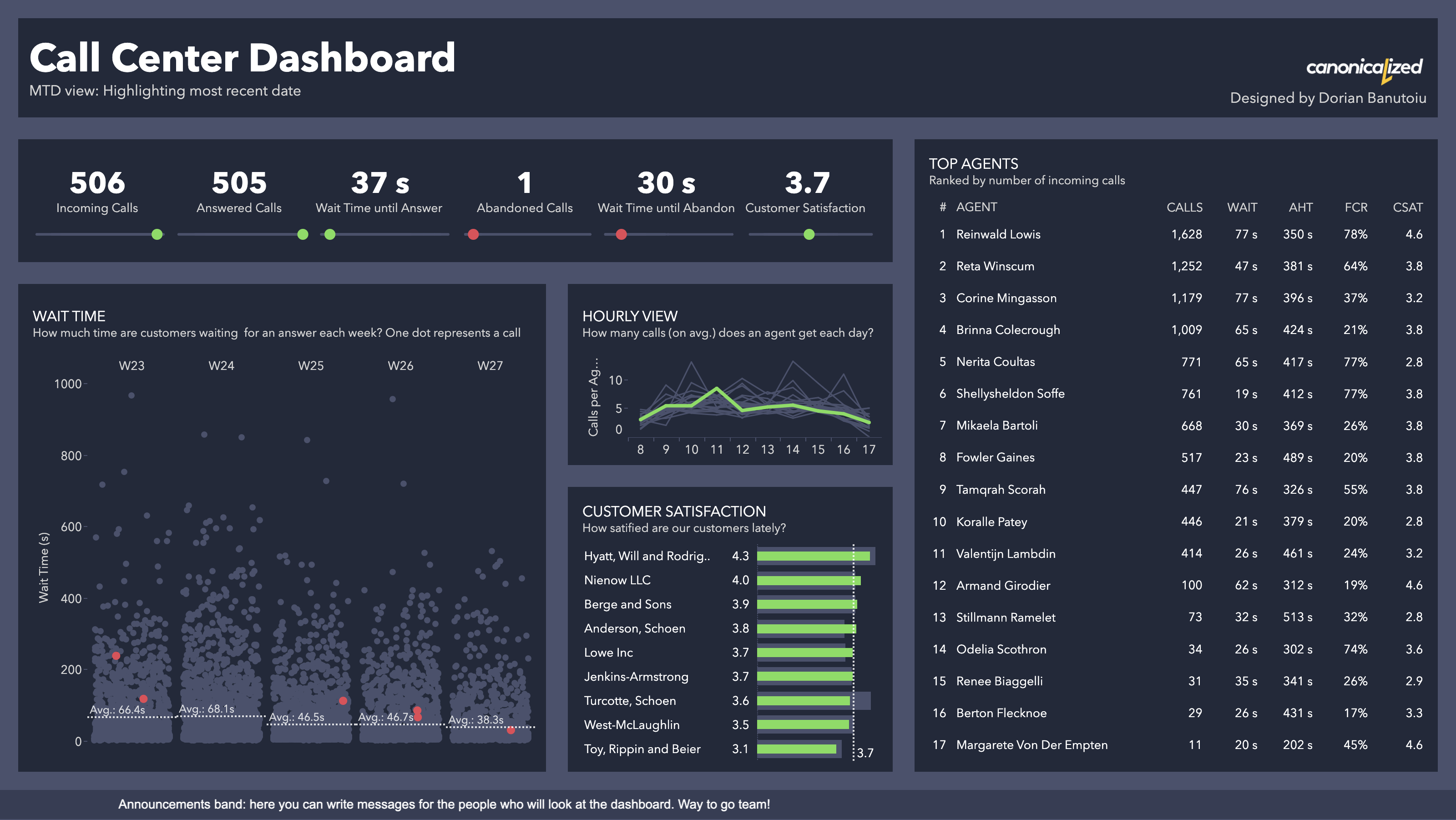
So here’s my first take on the Call Center Dashboard:
Lovely, right?
I created a Month-to-date view where the latest date is highlighted to show where it stands relative to the overall period. I even added a ranking table to show the top agents and how they’re performing.
I posted it on Twitter and LinkedIn and it seemed to be quite appealing for the audience.
The bummer
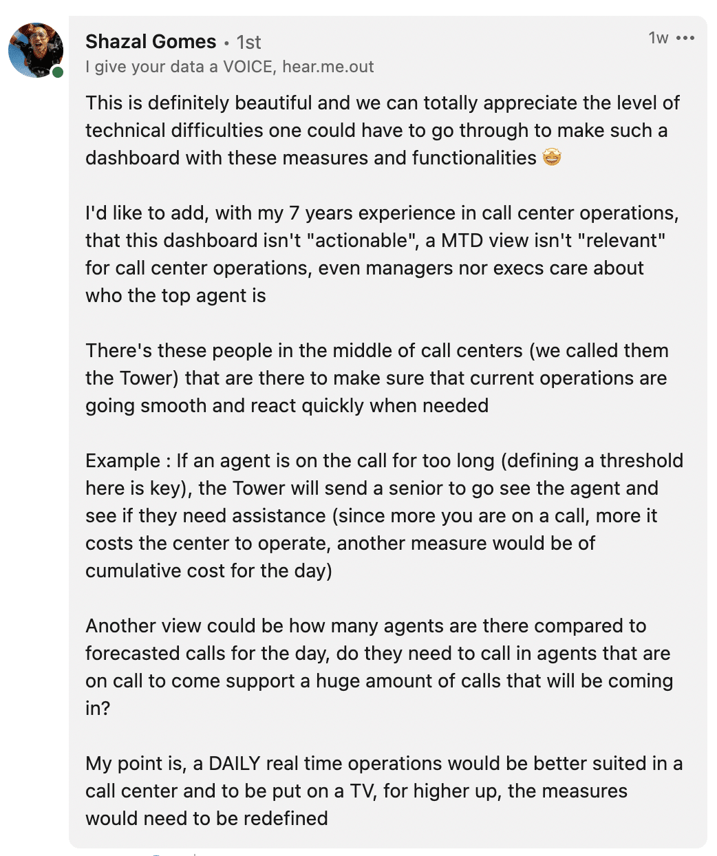
Shortly, I got a comment from Shazal Gomes on the Linkedin post.
Surprise, surprise! The dashboard looks good but it’s irrelevant. There’s nothing more useless than a dashboard that’s isn’t actionable.
Time to cry, right? Wrong!
I started breaking down his comment and I realized how valuable it is.
I like to think of myself that I’m good with Tableau, but my experience with Call Center data is a big fat 0.
Luckily, Shazal has a lot of knowledge in this area. A big thank you to him!
I didn’t know him before his comments. But I’m very glad we got to chat!
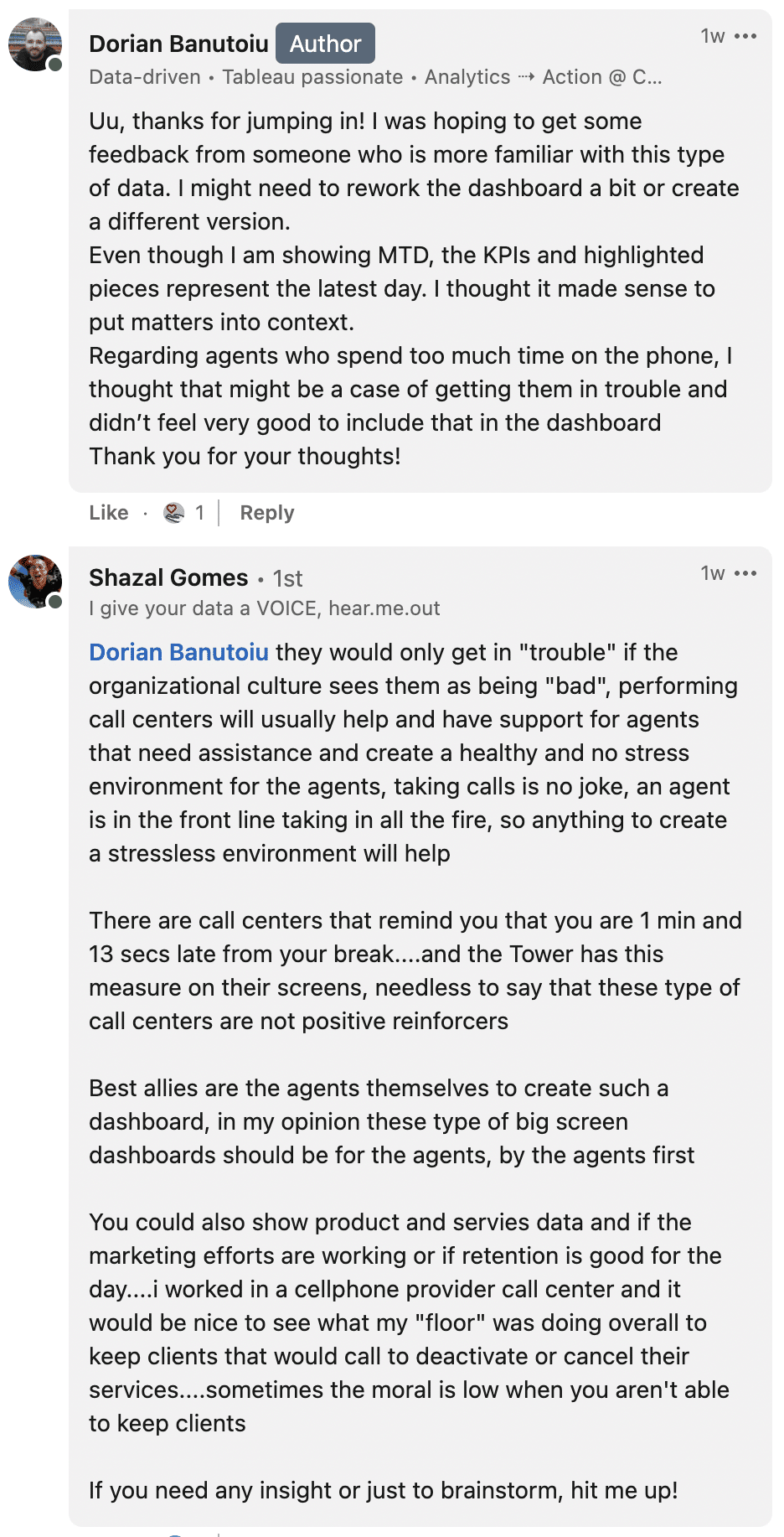
So back to listening! Here’s more from our conversation:
Here are the main thoughts I extracted from him:
- Daily view – the business only cares about the current day; what’s happening today live on the floor so that they can adjust
- Demand – how many calls do they get and how many agents are available
- Forecast – how many calls are they expecting today (this is a big ask – I’ll talk about how I handled it in a special section below)
- Handle time – the time the agent spends on a call is very important, the business needs to define a threshold and check in on agents who are spending too much time handling calls
- By the agents, for the agents: this is the main idea I should follow
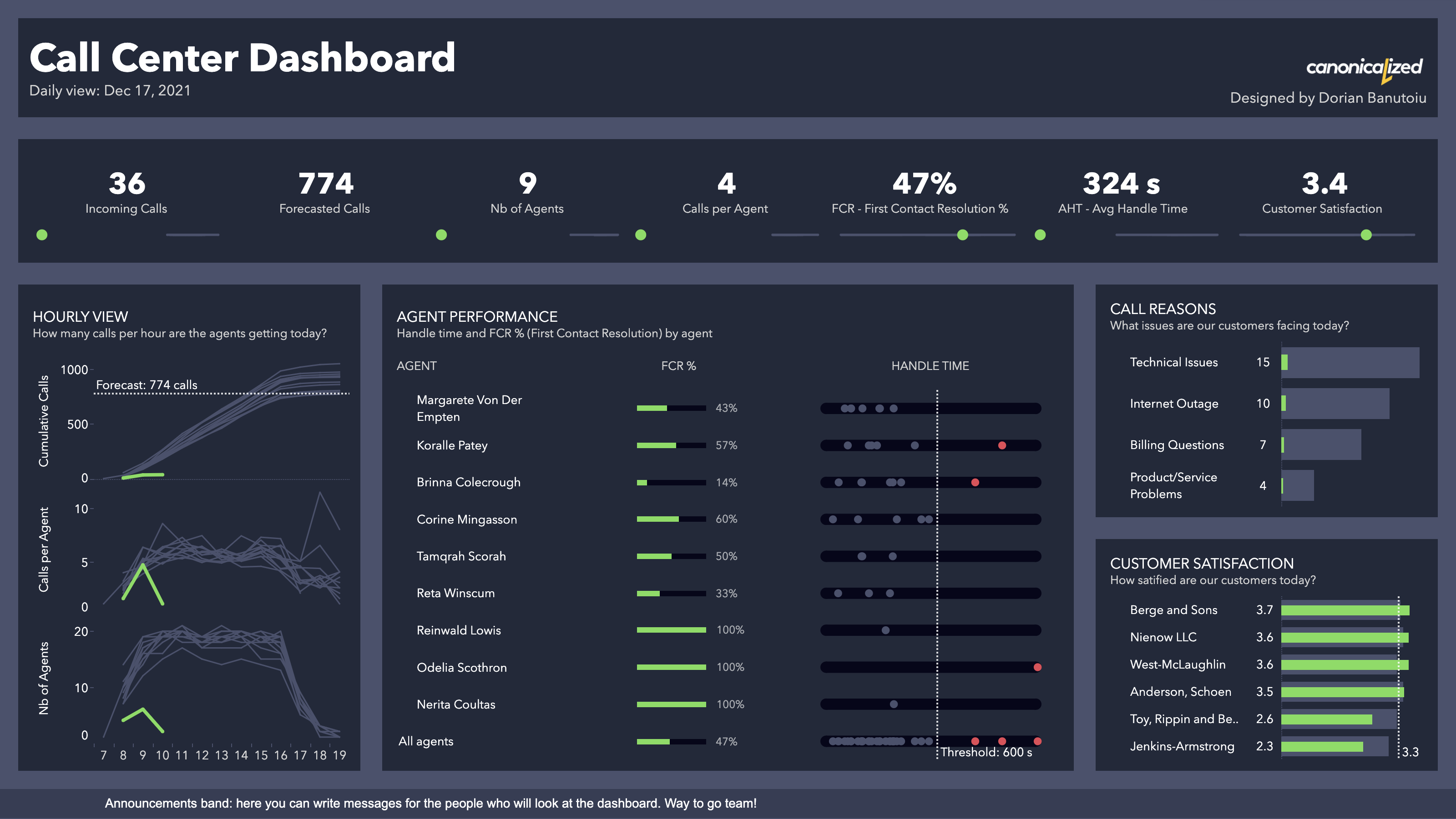
With this in mind, below is how I reworked the dashboard.
V2: Call Center Dashboard
Click here to open it on Tableau Public.
Main points:
- More relevant KPIs – in the monthly context (found it difficult to give up)
- Hourly view for calls and agents (also showing the previous days for comparison)
- Agent performance – is probably the most important piece, where the business can monitor calls that take too long and if agents can solve issues on first contact with the customer
- Call reasons and customer satisfaction – probably less important, but helpful to have in the view
There was another piece that I couldn’t include, unfortunately. That is the actual business generated/preserved by the agents.
I didn’t have anything like that in the dataset, but I believe it would have been the best way to wrap up the dashboard: tying up the actual work with the business result and showing it on the screen.
For those of you who would like to geek out some more with call center data, I have a cookie.
Bonus section: predicting future calls
You might have noticed the forecasted calls KPI in the dashboard. Even though it’s a simple count, it was not so easy to predict.
I went back to exploring the data, this time to figure out how to predict future call volume.
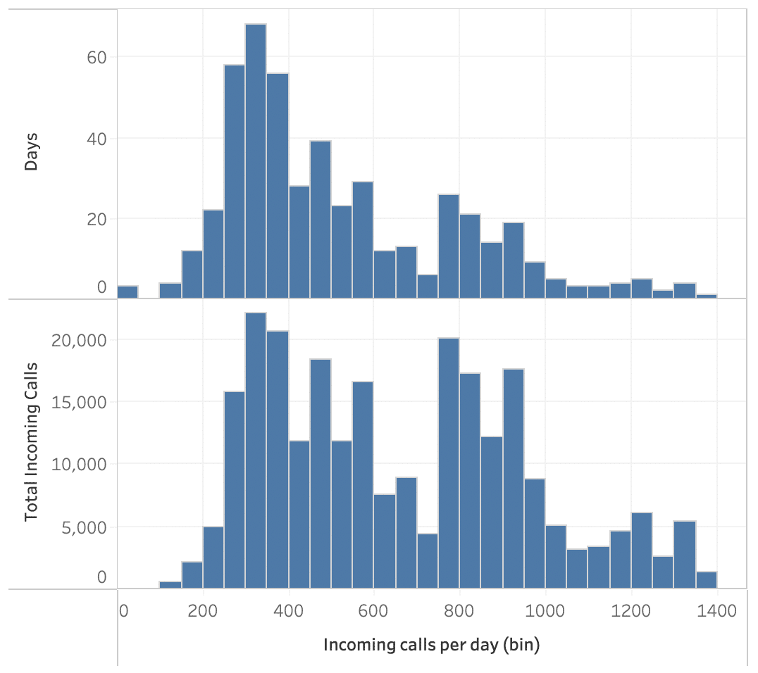
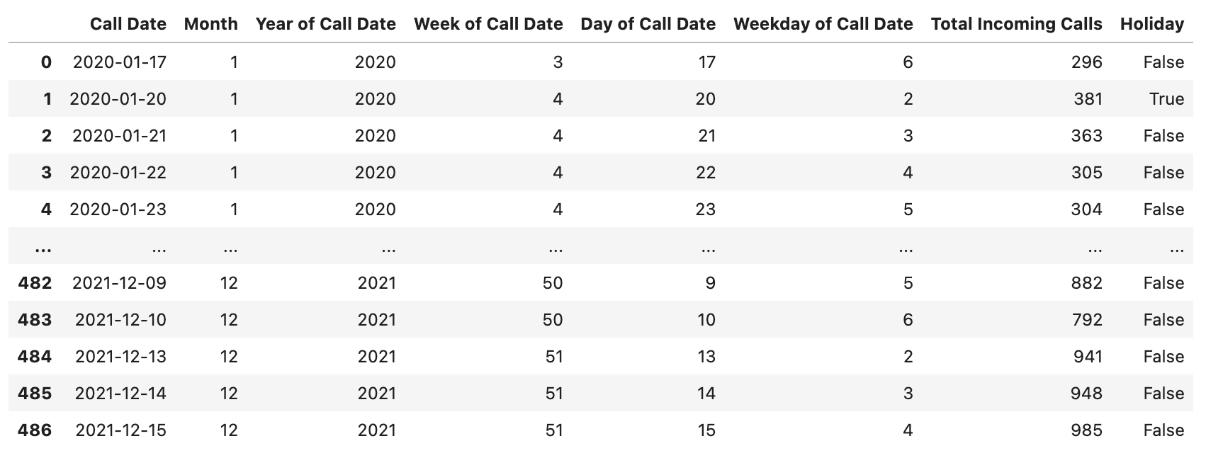
In the dataset, we have almost two years of call data available. Quick and dirty Tableau views below.
Timeline:
Distribution of the data:
Tableau forecast attempt (while it seemed close to the truth, it doesn’t seem reliable to me in the long run):
Year-over-year timeline by month:
Here I started to notice some patterns. The business looks quite seasonal, growing towards the end of the year with a steep drop around January 15.
Very cool!
Forecasting with tree models
One night I was reading an article about how popular it is to forecast with tree models in data competitions.
I’ve never used any regression algorithms to forecast time series before, so what better way to learn? The power of community projects strikes again!
Long story short, I processed the data to work with tree models and tested out some algorithms. Basically splitting the dates into parts and feeding them to the models.
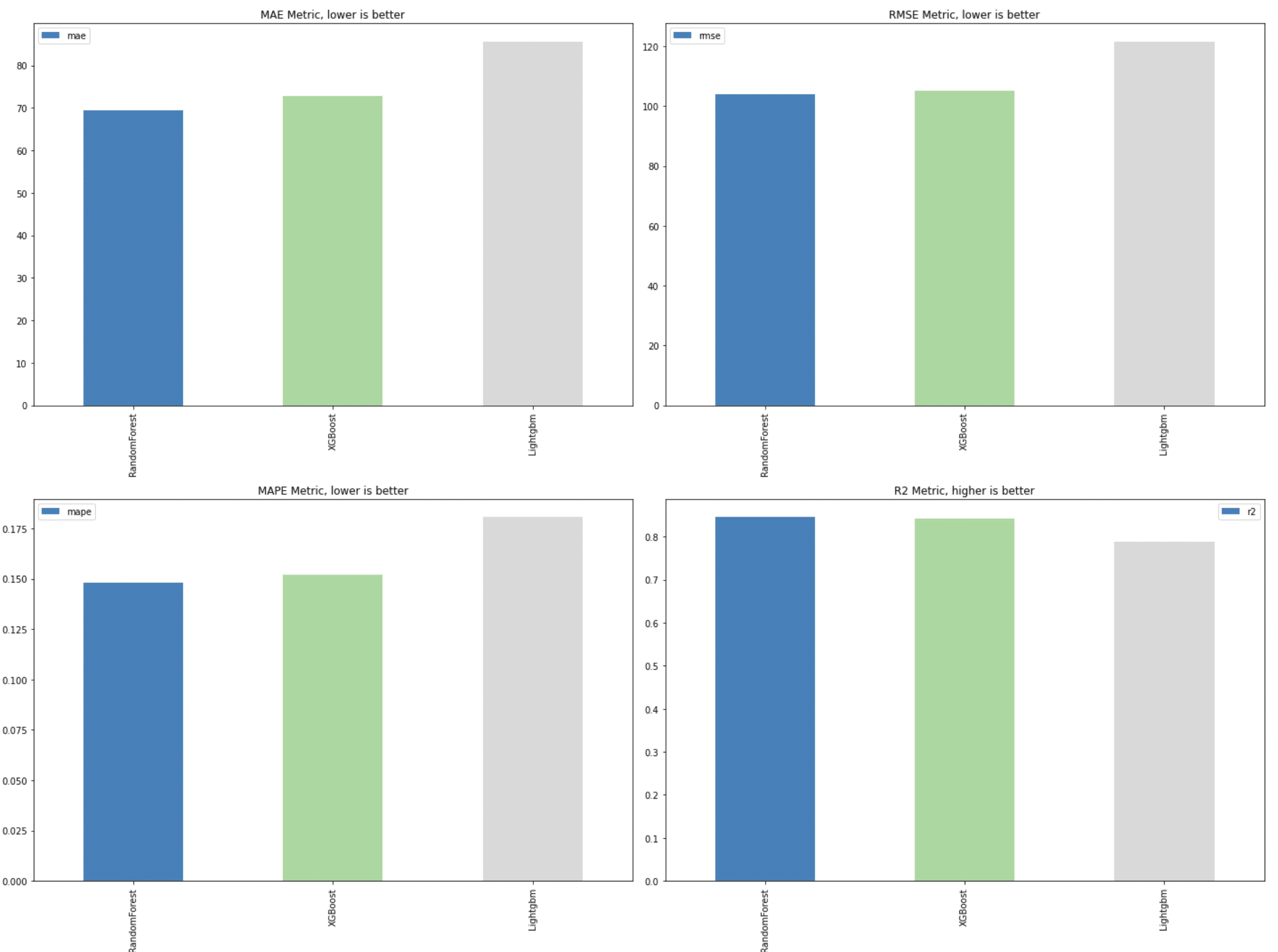
Among others, three methods stood out to me: Random Forest, XGBoost, and LightGBM.
The full code I used is in this Jupyter Notebook on our Github account.
Initially, the plain RandomForest seemed like the best choice:
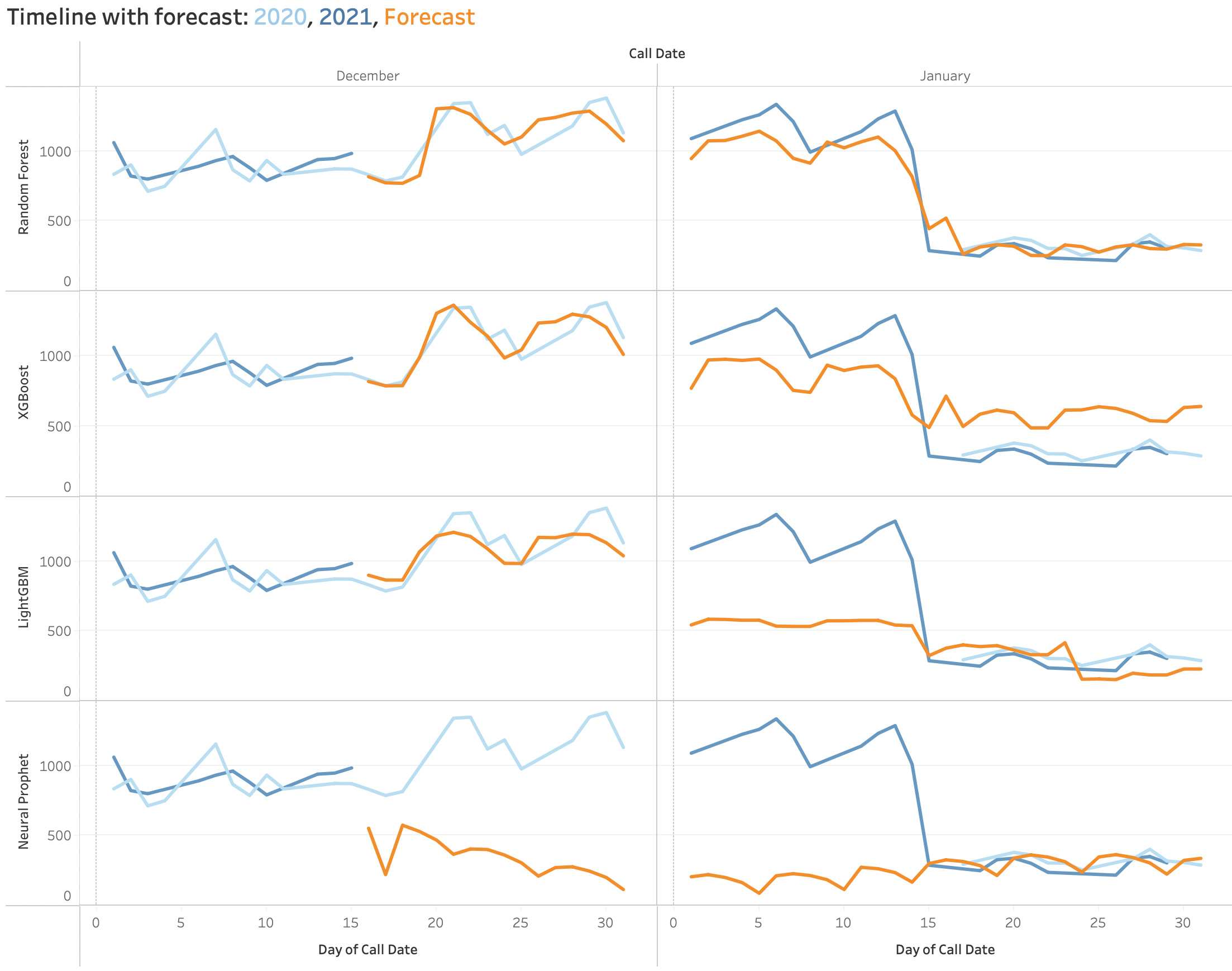
After plotting the actual forecasts back in Tableau here’s what I saw for December and January:
The Random Forest prediction (orange line from the first row) looks very close to the actual call lines from the previous year(s).
Yep, I was amazed to see how well it worked. With more data I expect the model to become even better.
I included the NeuralProphet algo just out of curiosity. You can probably see how far from the truth it is in this case.
Note that the code might seem extensive, but there are basically three lines that do most of the work after we’re done with the data processing/feature engineering:
reg = RandomForestRegressor()
reg.fit(predictors, target)
future = reg_rf.predict(prediction)
That’s it!
Final thoughts
Getting not-so cheerful feedback is often a difficult pill to swallow. But it’s also a great opportunity to improve if we allow ourselves to listen.
And also to learn new stuff. I sure did learn a lot from this process!
I hope you got something out of me writing about it. Thanks for reading!
Highly passionate about data, analysis, visualization, and everything that helps people make informed decisions.
I love what I do! I am working to improve speed in every aspect of my life and that of our clients.
I find comfort in helping people, so if you have a question, give me a shout!
