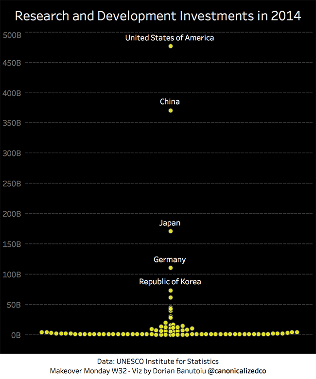
In this article, I want to show you how I built a beeswarm chart in Tableau (with a little help from R).
I am very fond of the Makeover Monday project run by Andy Kriebel and Eva Murray. I have been contributing every week since I found out about its existence.
This week’s challenge was to redo a lousy visualization that tries to show how much a selection of countries invests in Research and Development.
The data was provided via data.world, and it comes from the UNESCO Institute of Statistics.
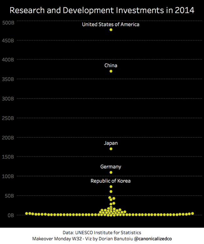
Below is the final result:
click on the image to see the Dashboard on Tableau Public
The design progress
Before we get into the technical details on how I created this chart, I want to go through the thought process behind the design choice.
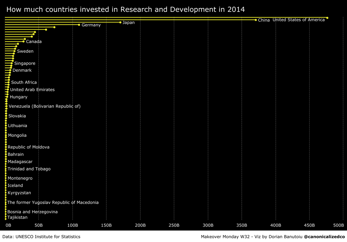
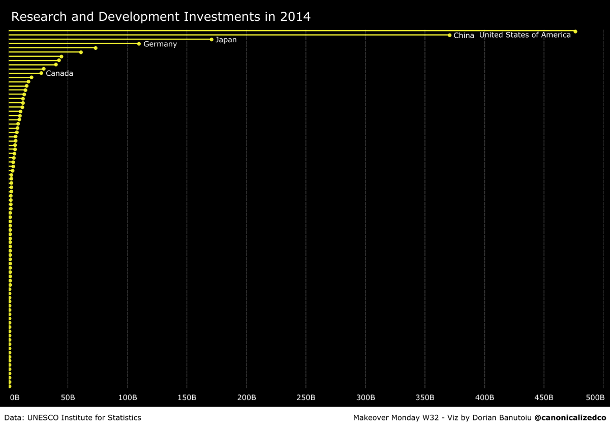
At first, this is how my viz looked like:
It has a number of issues, which at 1 AM are not so easy to notice.
Luckily, some new found friends on Reddit jumped over to help me. I asked for feedback and immediately got two solid answers:
I didn’t expect it. tacobowl8, Trek7553 I feel grateful for giving up your time to help me, and I want to thank you for it!
After iterating on the feedback, I got a much cleaner look (title, labels, tooltips):
I’m not very sure about how helpful this viz is, but I didn’t like at all how the bottom part looks like:
- it’s difficult to see the difference between the countries that invested less than .5B
- there’s a vast empty space in the bottom-right direction
- the grid labels are quite far away from the main content of the viz
I wanted to find a way to include all of the countries in the viz, but at the same time to show the distribution nicely.
Enter beeswarm charts
Luckily, I couldn’t find a guide on how to build one in Tableau.
I’ve read about them in the past, and I know there are multiple ways to do it in [R](https://en.wikipedia.org/wiki/R_(programming_language)).
The process was quite simple. I don’t know why, but I often get surprised by how R makes my life easier.
Without further ado,
Initial approach: Tableau -> R -> Tableau
There was some manual work involved in moving the data in and out of R.
I am guessing it can be avoided using an Rserve connection, but that’s not available on Tableau Public.
So old-school it is!
Step 1: preparing the data
Before plotting anything, the data needed a bit of cleaning.
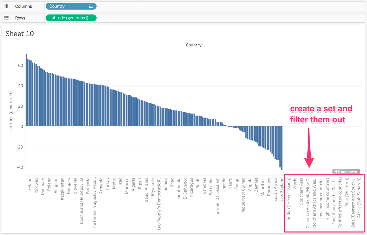
From what I noticed, there are entries in the dataset that don’t represent actual countries. Stuff like continents and some aggregate data that isn’t useful for our direction.
My idea was to use Tableau’s way to detect countries (generated longitudes/latitudes) and to filter out the non-countries.
Here’s a quick video on the filtering process:
I think the set functionality works well in this case. I felt it was a safer choice as opposed to filtering by latitude, spending, and so on.
Step 2 towards R
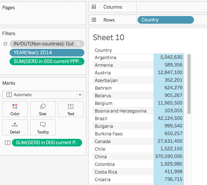
To get the data into R, I created a filtered crosstab, and copied the following data into a .csv file:
- select amount spent
- copy (CTRL+C/CMD+C)
- paste into a new Excel window (CTRL+V/CMD+V)
- save as .csv
Step 3: Trying two ways to beeswarm
Here’s our R code:
#read the data
rd <- read.csv("rd.csv",sep=";")
rd$Amount <- as.numeric(gsub("\\.", "", as.character(rd$Amount)))

#first approach
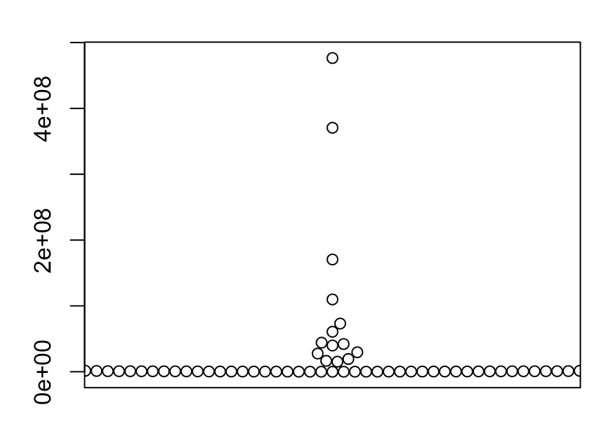
library(beeswarm)
beeswarm(rd$Amount)

#second approach
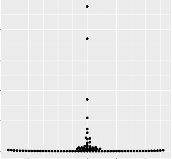
library(ggplot2)
library(ggbeeswarm)
ggplot(rd,aes(1,Amount)) + geom_beeswarm()
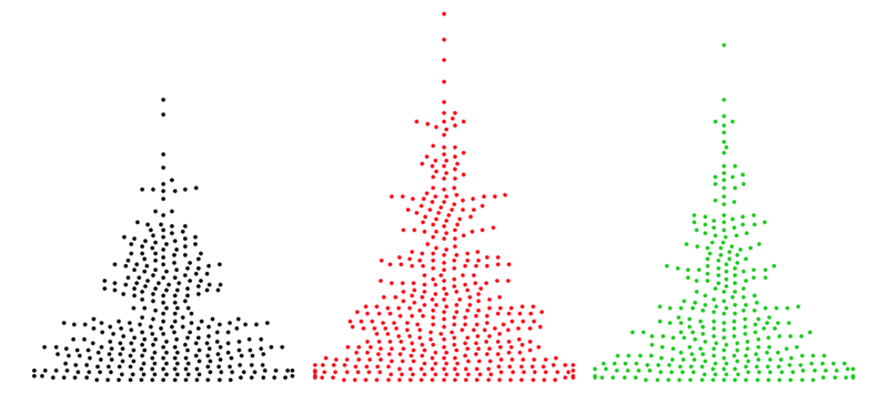
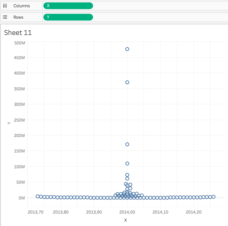
With the first approach (using the “beeswarm” package) our graph looked like this:
Moreover, with the second one (using “ggplot” and “ggbeeswarm”):
I felt that the second one looked a lot cleaner and decided to run with it.
Step 4 Get the data back into Tableau
This is the R code I used to “extract” the coordinates out of the plot:
#process the beeswarm data
p <- ggplot(rd,aes(1,Amount)) + geom_beeswarm()
pg <- ggplot_build(p)
bee <- cbind(rd,pg$data[[1]])
write.csv(bee,file = "bee.csv")
Now our data is ready to be used in Tableau:
- add a new data source
- set it to use the .csv file we generated from R
- start playing around with the new fields
Our visualization
Since we now have X and Y coordinates for each dot (country), we can easily plot them onto our canvas.
With a little bit of spit and polish, I got to my final result. Here it is again:
I would like to thank Andy and Eva for taking the time to go through our work every week and for offering invaluable feedback!
What if we were to build everything in R?
Andy asked me on Twitter why I didn’t build the chart using ggplot and went back to Tableau to do the visualization.
I have two reasons:
- ggplot doesn’t offer interactivity
- it’s a lot faster to build to viz in Tableau (especially the tedious formatting stuff)
Luckily, there is a workaround to show the tooltips by using plotly. Also, who cares about the effort when you’re doing stuff you love!
So here we have the interactive version built with R:
The R code we used to build the visualisation:
billions <- function(nr=0){
  paste(format(round(nr / 1e9, 1), trim = TRUE), "B")
}

p <- ggplot(rd,aes(1,Amount,label = Country,
    text = paste('US$<b>', billions(Amount),'</b>','R&D investment in<b>',Country,'</b>')
                  )) +
  geom_beeswarm(color = "#e0e130") +
  ggtitle("Research and Development investments in 2014") +
  geom_text(data=top_n(rd, 5, wt = Amount),check_overlap = TRUE,color="white",vjust = 0, nudge_y = 1e+10) +
  scale_y_continuous(labels = billions) +
  theme(
    plot.title = element_text(hjust = 0.5, size = 14, color = "white"),
    panel.background = element_rect(fill = "black"),
    plot.background = element_rect(fill = "black"),
    panel.grid.major.x = element_blank(),
    panel.grid.minor.y = element_blank(),
    panel.grid.minor.x = element_blank(),
    panel.grid.major.y = element_line(size=0.1,color="#666666"),
    axis.title.x=element_blank(),
    axis.text.x=element_blank(),
    axis.ticks.x=element_blank(),
    axis.title.y=element_blank()
    )
pl <- ggplotly(p, tooltip = c("text"), height = 600, width = 600)
pl$x$data[[2]]$hoverinfo = 'none'
pl
It looks like a mouthful, but it’s mostly stuff we added to make it look nice.
Beeswarm chart done in Tableau from start to finish
Zen Master Mark Jackson also replied to my tweet offering a way to do it without using R.
Is this the best community or what?
The thing is he only posted a picture. I had to reverse engineer this thing:
A puzzle to solve. This is getting better and better!
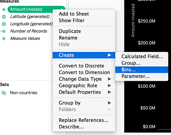
Step 1 creating bins for the amounts (investments)
We will play with the bin size later on, for now, let’s leave it as Tableau suggests it.
Step 2
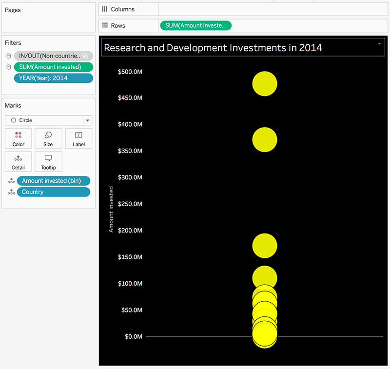
After placing the bin and the Country dimensions on the detail marks card we get this:
The chart is basically a scatterplot. We need to find a way to distribute the circles, so they don’t overlap too much.
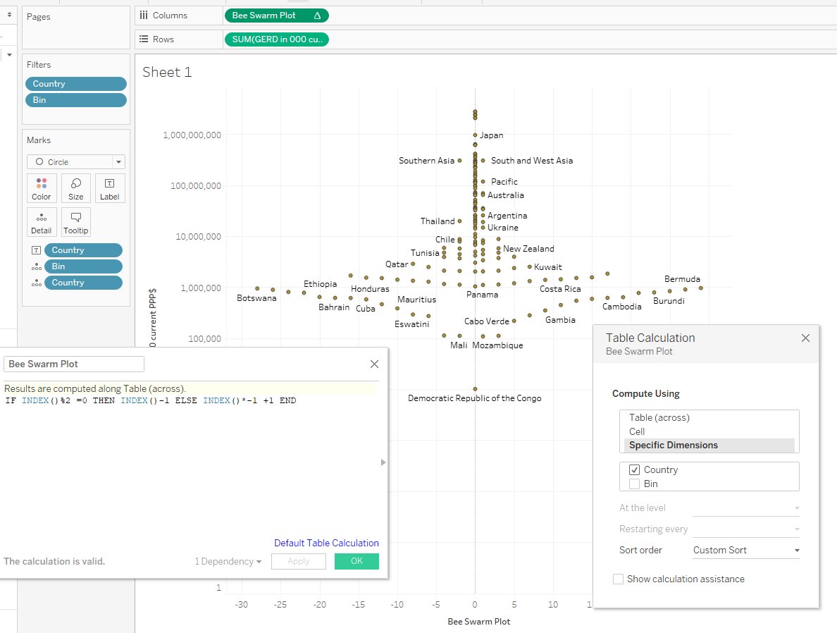
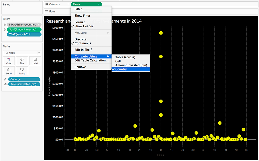
Step 3: computing the X-axis (the jittering) with a Table Calculation
The formula suggested by Mark tries to move the dots left and right of 0 when there are more countries in the same bin:
IF INDEX()%2=0 THEN INDEX()-1 ELSE INDEX()*-1+1 END
We add it to the columns shelf and have it compute using the country:
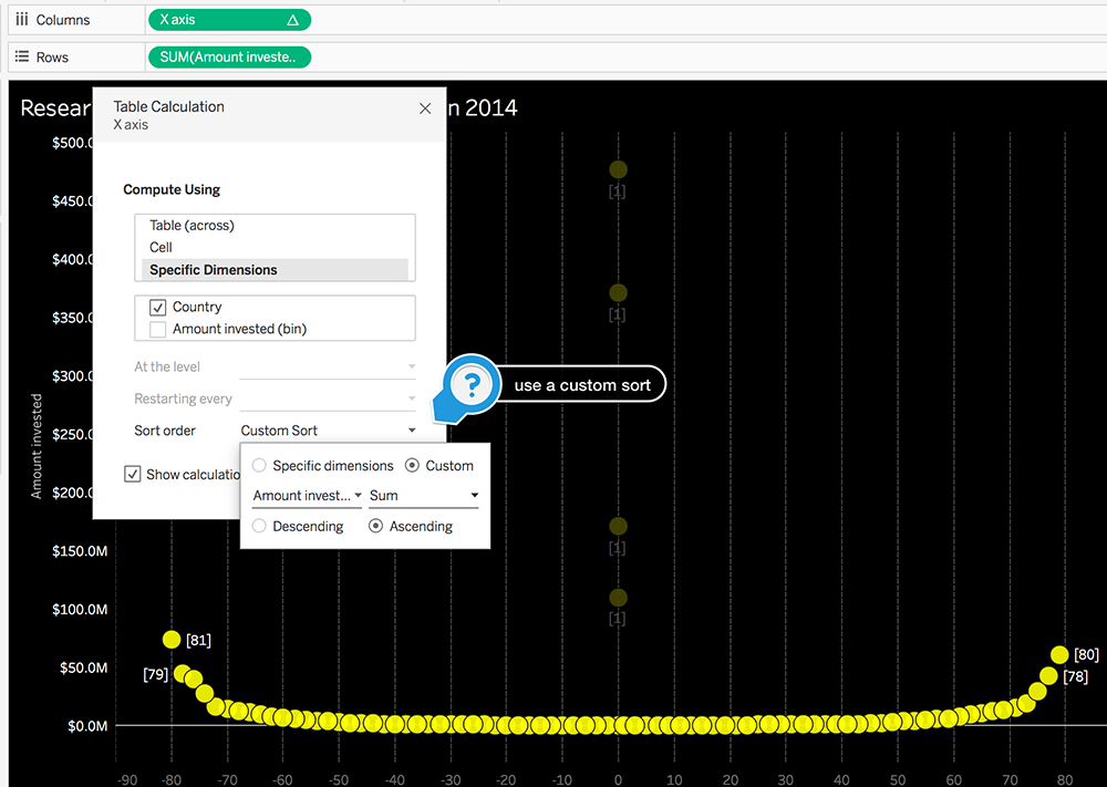
Step 4: sorting the dots
This is my favorite part of the whole thing!
The dots should be sorted in ascending order towards left and right. It’s how we obtain the “swarm effect”.
We need to edit our table calculation to use a custom sort. Specifically by the Sum of the Amount invested field:
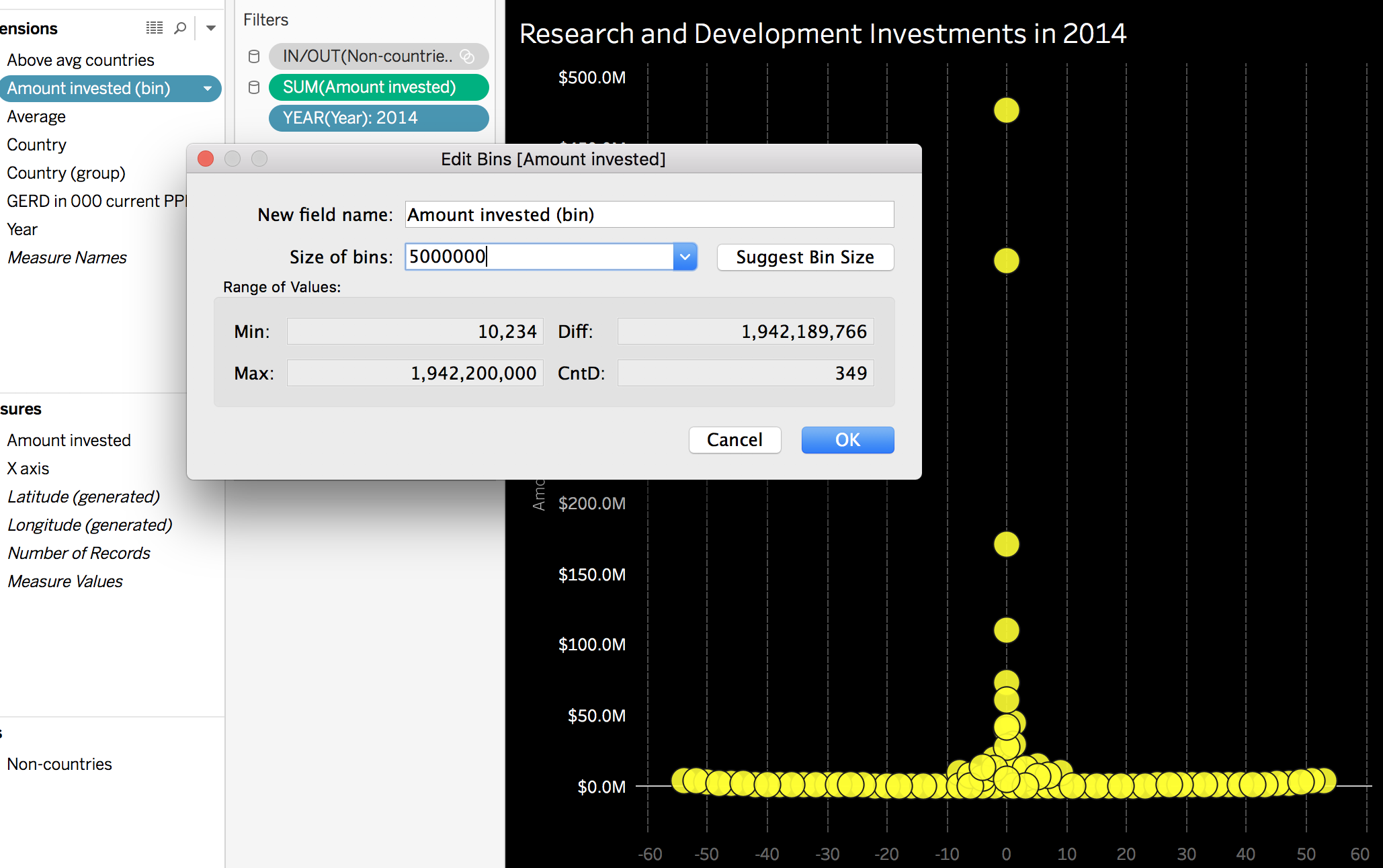
Now we have to go back to our bins and play around with their size until we get an excellent looking distribution.
In this case, it seemed to work well with a 5M bin size:
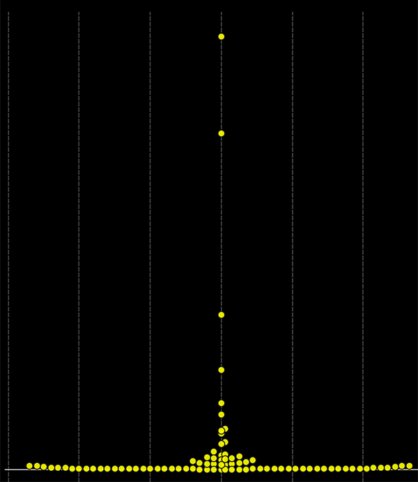
After reducing the size of the circles, we’ve pretty much obtained our beeswarm:
After formatting the viz, we’ve obtained pretty much the same result without leaving Tableau (click on the image to see the interactive version):
Highly passionate about data, analysis, visualization, and everything that helps people make informed decisions.
I love what I do! I am working to improve speed in every aspect of my life and that of our clients.
I find comfort in helping people, so if you have a question, give me a shout!
