I have the bad habit of revisiting things I’ve built with a critical eye. What I love about Tableau Public is that we can let visualizations fly and observe how people react to them.
The key thing for me is perspective. The ability to not take feedback personally is essential!
I believe we should try to collect relevant ideas from other people’s opinions and use them to improve.
A scatter plot’s story
The scatter plot is an excellent chart type to visualize correlations between two variables. It’s beneficial for spotting outliers as well.
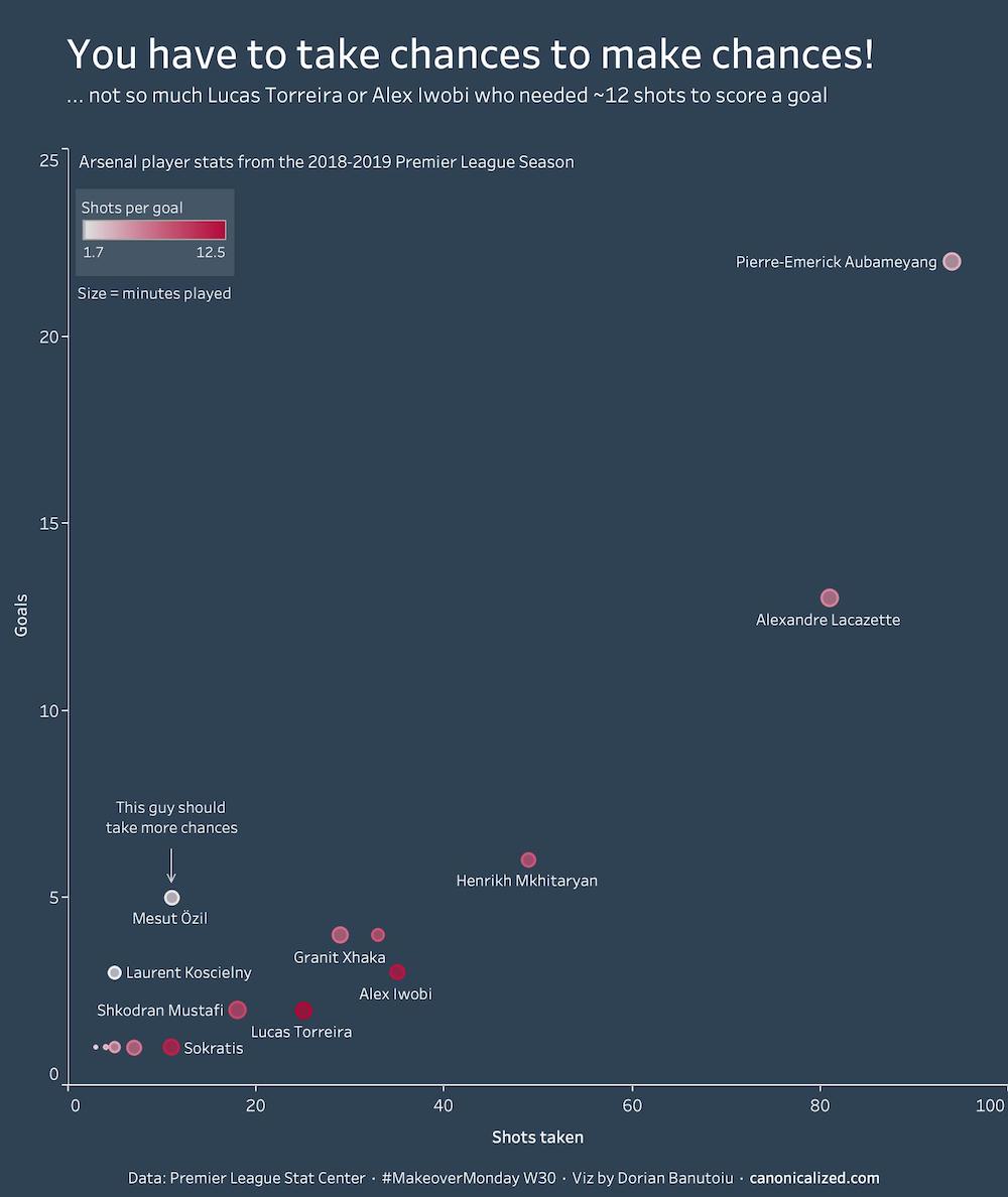
Let’s start by looking at a visualization I created for MakeoverMonday about Arsenal player stats.
Don’t worry if you don’t know anything about football/soccer! We can manage without any knowledge of the topic.
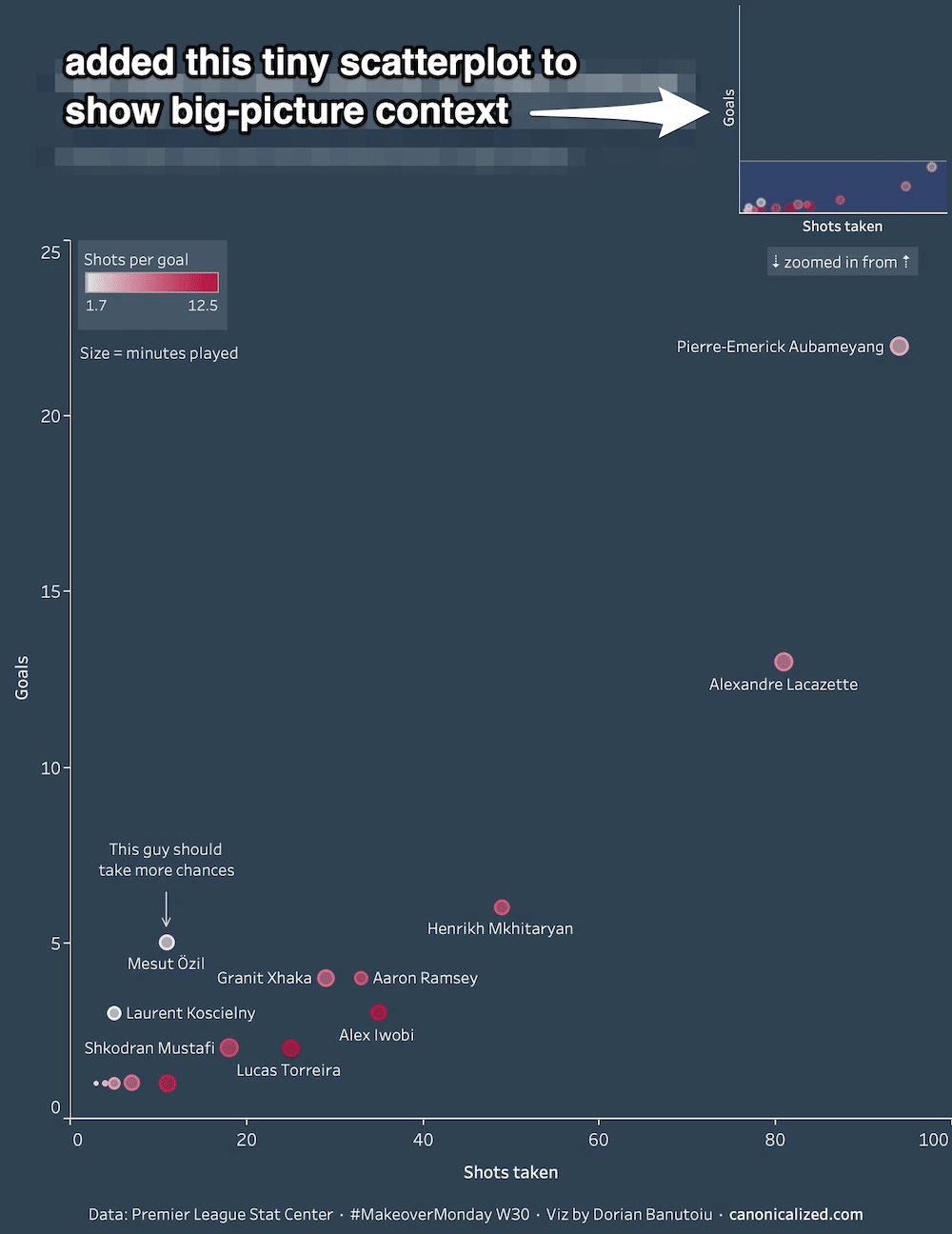
Every dot represents a player. Their positions are the most important part of the graph.
The X-axis value represents the total number of shots the player has taken in a season and the Y-axis the number of goals scored.
The purpose of this visualization is stated in its title. My hunch was that the players who make the most goals are the ones that take the most shots.
And the chart is supposed to show that I was right!
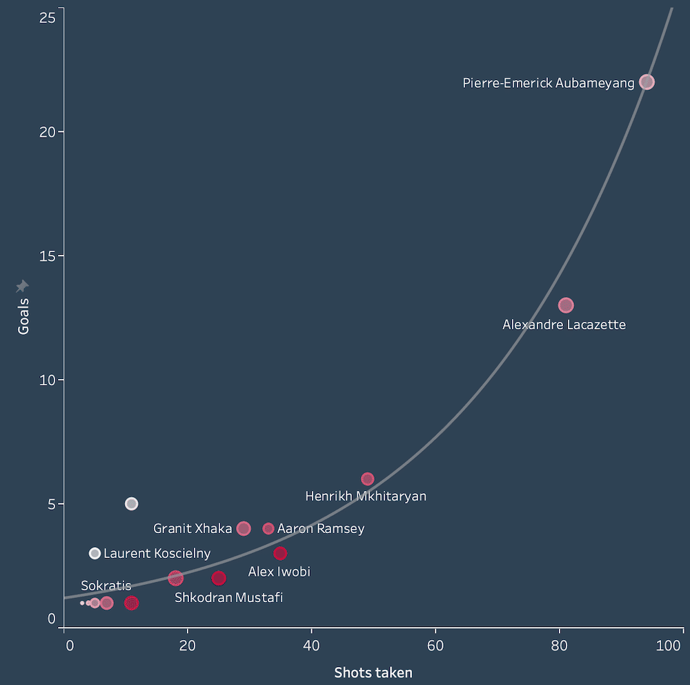
From the looks of it there seems to be a linear or even an exponential correlation between the two variables:
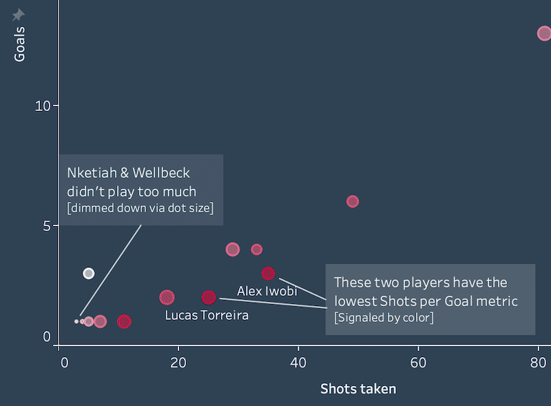
I felt the need to add additional context to this scatter plot via size and color. Not super helpful for making accurate comparisons, but handy to guide our audience’s eyes.
In my example I thought it might be useful to color the dots by a performance metric (shots per goal). The reddest dots push our attention to the players that are not performing very well.
I also sized them up by time played to dim down the importance of players who weren’t involved too much in the season.
Here’s what it accomplished:
Sports only? Forget about it!
This type of analysis can be applied to lots of different fields such as:
- medical: clinical trials vs. successes
- retail: store visits vs. purchases
- sales: opportunities vs. closed deals
- and so on
Now let’s move on to the juicy part!
Initial feedback: Synchronised Axes
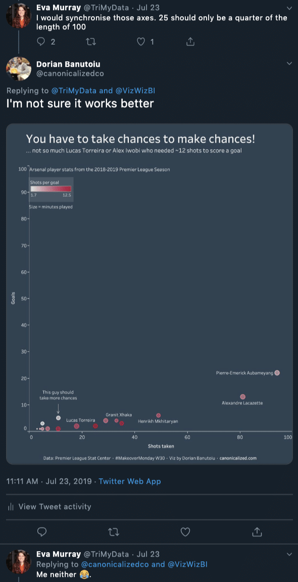
So I posted the thing on social media and got some comments on it.
The first one being that the axes are not synchronized. I did a quick iteration to see how it would look:
As you can see, it didn’t look right. My initial insights were not so visible anymore.
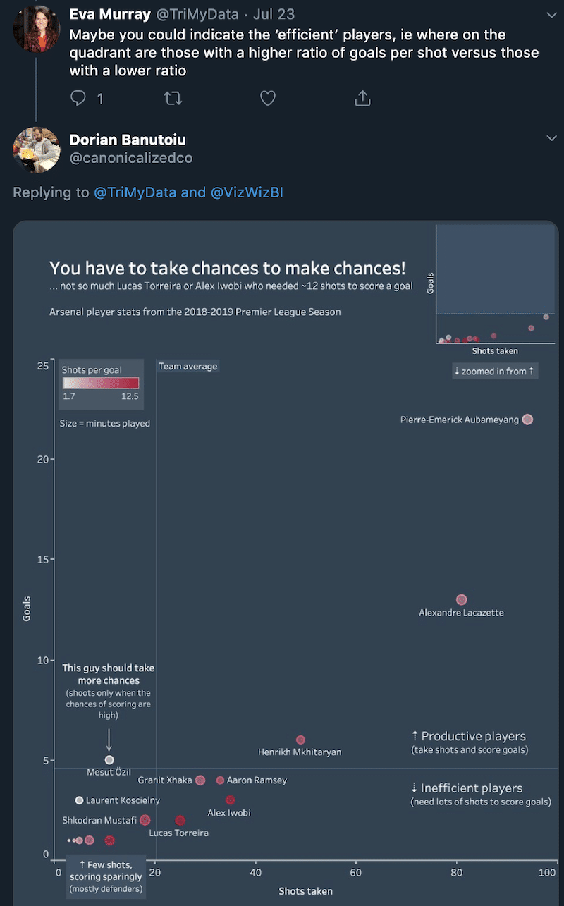
Martin Buchheit stirred up the conversation a bit, asking about the blank space. Eva came up with a cool idea to fill it up with insights:
This would have probably worked better with closer scales, but I don’t think it applies to my case.
I did some more research on the topic and found some great advice in an old book (one of the best).
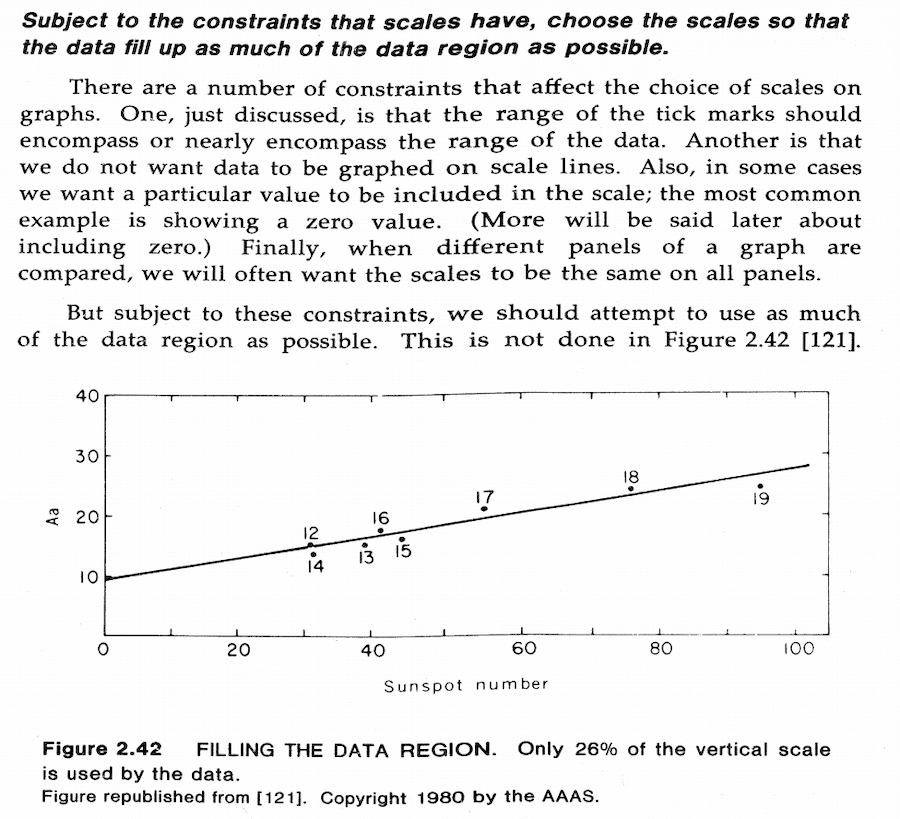
“Choose the scales so that the data fill up as much of the data region as possible.”
William S. Cleveland, The Elements of Graphing Data (published in 1985)
The author discusses a similar situation:
In my case, the goals are directly related to chances. You can’t have goals without shots or successes without trials. And the successes will always be smaller than the number of trials.
So, to avoid any confusion and to let the data speak, I tried to make the best out both sides of the story.
My solution was to add a tiny scatter plot showing the synchronized axes. I think it’s an elegant and unobtrusive way to avoid confusion for readers.
Quadrants
I implemented the feedback; everything was peaches and cream!
But like Columbo always says, there was one more thing …
The thing was quadrants. Or dividing the scatter plot into four areas by average lines:
So I posted this, and after a while, the critical part of my mind kicked in. The above chart is wrong!
Can you figure out why?
If you can, good for you! I’ll tell you anyway: there’s a problem with the average lines.
Let’s rewind a bit!
When I initially built the view, I wanted to focus on the players that make goals.
But the team has players take shots and don’t score any goals. In my case, the players who didn’t make any shots or goals were absent from the data.
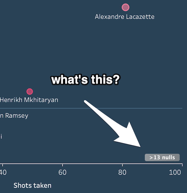
Tableau warned me about it, but I successfully ignored it at that point:
Dealing with NULL values
Once I incorporated Eva’s quadrant idea, the scatter plot was showing average lines that ignored NULL values.
So the “Team Average” wasn’t exactly the team’s average, but that of the players who scored.
Here’s how the quadrants change once we include the players who didn’t score goals:
It’s usually ok to filter out NULL values, but in this particular one, they have to be replaced with 0.
Also, I didn’t consider goalkeepers to be relevant to the analysis. So I filtered them out.
The finished dashboard
Alex Iwobi’s season doesn’t look so bad now. Even though he needs lots of shots, he scored more than the team’s average of 2.65 goals per player.
Tableau Options for dealing with NULL values
- filter out the nulls
- make sure that averages make sense once you filter data
- filters work on an entire sheet: if you have multiple graphs in the same worksheet, you will end up filtering both
- hide the null indicator (right-click& hide)
- makes sense when you want to avoid filtering the view, and you don’t need to show the NULLs
- show data at the default position
- shows the null values positioned at 0, but does not affect average lines
- treat nulls as 0
- ZN is a function that returns 0 when a field is NULL
- it will affect average lines, color/size scales, etc.
- we can also use the ISNULL and IFNULL functions in calculations
A different case for NULL values: Movie ratings
In the case of Arsenal players, I have replaced the NULLs with zero. But what do we do when this approach doesn’t make sense?
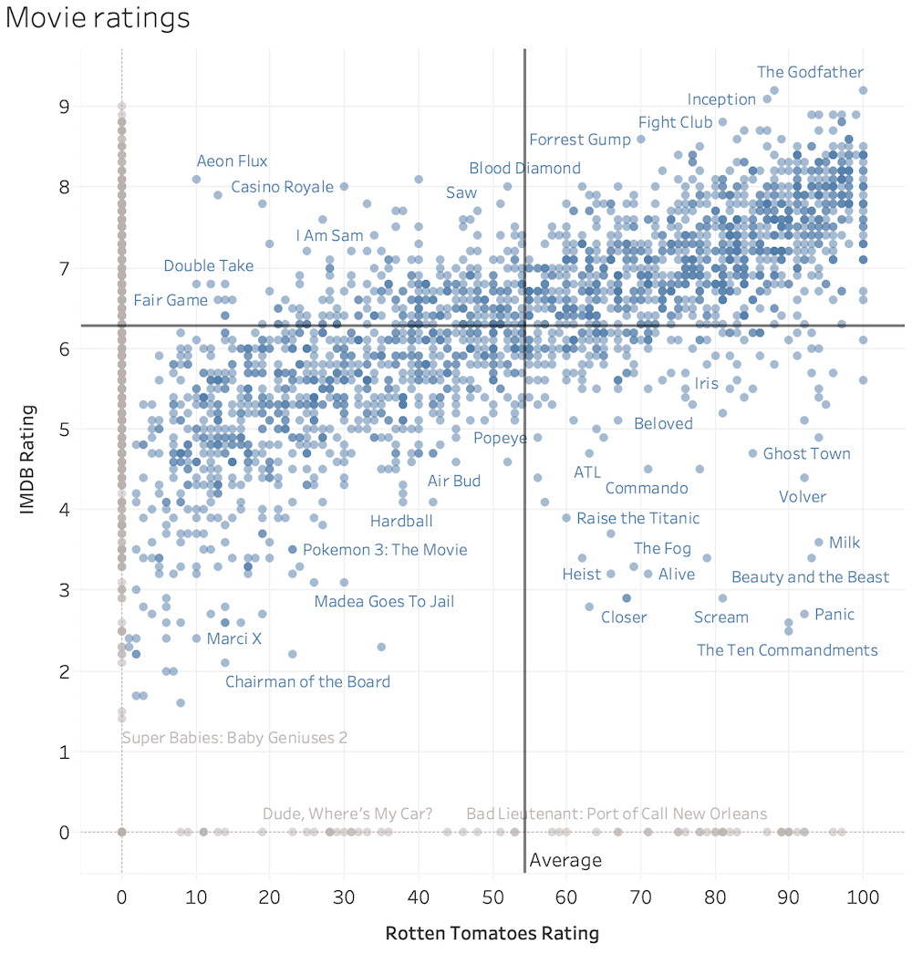
Below is an example showing movie ratings in a scatter plot.
Most movies from the dataset have ratings from both Rotten Tomatoes and IMDB, but some of them have it from a single source (the gray dots).
If we want to show the quadrants, we cannot replace NULLs with 0. It would mess up the other source’s average. But we want to display NULLs because they are relevant to the analysis.
So, what do we do?
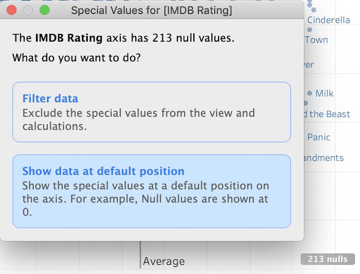
We show the data at the default position:
In this way, we get to keep the correct average, and we see the movies that have ratings on either IMDB or Rotten Tomatoes.
Advice to self:
- show the data
- add relevant context
- apply brainpower to understand and make sense
Highly passionate about data, analysis, visualization, and everything that helps people make informed decisions.
I love what I do! I am working to improve speed in every aspect of my life and that of our clients.
I find comfort in helping people, so if you have a question, give me a shout!
