I’ve been playing with AIs lately to generate images of dashboards.
I know, fun. Right?
While I don’t think that these tools will take over our jobs like I scared my friend Ludovic here, I do believe they are spectacular in a way that they can help with inspiration.
Business dashboards are sometimes dull, and can become repetitive from a visual standpoint.
So I reworked a Tableau Supply Chain Accelerator to see if I can make an Inventory Dashboard look cool.
I’ll need your help to figure out if it’s helpful for business users. Let me know your thoughts in the comments or ping me on social media.
Enough said, let’s see this thing!
Tableau Inventory Dashboard
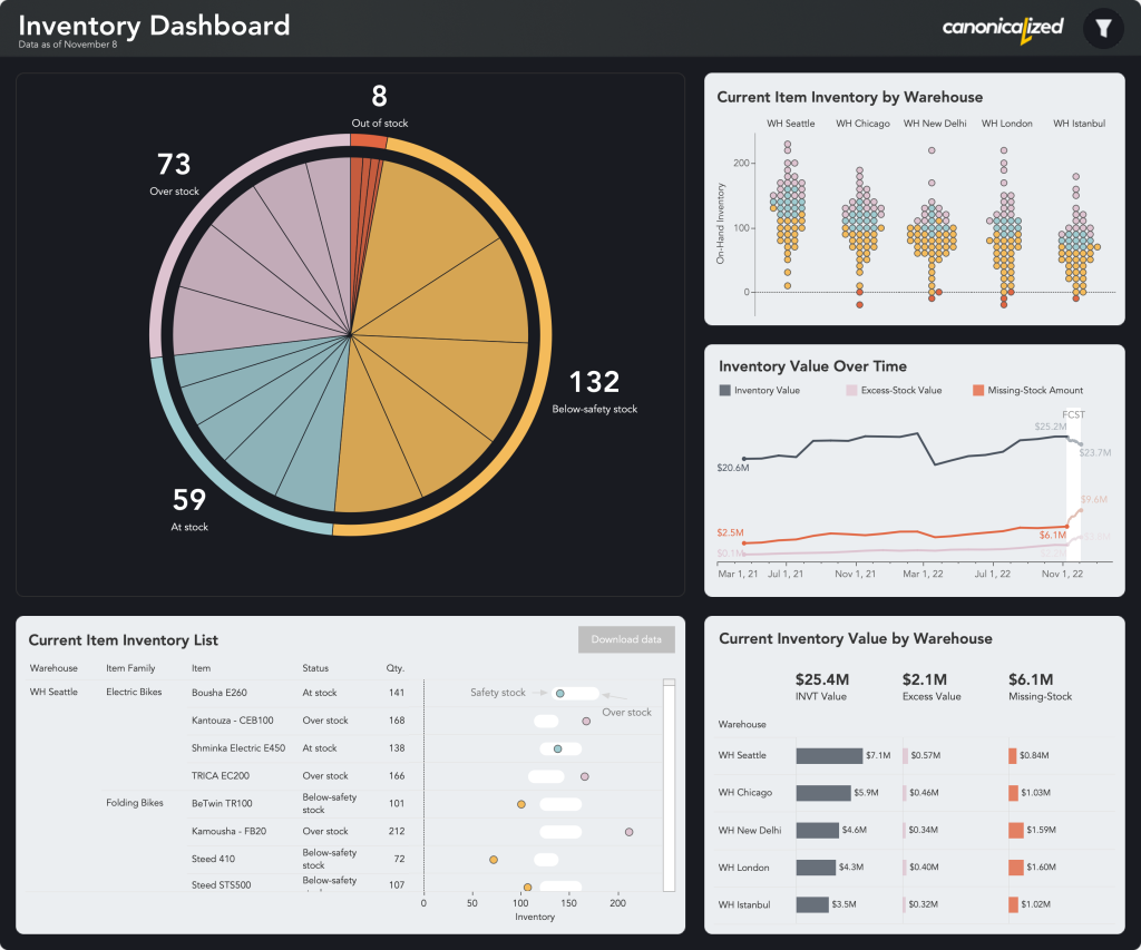
Click here to see the interactive version on Tableau Public.
Inspiration
Jeff Shaffer pointed me to this on Twitter. I found it was generated by Zoltán Szőgyényi.
It looks like I’m not the only one geeking out over Midjourney.
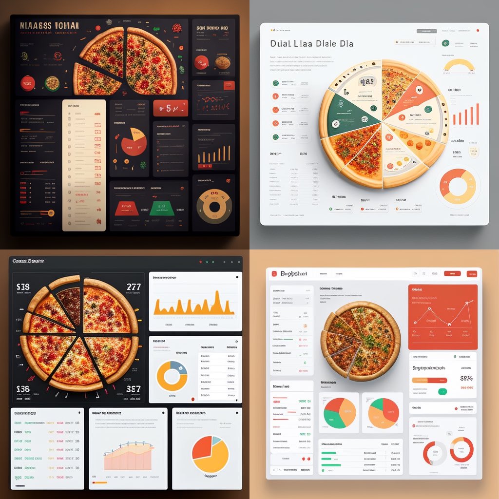
I really liked the layout on the bottom left and I wanted to apply to a business dashboard. I also have some ideas for the bottom right one, so stay tuned for more!
The Charts
I know, pie charts are bad. But from my experience people often find them easy to understand. And in this case it looks like a pizza with uneven slices.
The outer circle adds the total stock by status and the inner slices break it down by warehouse.
It’s also my first time using rounded corners for containers in Tableau. This is not an out of the box option and I tried to stay away from them if I can.
I’ve been experimenting more and more with Figma lately, so why not give it a shot?
Dot-density charts
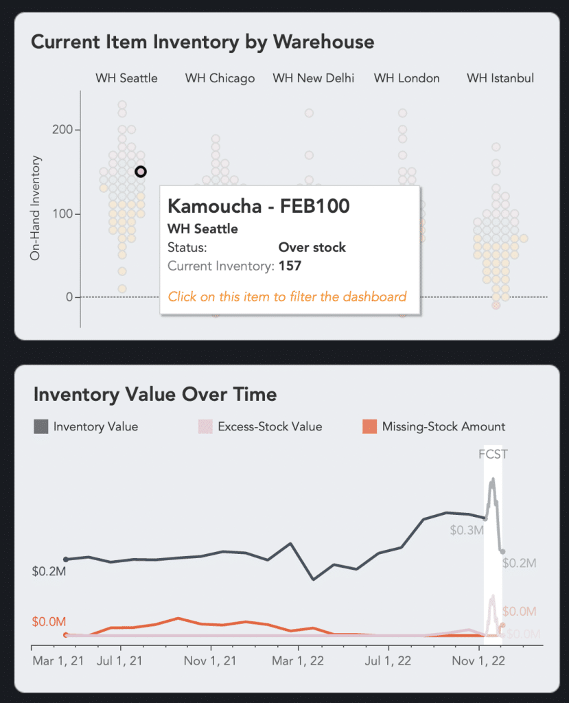
I’ve also incorporated dot-density charts on the top right side to show the item inventory distributions by warehouse.
It’s a very interesting way to encode distributions while showing the detailed breakdown by item (an improvement on a unit histogram).
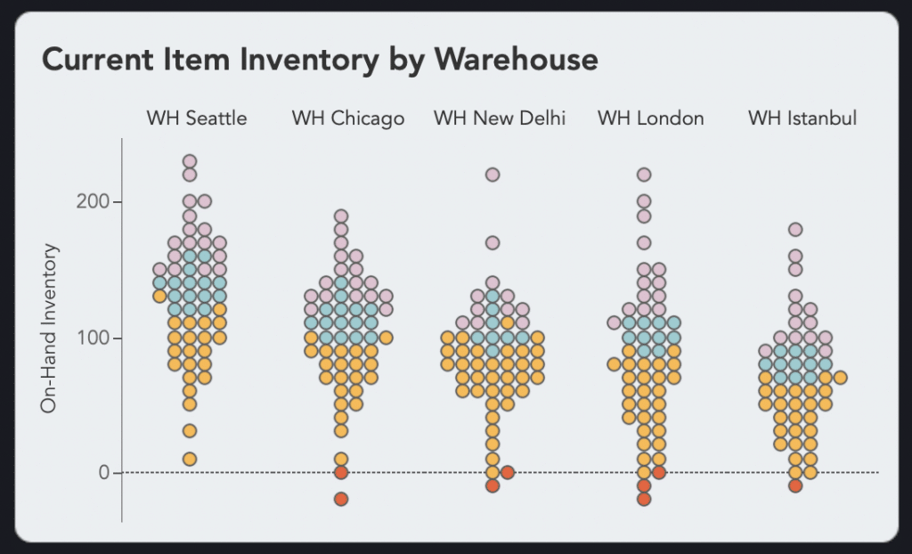
I’ve been drooling over this type of chart for years since I first learned about it from Daniel Zvinca. By the way, give Daniel a follow on Twitter where he often posts innovative Data Visualization techniques.
Up until now I was unable to create such a chart in Tableau. A few days ago Matthew Kay added a method on his R ggdist package that enables this functionality.
See below two screenshots that compare the classic Wilkinson unit histogram with the one using density estimations.
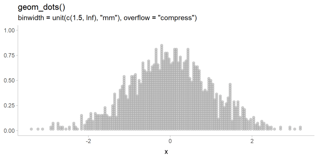
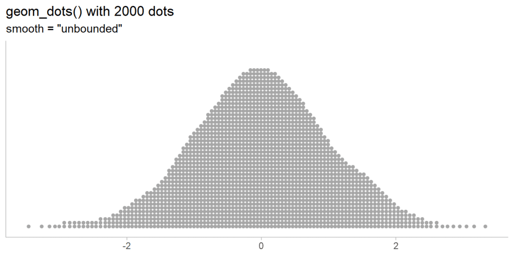
The density version is a lot cleaner and more meaningful in my opinion. And it’s cool how it can scale to hundreds of thousands of points. I’ve tested.
But does it answer the business questions?
Let’s go back to the our dashboard. On the Tableau Exchange page there is a list of questions for which the dashboard can be used to obtain answers.
Let’s go through them one by one
What is the value of our inventory?
See bottom right section that shows the overall totals and breakdowns by warehouse.
Which items are stock-out? Below safety stock?
Top right section (density charts) and the bottom left table which can be used to export the data just as well (you know you want to do that).
What is the availability of this item? What is the forecast for the coming days?
Same top right chart for item availability. You can see the item history and forecast in the below line chart if you click on an item in the density chart.
Love me some interactivity!
Which positions must be refilled? What would it cost?
See the bottom right chart for the total missing stock value. The density dot plot and the table both show the items that are below the safety stock reference.
Which items are in excess stock?
Excess stock amounts are marked with pink across the dashboard which makes them easy to recognize.
Conclusions
From my point of view the example dashboard I created answers all of the above questions perfectly fine. It’s packing a ton of information in one screen.
I believe that there’s no need to overwhelm the business user with tens of tabs most of which can be consolidated in a single view.
I mean we could if we would want them to think that we’ve been working hard, but I’m sure we can be smarter about that.
The design piece is also important from my point of view. Both in terms of choosing the chart types, positioning them on the dashboard, and crafting the design elements (fonts, containers, colors, etc).
Using AI tools with Figma is the approach that worked for me in this case.
We need to make sure the end users enjoy the experience of interacting with the dashboard. Otherwise I won’t be surprised if they request the ability to export the data to Excel on the first chance they get.
Highly passionate about data, analysis, visualization, and everything that helps people make informed decisions.
I love what I do! I am working to improve speed in every aspect of my life and that of our clients.
I find comfort in helping people, so if you have a question, give me a shout!

