A look behind the scenes at how we helped Chaoly use Tableau to bring data to life.
The Goal
Clients of Chaoly will be able to get valuable insights into their China e-commerce strategy and make smart decisions.
The tool of choice: Tableau.
People will be able to log in to their accounts and use interactive dashboards to explore data freely.
The dashboards should also work well as static reports because they will be sent weekly via email.
Platforms targeted:
- Tmall (one of the world’s biggest e-commerce marketplaces)
- WeChat (the Chinese version of WhatsApp)
- Weibo (the Chinese version of Twitter)
- Baidu (the Chinese version of Google)
Allowing people to use the dashboards as analytical tools can become cumbersome. We were tasked to find the sweet spot between the amount of information, flexibility, and ease of use.
Challenges
There’s no market like the Chinese one! Its volatility became very obvious once we had a first look at the data.
The ups are sky-high, and the downs are very steep. This makes it challenging to deal with, but it also opens up a lot of opportunities.
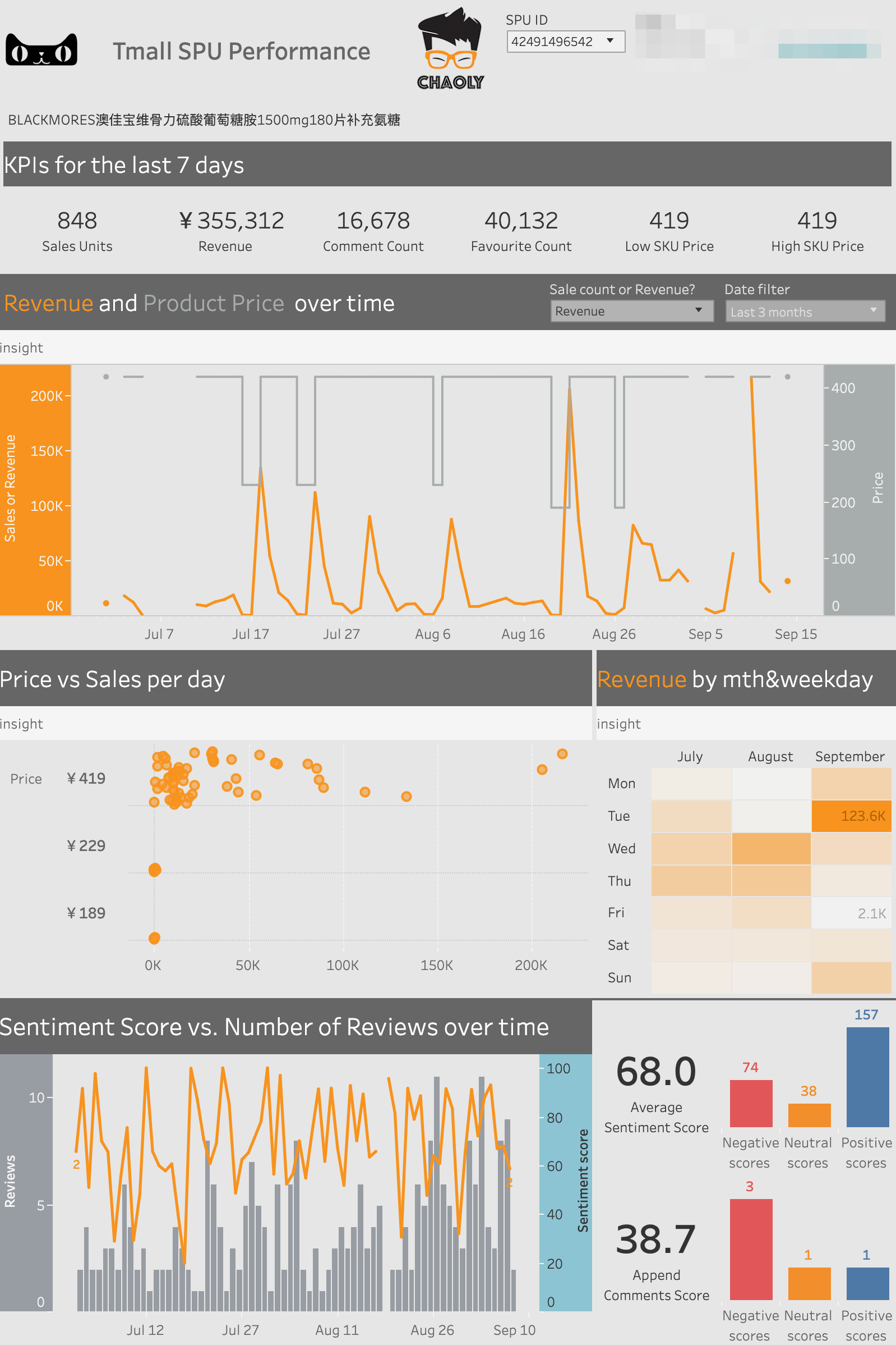
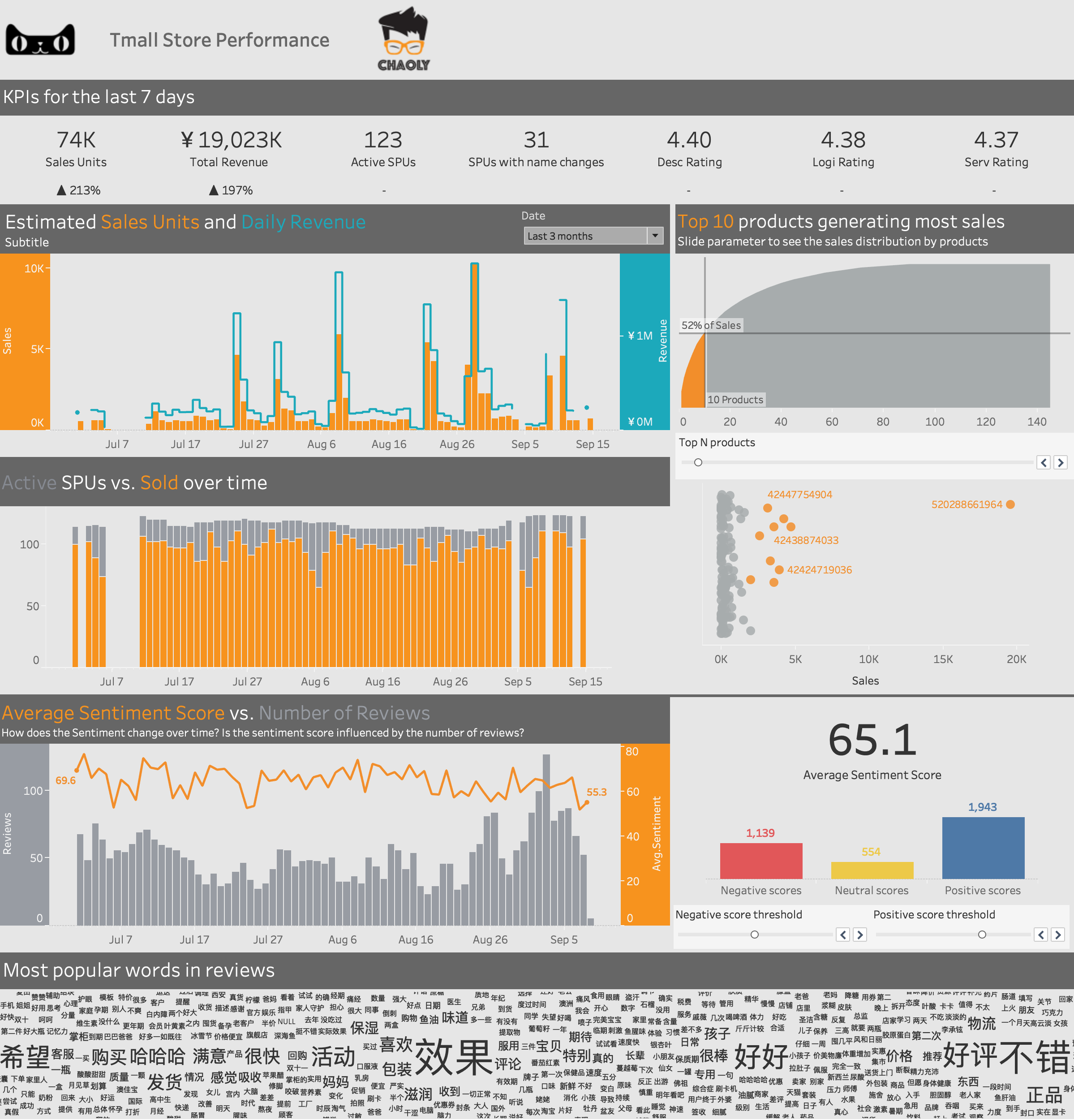
Below is the first analysis we performed on sales data from Tmall. Clients of Chaoly are using it to sell their products in China.
It was interesting to see how two different patterns emerged from this data:
- one for products priced under 50 yuan
- one for the more expensive products
And how Singles Day (the rightmost date) disturbs their trend.
Tableau is a tool that can be used to create dashboards. But more importantly, it enables almost anyone to analyze data.
And since visual is the best way to get acquainted with the data, that is what we did.
Disparate data sources
Chaoly have lots of cool data, which is good news for their customers!
But it can quickly become overwhelming for those trying to make sense of what it all means.
We “stitched” everything together via Tableau’s data blending option.
For the data nerds out there, the blending acts as a left join with a twist: that the aggregation happens before the join.
I’ve noticed that lots of people tend to dread it, but we kinda like it.
Why?
Well, think of it this way: you have 10 charts on a dashboard. Would you prefer to send 10 requests to one big data source, or send 10 requests to 10 smaller data sources?
Keep in mind that Tableau is smart enough to process these in parallel.
The blends indeed have limitations in terms of aggregation. Dealing with them was not a walk in the park.
For example, non-additive aggregations like COUNTD (count distinct) don’t work unless the blending fields are in the view. Tableau will throw an error: “Cannot blend the secondary data source because one or more fields use an unsupported aggregation.”.
To fix this, we had to add the fields being used in the blending relationship onto the view:
Aside from a few of these, we didn’t need to combine the data in very complicated ways. All we needed were some cross data source filters, which didn’t put too much of a strain on dashboard performance.
There were also cases where adding a column in the data source was enough to avoid unnecessary blending. And I’ll take this chance to publicly thank Roberto Ockerse Hernandez (the Chaoly DBA at the time) for all his help and assistance!
Dealing with outliers
We mentioned the fluctuating nature of the Chinese market. The social media data made no exception.
Offering customers the ability to hide outliers on demand can make the difference between a good dashboard and an unusable one.
Have a look below at how a few outliers can destroy our ability to find valuable insights. And how filtering them out can shine some light on our data.
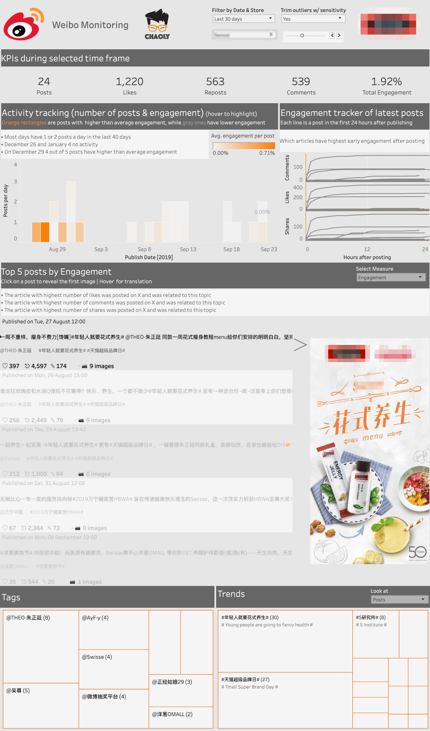
The above charts are part of a dashboard used to analyze social media data from Weibo.
Amount of information
Chaoly wanted to include a lot of details in their dashboards to satisfy as many questions as possible.
The problem with this approach is that when you try to answer too many questions, you end up answering none. The customers might find the quantity of information overwhelming and will not use the tool.
So we had to find ways to avoid clutter. Even if it meant we had to compromise on best practices.
Below is a situation where we used a packed bubble chart to look at engagement by weekday and time of day:
Packed bubble charts are almost never the best way to visualize a dataset.
The client requested us to display Reposts, Likes, and Comments in the same view. Multivariate charts are tricky, but the sized bubbles worked in this case.
It answered the question asked in the title. Mainly because we used it as a kind of decision matrix, for which we got the inspiration from Elijah Meeks.
The Tradeoffs
They say that data visualization is a game of compromise.
We totally agree!
There’s no such thing as a perfect chart or perfect dashboard. But we believe that there is a “best way” to visualize a particular dataset to answer one or more questions.
The only way to get to the best approach is by understanding the audience. And if satisfying the audience involves breaking best-practice rules, so be it!
So, to our shame, the one tradeoff we made was to use dual-axis charts with different measures. Have a look below:
We did it, but we’re not happy about it.
Why, you ask?
Mainly because of this:
The intersections are meaningless from an analytical standpoint. And it might confuse people.
The better way to do it is to use separate charts, like so:
Dashboard real-estate was a big problem, so we chose the compact version.
One article that comes to mind when dealing with this type of dilemma is Steve Wexler’s “Be Careful with Dual Axis Charts“.
Fixing problems through observing
We are firm believers in customer feedback and iteration. Once the dashboards get more views from interested people, feedback will come, and we will be able to remove information that is not useful.
So watch out dual-axis charts! We will be waiting to cut you off!
The customer’s compromises
We had to relinquish some of our principles so, obviously, Chaoly had to accept some of our arguments:
- Trim off KPIs: Our recommendation is to keep only the KPIs that make sense, are easy to understand and relevant to the people who read them.
- Renounce pie charts: We had some requests to visualize part-to-whole data using pie charts, and our answer is always yes. But we always offer alternatives, so the cases where we end up using them are super rare.
- Gauges to measure performance: Not on our watch! Not unless we’re looking at speed or engine data. Maybe not even then.
- Automatic layouts – These are a big no-no! Auto layouts will render differently on every screen which will mess up aspect ratio for charts and will put a strain on Server performance.
- Dynamically loading images: The customer wanted to be able to change post/product images based on different filter scenarios. For this part, we’ve hit a Tableau limitation, and we will write about a possible workaround using a web portal.
Factors that have contributed to the success
- A set of initial questions that had to be answered visually
- Chaoly knew when to ask for help
- Communication:
- feedback from Chaoly and their clients on the UX side
- our communication with the DB admin to re-structure the data
- The client’s trust that we can do the job properly
Design is important
- our strive to find the best way to visualize the data
- adding only stuff that makes sense to the story
- adding actionable insights for each chart (prescriptive analytics)
- working to offer an enjoyable experience through clean design, consistent colors, meaningful structure, and interactivity
There is a long way to go from building charts for the sake of building charts to answering questions. We did our best to help the client close the gap between visualization and decision making.
There’s a lot more to these dashboards than drawing pictures. These are a result of hard work starting with analysis, sense-making, and visualization.
And these pretty things answer questions. Imagine that! Magical!
Moreover, getting to chance to use Tableau through all of this was a delightful ride!
A word from the client
It was a pleasure working with Dorian and his team! They managed to help us structure a large amount of data from different sources and visualized it in a clear way.
The user has a good idea of the brand’s performance on the Chinese digital channels, can easily benchmark it with the competition, and has insights to improve the performance.Thank you, Dorian, for your hard work and for sharing your experience to improve the quality of Chaoly!
Gallery
A 360° overview to customers of how their online business is performing in China.
These dashboards are designed to help clients spot and investigate changes in data, to understand the causes of spikes in trends, and identify actionable business insights.
Highly passionate about data, analysis, visualization, and everything that helps people make informed decisions.
I love what I do! I am working to improve speed in every aspect of my life and that of our clients.
I find comfort in helping people, so if you have a question, give me a shout!
View Comments (1)
Nice choice of colors (orange vs. gray).
I might explain blending differently: joining data with different granularities. For example, daily sales vs. monthly targets.
Note: in the viz, we still want to show daily sales, otherwise we could pre-aggregate in Tableau Prep.